- Matplotlib is a python library to create data visualisations.
- Pyplot module within matplotlib provides a MATLAB-like interface.
- It creates figures and axes to achieve the desired plot.

- Figure: It may contain one or multiple axes (plots).
- Axes: Known as plots. It contains two (2D) or three (3D) axis objects.
- Axis: Lines with numbers.
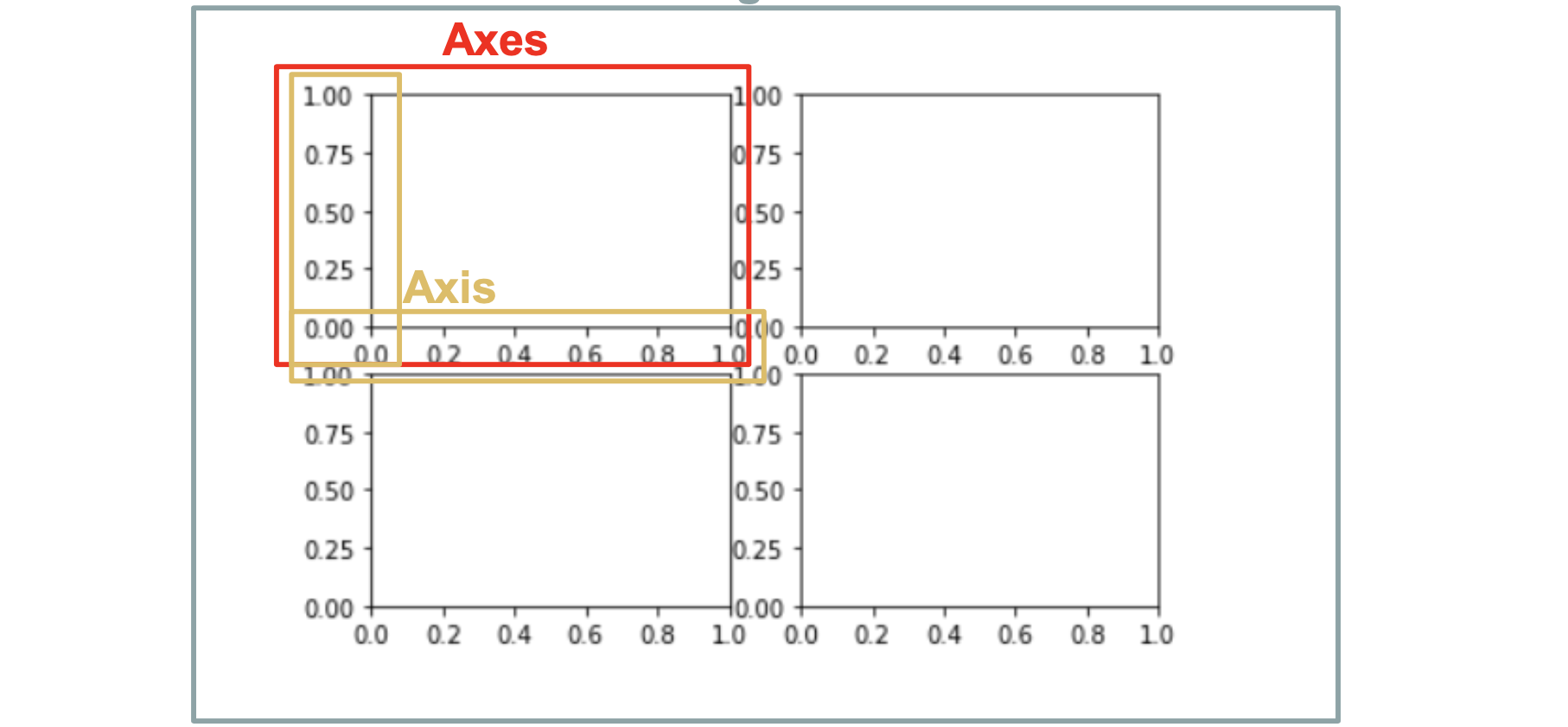
- Figure object is the overall window where everything is drawn.
- When run
plt.show(), python will create a default figure if there’s no existing one. - The default figure only contains one axes and the user is unable to call the axes.
import matplotlib.pyplot as plt
fig = plt.figure() #optional
plt.show()- Create axes with
add_subplot
fig = plt.figure(figsize=(10,10))
ax1 = fig.add_subplot(2,2,1)# (n_rows, n_cols, index)
ax2 = fig.add_subplot(2,2,2)
ax3 = fig.add_subplot(2,2,3)
ax4 = fig.add_subplot(2,2,4)

ax1.set(title = 'Axes 1')
ax2.set(title = 'Axes 2')
ax3.set(title = 'Axes 3')
ax4.set(title = 'Axes 4')

fig.tight_layout() #to ensure no overlaps
plt.show()fig, axes = plt.subplots(nrows=2, ncols=2, figsize=(8, 8))
axes[0,0].set(title = 'Axes 1')
axes[0,1].set(title = 'Axes 2')
axes[1,0].set(title = 'Axes 3')
axes[1,1].set(title = 'Axes 4')
plt.show()
#OR
fig, ((ax1, ax2), (ax3, ax4)) = plt.subplots(nrows=2, ncols=2, figsize=(10, 10))
ax1.set(title = 'Scatter')
ax2.set(title = 'Line')
ax3.set(title = 'Bar')
ax4.set(title = 'Bar with Artists')
plt.show()
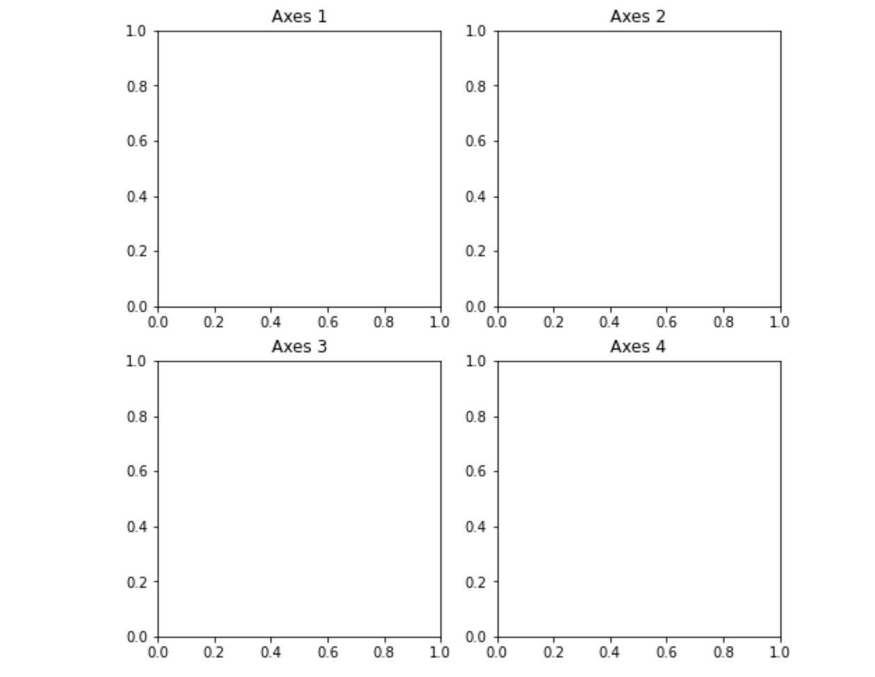
fig = plt.figure()
ax = fig.add_subplot()
ax.set(title = "Exercise 2", xlim=[-6,6], ylim=[-6,6])
#OR
ax.set_xlim([-1,4])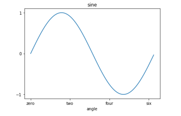
ax.set_ylim([-6,6])- Customize axis ticks
ax.set_xlabel(‘angle’)
x = [0,2,4,6]
label = ['zero','two','four','six']

#Method 1:
ax.set_xticks(x) #denote the positions on corresponding action where ticks will be displayed.
ax.set_xticklabels(label) #labels corresponding to tick marks

#Method 2:
ax.set(xticks=x, xticklabels=label)
- Label when there are multiple plots on same axes
plt.plot([1, 2, 3], [10, 20, 25], color = 'black', label='city1')
plt.plot([1, 2, 3], [30, 23, 13], color = 'orange', label='city2')
plt.scatter([1, 2, 3], [20, 10, 30], color = 'salmon', label='city3')

plt.legend() #Need to call .legend() to display label
#plt.legend(loc='upper left') #To display where to put the label box
plt.show()- Scatter
- Line
- Bar
- Histogram
fig, ((ax1, ax2), (ax3, ax4)) = plt.subplots(nrows=2, ncols=2, figsize=(10, 10), sharex='all', sharey='all') #sharex='all', sharey='all' to share same axis x, y
ax1.set(title = 'Scatter')
ax2.set(title = 'Line')
ax3.set(title = 'Bar')
ax4.set(title = 'Bar with Artists')

ax1.scatter(x,y, marker="+", color="red")
ax2.plot(x,y,marker='*', linestyle='dashed', color="black")
ax3.bar(x,y, edgecolor='black', color='lightblue')

bars = ax4.bar(x,y, color='lightblue')
for bar, height in zip(bars, y):
    if height < 0:
        bar.set(color = 'salmon') #To change the color of each bar based on Height values

plt.show();
- A boxplot is a standardized way of displaying the distribution of data as below:
- whis (whisker):
whis = 1.5, by default. - “minimum”:
Q3 + whis*IQR - first quartile (Q1/25th Percentile): the middle number between the smallest number (not the “minimum”) and the median of the dataset.
- median: middle value of the dataset (i.e: half of the numbers in the dataset below the median, half of the numbers in the dataset above the median)
- interquartile range (IQR):
Q3-Q125th to the 75th percentile. - third quartile (Q3/75th Percentile): the middle value between the median and the highest value (not the “maximum”) of the dataset.
- “maximum”:
Q3 + whis*IQR
- whis (whisker):
- It can tell you about your outliers and what their values are.
- outliers:
those points > (Q3 + whis * IQR) = "maximum"orthose points < (Q1 – whis * IQR) = “minimum”
- outliers:
- It can also tell you if your data is symmetrical, how tightly your data is grouped, and if and how your data is skewed.
x = np.random.randn(100)
plt.boxplot(x)
plt.show()
- Contour plots show the relationship between a fitted response and two continuous variables
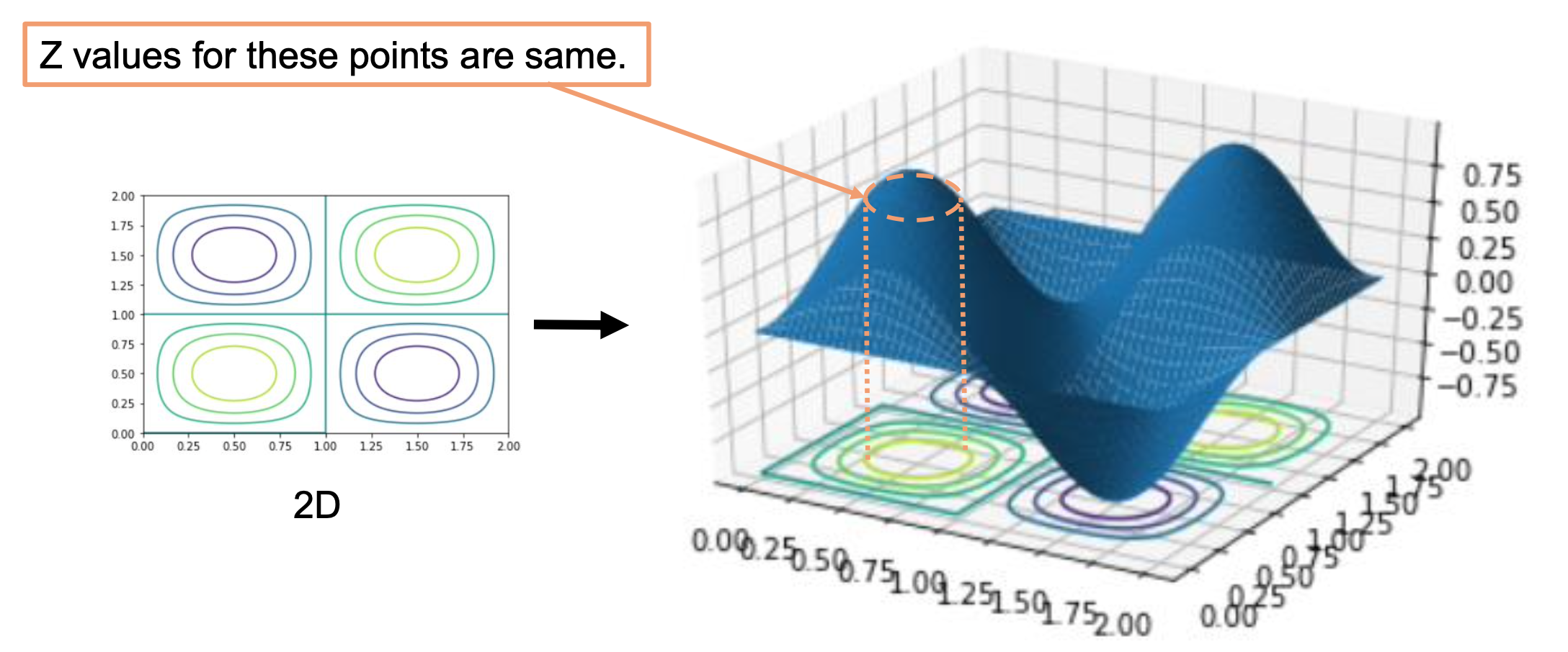
def f(x, y):
  return np.sin(np.pi*x)*np.sin(np.pi*y)
x = np.linspace(0, 5, 50)
y = np.linspace(0, 5, 50)
X, Y = np.meshgrid(x, y) #create positions Z = f(X, Y)

plt.contour(X, Y, Z)
plt.show()