Learn how to plot data in the form of Pie Chart, Contor plot and scatter plot
- Matplotlib - Pie Chart
- Matplotlib - Contour Plot
- Matplotlib - Scatter Plot
-
- A Pie Chart is a circular statistical plot that can only show one set of data at a time.
- The entire percentage of the provided data is represented by the chart's area.
- The proportion of sections of the data is represented by the** area of the pie slices**.
- Pie wedges are the pieces of the pie.
- The length of the wedge's arc determines the area of the wedge.
-
-
Create Simple Pie Chart: We can use the pie() function to draw pie charts
import matplotlib.pyplot as plt # pip install matplotlib
import numpy as np

chart = np.array([10, 20, 30, 40, 50])

plt.pie(chart)
plt.show()
Sample Output:

📝 NOTE: Each value in the array is represented by a slice in the pie chart. The plotting of the first wedge, by default, begins at the x-axis and moves counterclockwise
-
Add Labels to the Pie Chart: We can add labels to the pie chart with the label() parameter.
import matplotlib.pyplot as plt
import numpy as np

chart = np.array([10, 20, 30, 40])
tempLabels = ["C", "C++", "JAVA", "PYTHON"]

plt.pie(chart, labels = tempLabels)
plt.show()
Sample Output:

📝 NOTE: The label parameter must be an array with one label for each wedge
-
Pie Chart Starts from Start Angle: We can change the start angle by specifying a startangle() parameter.
import matplotlib.pyplot as plt
import numpy as np

chart = np.array([50, 40, 30, 20, 10])

plt.pie(chart, startangle=180)
plt.show()
Sample Output:


📝 NOTE: The startangle parameter is defined with an angle in degrees, default angle is 0.
-
Explode Wedges in Pie Chart: The explode() parameter is used for wedges to stand out and must be an array with one value for each wedge.
import matplotlib.pyplot as plt
import numpy as np

chart = np.array([10, 20, 30, 40])
tempLabels = ["C", "C++", "JAVA", "PYTHON"]
tempExplode = [0.1, 0.1, 0.1, 0.3]

plt.pie(chart, labels = tempLabels, explode = tempExplode)
plt.show()
Sample Output:

📝 NOTE: Each value represents how far from the center each wedge is displayed.
-
Add Shadow to the Pie Chart: Set the shadow() parameter to True to add a shadow to the pie chart
import matplotlib.pyplot as plt
import numpy as np

chart = np.array([10, 20, 30, 40])
tempLabels = ["C", "C++", "JAVA", "PYTHON"]
tempExplode = [0.1, 0.1, 0.1, 0.3]

plt.pie(chart, labels = tempLabels, explode = tempExplode, shadow=True)
plt.show()
Sample Output:

-
Set the Color of Each Wedge: With the color() parameter, we can change the color of each wedge.
import matplotlib.pyplot as plt
import numpy as np

chart = np.array([10, 20, 30, 40])
tempColors = ["blue", "red", "yellow", "green"]

plt.pie(chart, colors = tempColors)
plt.show()
Sample Output:

📝 NOTE: If given, the colors option must be an array with one value for each wedge.
-
Add a List of Each Wedge's Explanations: Use the legend() function to create a list of explanations for each wedge.
import matplotlib.pyplot as plt
import numpy as np

chart = np.array([10, 20, 30, 40])
tempLabels = ["C", "C++", "JAVA", "PYTHON"]

plt.pie(chart, labels = tempLabels)
plt.legend()
plt.show()
Sample Output:

-
-
- Contour plots, also known as level plots, are a multivariate analytic tool that allows you to visualize 3D plots in 2D space.
- The contour() and contourf() functions in the Matplotlib API draw contour lines and filled contours. Both functions require three inputs: x, y, and z.
- Contour plots are widely used to visualize the density, altitudes, or heights of the mountain.
- The method contour in matplotlib.pyplot makes it simple to draw contour plots.
-
-
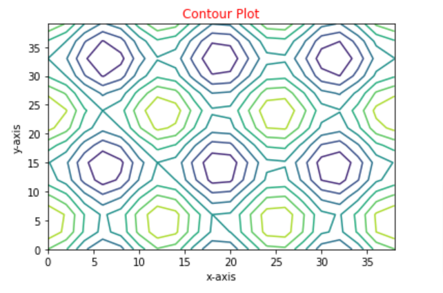
plt.contour() method: Contour is plotted using the contour() function, which only plots contour lines.
The basic contour() method call is below:
ax.contour(X, Y, Z)Where X and Y are two-dimensional arrays of x and y points, and Z is a two-dimensional array of points that determines the contour's "height", which is represented by color in a two-dimensional plot.
Let's look at the code and some examples of output:
import numpy as np
import matplotlib.pyplot as plt

# Store all numbers from 0 to 40 in steps of 2
x = np.arange(0, 40, 2)
# Store all numbers from 0 to 40 in steps of 3
y = np.arange(0, 40, 3)

# Creating 2-D grid of x and y
X, Y = np.meshgrid(x, y)

fig, plott = plt.subplots(1, 1)

Z = np.cos(X / 2) + np.sin(Y / 3)

# plots contour lines
plott.contour(X, Y, Z)

plott.set_title('Contour Plot') # Set the title of the plot
plott.set_xlabel('x-axis') # Set the x-axis title
plott.set_ylabel('y-axis') # Set the y-axis title

plt.show()
Sample Output:
-
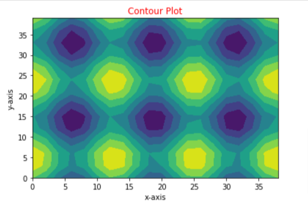
plt.contourf() method: Plotting of contour using contourf() which plots filled contours.
The basic contourf() method call is below:
ax.contourf(X, Y, Z)Where X and Y are two-dimensional arrays of x and y points, respectively, and Z is a two-dimensional array of points that determines the colour of the areas on the two-dimensional plot.
Let's look at the code and some examples of output:
import numpy as np
import matplotlib.pyplot as plt

# Store all numbers from 0 to 40 in steps of 2
x = np.arange(0, 40, 2)
# Store all numbers from 0 to 40 in steps of 3
y = np.arange(0, 40, 3)

# Creating 2-D grid of x and y
X, Y = np.meshgrid(x, y)

fig, plott = plt.subplots(1, 1)

Z = np.cos(X / 2) + np.sin(Y / 3)

# plots contour lines
plott.contourf(X, Y, Z)

plott.set_title('Contour Plot') # Set the title of the plot
plott.set_xlabel('x-axis') # Set the x-axis title
plott.set_ylabel('y-axis') # Set the y-axis title

plt.show()
Sample Output:
-
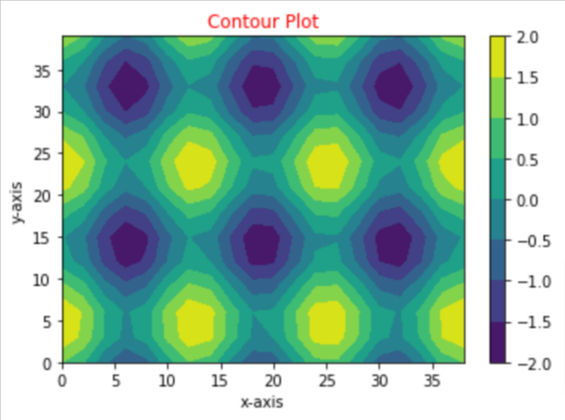
Color Bars on Contour Plot: The fig.colorbar() method is used to add colour bars to matplotlib contour plots.
-
A plot object must be provided when adding a color bar to a figure.
-
The output of the contourf() method is a plot object.
-
The contourf() method's output was not previously allocated to a variable.
-
To add a color bar on a contour plot, however, the plot object must be saved to a variable before passing it to the fig.colorbar() method.
  cont = plott.contourf(X, Y, Z)
  fig.colorbar(cont)
Where cont is the plot object created by contourf(X, Y, Z)
Let's look at the code and some examples of output:
import numpy as np
import matplotlib.pyplot as plt

# Store all numbers from 0 to 20 in steps of 2
x = np.arange(0, 40, 2)
# Store all numbers from 0 to 20 in steps of 3
y = np.arange(0, 40, 3)

# Creating 2-D grid of features
X, Y = np.meshgrid(x, y)

fig, plott = plt.subplots(1, 1)

Z = np.cos(X / 2) + np.sin(Y / 3)

# plots contour lines
cont = plott.contourf(X, Y, Z)
fig.colorbar(cont) # Adding colorbar in the figure

plott.set_title('Contour Plot') # Set the title of the plot
plott.set_xlabel('x-axis') # Set the x-axis title
plott.set_ylabel('y-axis') # Set the y-axis title

plt.show()
Sample Output:
-
-
-
- A scatter plot is a visual representation of how two variables relate to each other, with the variables presented as dots.
- The position of a dot depends on its two-dimensional value, where each value is a position on either the horizontal or vertical dimension.
- Matplotlib has a built-in function to create scatterplots called scatter().
- A scatter chart works best when comparing large numbers of data points without regard to time.
-
-
Create Simple Scatter Plot: We can use the plt.scatter() function to draw scatter plots
 import matplotlib.pyplot as plt

 x =[3,5,2,8,6,9,10,1]
 y =[12,34,56,23,42,54,76,43]

 plt.scatter(x, y, c ="blue")

 plt.show()
Note: Syntax for scatter()
matplotlib.pyplot.scatter(x, y, s=None, c=None, marker=None, cmap=None, norm=None, vmin=None, vmax=None, alpha=None, linewidths=None, verts=, edgecolors=None, *,plotnonfinite=False, data=None, kwargs)
Where:
- x, y: float or array-like data values
- s: float or array-like value for size
- c: array-like or list of colours or colour
The plot function will be faster for scatterplots where markers don't vary in size or color.
**Sample Output:** <p align="center"><img width="30%"src="https://user-images.githubusercontent.com/81686454/125423906-0e318c06-3345-4d5e-8bd2-567bde7b725f.png"></p> -
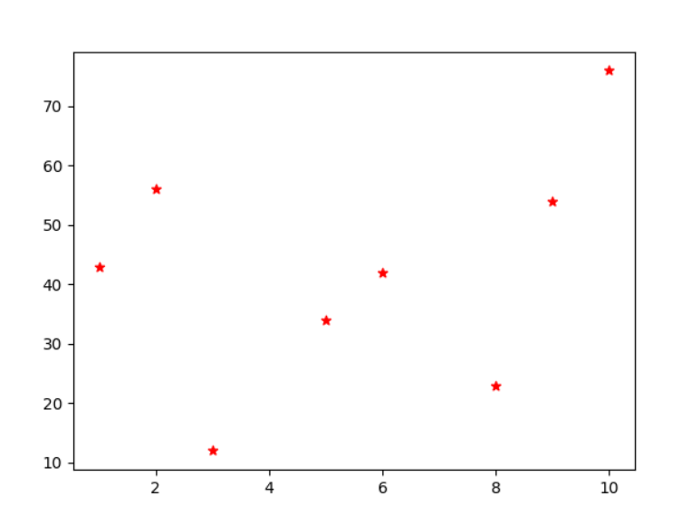
Change the label and colour of the marker
import matplotlib.pyplot as plt
x =[3,5,2,8,6,9,10,1]
y =[12,34,56,23,42,54,76,43]

plt.scatter(x, y, label= "stars", color= "red", marker= "*")

plt.show()
Sample Output:
-
Create Scatter Plot for two data sets:
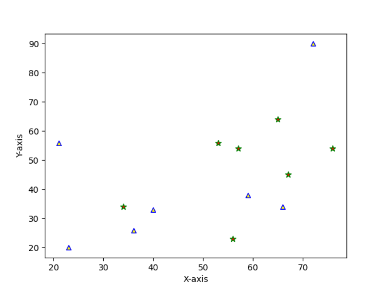
import matplotlib.pyplot as plt


x1 = [56, 67, 34, 65, 53, 57, 76]
y1 = [23, 45, 34, 64, 56, 54, 54]
x2 = [36, 66, 72, 40, 59, 23, 21]
y2 = [26, 34, 90, 33, 38, 20, 56]

plt.scatter(x1, y1, c ="red", marker ="*", edgecolor ="green", s = 50)
plt.scatter(x2, y2, c ="yellow", marker ="^", edgecolor ="blue", s = 30)

plt.xlabel("X-axis")
plt.ylabel("Y-axis")
plt.show()
Note:
plt.title()is used to set title to your plot.plt.xlabel()is used to label the x axis.plt.ylabel()is used to label the y axis.
Sample Output:
-