-
Notifications
You must be signed in to change notification settings - Fork 2
Expand file tree
/
Copy pathLecture2Slides.Rmd
More file actions
238 lines (150 loc) · 8.8 KB
/
Copy pathLecture2Slides.Rmd
File metadata and controls
238 lines (150 loc) · 8.8 KB
1
2
3
4
5
6
7
8
9
10
11
12
13
14
15
16
17
18
19
20
21
22
23
24
25
26
27
28
29
30
31
32
33
34
35
36
37
38
39
40
41
42
43
44
45
46
47
48
49
50
51
52
53
54
55
56
57
58
59
60
61
62
63
64
65
66
67
68
69
70
71
72
73
74
75
76
77
78
79
80
81
82
83
84
85
86
87
88
89
90
91
92
93
94
95
96
97
98
99
100
101
102
103
104
105
106
107
108
109
110
111
112
113
114
115
116
117
118
119
120
121
122
123
124
125
126
127
128
129
130
131
132
133
134
135
136
137
138
139
140
141
142
143
144
145
146
147
148
149
150
151
152
153
154
155
156
157
158
159
160
161
162
163
164
165
166
167
168
169
170
171
172
173
174
175
176
177
178
179
180
181
182
183
184
185
186
187
188
189
190
191
192
193
194
195
196
197
198
199
200
201
202
203
204
205
206
207
208
209
210
211
212
213
214
215
216
217
218
219
220
221
222
223
224
225
226
227
228
229
230
231
232
233
234
235
236
---
title: "Stat 201 - Lecture 2"
author: "Prof. Heggeseth"
date: "September 15, 2015"
output: slidy_presentation
---
```{r global_options, include=FALSE}
knitr::opts_chunk$set(dev='png',fig.path='Figs/',
echo=TRUE, warning=FALSE, message=FALSE,tidy=TRUE)
```
#Last Class
Any interesting SF Crime recommendations or insights?
#Last Class
**Key Concept:**
**Most interesting research questions involve more than 1 (and often more than 2) variables!**
Univariate Summaries
- Categorical: Frequency Tables, Bar plots
- Quantitative: Histograms, Center (mean, median, trimmed mean), Spread (IQR, range, sd)
Bivariate Summaries
- Both Categorical: Contingency Tables, Mosaic plots (not to be confused with mosaic package)
- To be discussed (TBD): both quantitative (next week), one of each type (today)...
#Questions to Contemplate
Since a relatively stable base period from 1940 to 1960, the global temperature has increased by about 1 degree (Fahrenheit). Scientists predict that by 2100, the increase will be an additional 2 to 11.5 degrees.
Think about: **What does that prediction range depend on?**
```{r}
Global.Temperature <- read.table("GlobalTemperature.txt", header=TRUE, quote="\"")
with(Global.Temperature,plot(Annual_Mean~Year, pch=19,bty="n",ylim=c(-1,1),xlim=c(1880,2100)))
abline(h=0)
```
```{r}
Global.Temperature <- read.table("GlobalTemperature.txt", header=TRUE, quote="\"")
with(Global.Temperature,plot(Annual_Mean~Year, pch=19,bty="n",ylim=c(-1,12),xlim=c(1880,2100)))
abline(h=0)
segments(2100,2,2100,11.5,col='red')
```
#Questions to Contemplate
Earlier this month, Donald Trump was the favorite of 32% of Republicans with a margin of error of 4.5 percentage points.
Think about: **What does this mean? What does that margin of error depend on?**
#Questions to Contemplate
My husband, a classical musician, claims to be able to distinguish Mahler symphonies from any other classical pieces. I test him by randomly presenting him with 10 pieces (5 of which were snipets of Mahler symphonies). He gets 9 out of 10 right.
Think about: **Are you convinced? Could he have just gotten lucky?**
#Missing Data and R
**Missing data** are values that were supposed to be observed but weren't.
If you have some values that are missing (`NA` in R), **what could be some reasons for these?**
#Missing Data and R
R forces you to deal with these `NA` values.
- Remove the missing data (na.rm = TRUE in many functions like `mean` and `sd`)
- Think about why they might be missing.
- We could impute (fill in) these values with the mean. **Why might that not be a good idea?**
- There are other ways ways to deal with missing data (multiple imputation, etc.).
#Missing Data and R
You could also have *missing cases* that don't even appear in R.
These are subjects/units that were "selected" to be in a study, but they "refused to participate".
Think about SF crime data. **Why would a case be missing in that situation? **
#Relative Importance
Jordan Spieth, 22 year old golfer, won back-to-back titles this summer with the Masters and then the U.S. Open and is currently fighting for the No. 1 ranking in World Rankings.
How impressive are these back-to-back victories?
**How would you compare victories? How would you know if they are impressive?**

#Relative Importance
There are many approaches one could take and you have to think carefully about which approach makes more sense in the data context.
For now, let's try to use all of the cases (not just one or two values)!
Calculate a **z-score**, a standardized data value.
- Calculate how far the victor's performance was below (or above) the mean.
- Then divide the difference by the standard deviation.
\[ z = \frac{y - \bar{y}}{s_y}\]
At the 2015 Masters, Jordan Spieth had $z = -2.79$ and $z = -2.03$ at the 2015 U.S. Open.
**What does this mean?**
#2015 U.S. Open Data
```{r}
dat <- read.csv('golfusopen.csv')
dat <- dat[dat$Score>200,] #Subset of golfers who had score at least 200 (meaning they golfed all rounds)
head(dat)
z <- (dat$Score - mean(dat$Score))/sd(dat$Score) #z-scores for everyone!
head(z)
```
#Jordan's Performance
Is $z = -2.03$ impressive?
- http://fivethirtyeight.com/datalab/can-jordan-spieth-complete-the-grand-slam/
- http://grantland.com/features/relative-dominance/
**What about in general (outside of golf)?**
#Impressive (or Unusual) Z-scores
There is a general rule called **Chebyshev's inequality** that tells us *the chance of being more than $k$ standard deviations away from the mean.* <span style="font-size:10px"> (we'll get to the mathematical details later in the semester). </span>
- At least 75% of the observations are within 2 standard deviations of the mean ($|z| < 2$).
- At least 88.9% of the observations are within 3 standard deviations of the mean ($|z| < 3$).
- At least 96% of the observations are within 5 standard deviations of the mean ($|z| < 5$).
Therefore, $|z| > 3$ is fairly uncommon (only happens at most about 11% of the time) and $|z|>5$ is very uncommon (only happens at most about 4% of the time).
#Impressive (or Unusual) Z-scores
If we know that the data follows a **unimodal, symmetric** distribution (histogram), we can do better.
- About 68% of the observations are within 1 standard deviation of the mean ($|z|< 1$).
- About 95% of the observations are within 2 standard deviations of the mean ($|z|< 2$).
- About 99.7% of the observations are within 3 standard deviations of the mean ($|z|< 3$).
```{r echo=FALSE}
par(mar=c(5,0,0,0))
x <- seq(-5,5,by = 0.1)
y <- dnorm(x)
plot(x,y,type='l',bty='n',yaxt='n',ylab='',xlab='z-scores',ylim=c(0,.7))
axis(1,at = -5:5)
segments(-3,.1,3,.1,col='red',lwd=2)
segments(c(-3,3),c(0,0),c(-3,3),.1,col='red',lwd=2)
text(0,.11,'99.7%',col='red',cex=.6)
segments(-2,.15,2,.15,col='blue',lwd=2)
segments(c(-2,2),c(0,0),c(-2,2),.15,col='blue',lwd=2)
text(0,.16,'95%',col='blue',cex=.6)
segments(-1,.2,1,.2,col='green',lwd=2)
segments(c(-1,1),c(0,0),c(-1,1),.2,col='green',lwd=2)
text(0,.21,'68%',col='green',cex=.6)
```
#Impressive (or Unusual) Z-scores
What about the distribution of 2015 U.S. Open scores? Does the 68-95-99.7 Rule apply?
```{r}
hist(dat$Score,breaks=10)
```
#Standardization
Converting each quantitative variable value into a z-score results in a **standardized variable**.
Z-scores are based on using the mean and standard deviation.
- But, the mean and sd are only appropriate for unimodal, symmetric distributions.
What if we used the median, quartiles, and IQR to compare data points for multimodal and/or skewed distributions?
**Come up with a similar type of standardized score, study its properties, publish your results, become a famous statistician...**
#Boxplot
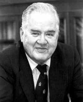
John Tukey, a famous statistician of the late 20th century, developed an alternative to the histogram to visualize the distribution of a quantitative variable called a **boxplot**.
```{r, echo=FALSE}
par(mar=c(5,4,4,1))
boxplot(dat$Score,ylim=c(270,310))
text(.8,median(dat$Score),'Median',pos=2,cex=.7)
text(1.2,quantile(dat$Score,c(.25,.75)),c('Q1','Q3'),pos=4,cex=.7)
segments(.7,quantile(dat$Score,.25)-1.57*IQR(dat$Score),1.3,quantile(dat$Score,.25)-1.57*IQR(dat$Score),lty=2)
segments(.7,quantile(dat$Score,.75)+1.57*IQR(dat$Score),1.3,quantile(dat$Score,.75)+1.57*IQR(dat$Score),lty=2)
text(1.2,quantile(dat$Score,c(.25,.75)),c('Q1','Q3'),pos=4,cex=.7)
text(1.3,quantile(dat$Score,c(.25,.75)) + c(-1.57,1.57)*IQR(dat$Score),c('Q1 - 1.5 IQR','Q3 + 1.5 IQR'),pos=4,cex=.7)
```
*Interesting fact: If the distribution is unimodal and symmetric, then the fences for the whiskers correspond to about $z = \pm 2.7$, which leaves about 1% of the points as outliers.*
#Hopkins Forest (2012 Data)
Since the boxplot is a simplified visualization of the distribution, it is very useful when you want to compare the distributions between groups (aka study the **relationship between a quantitative variable and a categorical variable**).
```{r}
forest <- read.table(url('http://sites.williams.edu/rdeveaux/files/2014/09/Hopkins.2012.txt'),header=TRUE)
with(forest,boxplot(Avg.Temp..F. ~ Month,names = month.name,cex.axis=.6,las=2,ylab='Average Temperatures (F)'))
```
**What do you learn?**
#Hopkins Forest (2012 Data)
In HW1, we introduced 3 ways of accessing variables in a data set. One was the the `data = ` format through the mosaic package.
- We also introduced the `y ~ x` syntax. Read as: `y` as a function of `x`.
- `mean(Weight~Height)` didn't make much sense because it calculates the mean weight for each possible height (only 2 people were 64 inches tall).
- `mean(Avg.Temp..F. ~ Month)` will make more sense because the `x` is a categorical variable.
```{r}
library(mosaic)
mean(Avg.Temp..F. ~ Month,data=forest)
favstats(Avg.Temp..F. ~ Month,data=forest)
```