-
Notifications
You must be signed in to change notification settings - Fork 2
Expand file tree
/
Copy pathLecture4Slides.Rmd
More file actions
248 lines (164 loc) · 7.1 KB
/
Copy pathLecture4Slides.Rmd
File metadata and controls
248 lines (164 loc) · 7.1 KB
1
2
3
4
5
6
7
8
9
10
11
12
13
14
15
16
17
18
19
20
21
22
23
24
25
26
27
28
29
30
31
32
33
34
35
36
37
38
39
40
41
42
43
44
45
46
47
48
49
50
51
52
53
54
55
56
57
58
59
60
61
62
63
64
65
66
67
68
69
70
71
72
73
74
75
76
77
78
79
80
81
82
83
84
85
86
87
88
89
90
91
92
93
94
95
96
97
98
99
100
101
102
103
104
105
106
107
108
109
110
111
112
113
114
115
116
117
118
119
120
121
122
123
124
125
126
127
128
129
130
131
132
133
134
135
136
137
138
139
140
141
142
143
144
145
146
147
148
149
150
151
152
153
154
155
156
157
158
159
160
161
162
163
164
165
166
167
168
169
170
171
172
173
174
175
176
177
178
179
180
181
182
183
184
185
186
187
188
189
190
191
192
193
194
195
196
197
198
199
200
201
202
203
204
205
206
207
208
209
210
211
212
213
214
215
216
217
218
219
220
221
222
223
224
225
226
227
228
229
230
231
232
233
234
235
236
237
238
239
240
241
242
243
244
245
246
247
248
---
title: "Stat 201 - Lecture 4"
author: "Prof. Heggeseth"
date: "September 22, 2015"
output: slidy_presentation
---
```{r global_options, include=FALSE}
knitr::opts_chunk$set(dev='png',fig.path='Figs/',echo=TRUE,message=FALSE, warning=FALSE,message=FALSE,tidy=TRUE,fig.width = 6,fig.height=6)
```
# Recap
## Numerical and Graphical Summaries
- One Categorical (frequency tables, bar plots)
- One Quantitative (histogram, boxplot, mean, median, sd, IQR, etc.)
- Two Categorical (contingency table, mosaic plot)
- Categorical and Quantitative (side-by-side boxplot, mean/sd/median/IQR within groups)
- Two Quantitative (TODAY!)
## Intro to Sampling Variability
- Simulating from Population (Babies census)
- Bootstrapping from Sample (Trump poll)
--------
# Normal Model
## Normal Curve
Unimodal and symmetric histograms often look like the Normal curve
$$f(x) = \frac{1}{\sqrt{2\pi}\sigma}e^{-\frac{1}{2\sigma^2}(x-\mu)^2}$$
where $\mu$ and $\sigma$ are parameters of this function that control the center and spread of the curve (corresponding to mean and sd).
```{r, echo=FALSE}
x = seq(-5,5,by=.01)
plot(x,dnorm(x),type='l',ylab='f(x)',ylim=c(0,.8),lwd=2)
lines(x,dnorm(x,mean=1,sd=1),col='red',lwd=2)
lines(x,dnorm(x,mean=1,sd=2),col='blue',lwd=2)
lines(x,dnorm(x,mean=0,sd=0.5),col='purple',lwd=2)
legend('topright',legend=c(expression(mu==0 ~','~ sigma==1),expression(mu==0~","~sigma==0.5),expression(mu==1~","~ sigma==1),expression(mu==1~","~sigma==2)),col=c('black','purple','red','blue'),lty=1,lwd=2)
```
--------
#Normal Q-Q plots
To check how close a histogram is to a Normal curve, we could use a Normal Quantile-Quantile plot (in addition to eye-balling the histogram).
```{r}
x = rnorm(100,mean=50,sd=10) #randomly generating data
qqnorm(x)
qqline(x)
```
Closer to the straight line, the closer to Normal curve.
## Construction (ignore axis labels)
- Y-value: variable value
- X-value: corresponding "z-score" if histogram was exactly Normal
**68-95-99.7 rule in action**
- "z-score" = -2: 2.5th percentile (95% in the middle)
- "z-score" = -1: 16th percentile (68% in the middle)
- "z-score" = 0: 50th percentile
- "z-score" = 1: 84th percentile (68% in the middle)
- "z-score" = 2: 97.5th percentile (95% in the middle)
## How to Interpret
- If points are ABOVE the line, they are greater (higher) than expected if it was Normal.
- If points are BELOW the line, they are less than expected if it was Normal.
**Match the Histogram with the Q-Q plot.**
```{r,echo=FALSE}
par(mfrow=c(3,2))
x = rnorm(100)
y = rbeta(100,1,5)
z = rbeta(100,5,1)
hist(x)
qqnorm(y)
qqline(y)
hist(y)
qqnorm(x)
qqline(x)
hist(z)
qqnorm(z)
qqline(z)
```
--------
#Summarizing and Displaying Two Quantitative Variables
```{r}
par(mfrow=c(1,1))
bodyfat <- read.delim("http://sites.williams.edu/rdeveaux/files/2014/09/bodyfat.txt")
bodyfat$Shirt = bodyfat$Neck/2.54 + 0.5
with(bodyfat,plot(Shirt~Weight))
#plot(bodyfat$Shirt~bodyfat$Weight)
#plot(x=bodyfat$Weight,y=bodyfat$Shirt)
```
What do we look for in a relationship between two quantitative variables?
* Direction (postive? negative? flat?)
* Form (linear? curved? nothing? other?)
* Strength
The relationship between *Weight* and *Shirt Size* is positive, linear, and quite strong.
I want to quantify the strength of the relationship...
--------
#Changing Units
Suppose instead of *Weight* in pounds and *Shirt Size* in inches,
I switched to metric and plotted *Weight* in kilograms and *Shirt Size* in cm.
**Would the strength change?**
```{r}
par(mfrow=c(1,2))
with(bodyfat,plot(Shirt~Weight,xlab="Wt (lbs)",ylab="Shirt (in)"))
with(bodyfat,plot(I(Shirt*2.54)~I(Weight/2.2),xlab="Wt (kg)",ylab="Shirt (cm)")) #I() allows us to do math in the y~x framework
with(bodyfat,plot(Shirt~Weight,xlab="Wt (lbs)",ylab="Shirt (in)",xlim=c(0,250),ylim=c(0,50)))
with(bodyfat,plot(I(Shirt*2.54)~I(Weight/2.2),xlab="Wt (kg)",ylab="Shirt (cm)",xlim=c(0,250),ylim=c(0,50)))
```
--------
#Standardizing
Since shifting and scaling make no difference, let's standardize both variables into z-scores and replot (and add some color):
```{r, echo=FALSE}
par(mfrow=c(1,1))
zShirt=with(bodyfat,scale(Shirt))
zWeight=with(bodyfat, scale(Weight))
plot(zShirt~zWeight,type="n")
abline(h=0)
abline(v=0)
points(zShirt[zWeight>0 & zShirt>0]~zWeight[zWeight>0 & zShirt>0],col="blue",pch=19)
points(zShirt[zWeight<0 & zShirt<0]~zWeight[zWeight<0 & zShirt<0],col="blue",pch=19)
points(zShirt[zWeight>0 & zShirt<0]~zWeight[zWeight>0 & zShirt<0],col="red",pch=19)
points(zShirt[zWeight<0 & zShirt>0]~zWeight[zWeight<0 & zShirt>0],col="red",pch=19)
```
**If we were to have a weaker positive relationship, how would this plot change?**
**If we were to have a negative relationship, how would this plot change?**
--------
#Make this Formal
We want one number to represent **strength** and **direction**.
- Points in the $1^{st}$ and $3^{rd}$ quadrants (blue) have the **same sign** (where both $z's$ are positive or both are negative).
- Points in the $2^{nd}$ and $4^{th}$ (red) have opposite signs.
**What if we took the product of the $z$-scores? What would the values look like?**
--------
#Correlation Coefficient
The almost *average* of products of the $z$-scores is the **correlation coefficient,**
$$ r = \frac{\sum z_x z_y}{n-1} $$
**Which points contribute the most to this average?**
##Calculation in R
```{r}
sum(zShirt*zWeight)/(length(zShirt)-1) #By formula
cor(zShirt,zWeight) #correlation function
```
--------
#Other expressions for r:
$$ r = \frac{\sum z_x z_y}{n-1} $$
$$ = \frac{\sum{\frac{(x_i-\bar{x})}{s_x}\frac{(y_i-\bar{y})}{s_y}}}{n-1}$$
$$= \frac{\sum{(x_i-\bar{x})(y_i-\bar{y})}}{(n-1) s_x s_y}$$
$$= \frac{\sum{(x_i-\bar{x})(y_i-\bar{y})}}{{(n-1)\sqrt{\sum{\frac{(x_i-\bar{x})^2}{n-1}}}}{\sqrt{\sum{\frac{(y_i-\bar{y})^2}{n-1}}}}}$$
$$=\frac{\sum{(x_i-\bar{x})(y_i-\bar{y})}}{{\sqrt{\sum{(x_i-\bar{x})^2}}}{\sqrt{\sum{(y_i-\bar{y})^2}}}}$$
$$=\frac{\sum{(x_i-\bar{x})(y_i-\bar{y})}}{{\sqrt{\sum{(x_i-\bar{x})^2\sum{(y_i-\bar{y})^2}}}}}$$
--------
#Properties of Correlation
* $-1 \leq r \leq 1$
* Sign of r goes with the direction of the relationship.
* r(x,y) = r(y,x), it doesn't matter which is x and which is y.
* r(ax+b, cy+d) = r(x,y) Change of scale (linear) don't affect r. Why? (look at original formula)
* r measures strength of *linear* relationship -- not curved
* one outlier can completely change r
--------
#Guess the Correlation
http://www.rossmanchance.com/applets/GuessCorrelation.html
--------
#Is correlation always the right way to judge strength?
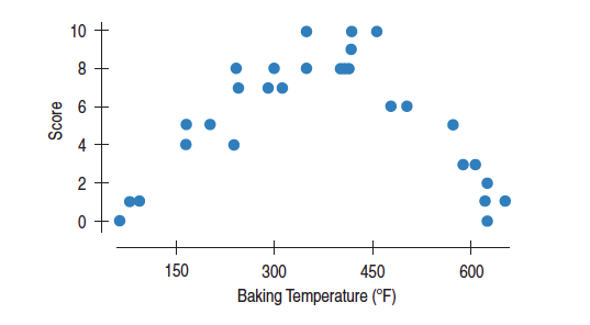
Here is the plot of brownie quality by temperature.
The correlation is near 0, but it doesn't mean that there's no relationship -- there's no **linear** relationship.
----------
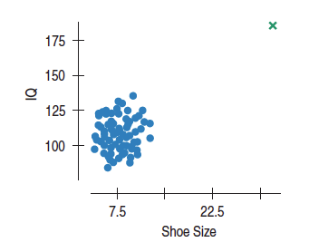
#Outliers !!
And be careful of outliers. One point can turn a near zero correlation large or a very high correlation can change sign with the addition of one outlying point:
----------
#Correlation and Causality
http://xkcd.com/552/
http://www.tylervigen.com/
http://io9.com/on-correlation-causation-and-the-real-cause-of-auti-1494972271