- Basics :
<title>My awesome website</title>
<meta charset="utf-8" />
<meta name="viewport" content="width=device-width, initial-scale=1">
<meta http-equiv="X-UA-Compatible" content="IE=edge"/>-
Do not block rendering by using external libs before the end of body: avoid declaring bootstrap / libs in the head tag. Or use defer methods.
-
prepare the browser to go somewhere else :
<link rel="dns-prefetch preconnect" href="https://cdnjs.cloudflare.com/" crossorigin="anonymous"/>- for web apps :
<meta name="application-name" content="My app">
<meta name="theme-color" content="#5ad08b" />
<meta name="apple-mobile-web-app-status-bar-style" content="#5ad08b">
<meta name="rating" content="General">- favicons; use sizes : 64,128,256,512 square
- Declare external lib and execute javascript in the footer right before the
</body> - Do you REALLY need jquery ?
-
Ask only for stuff you really, REALLY need: Keep forms short. Avoid asking for data that isn’t necessary at the moment—you can always gather that later. The shorter your form is, the more likely people are actually going to fill it out.
-
Explain why you are asking for sensitive data: If you need to ask for some sort of sensitive data that folks might hesitate to share, explain why you are asking for it. Build trust by being transparent about how and why you are going to use this data.
-
Label fields that are optional: If your form contains some optional textfields, mark them with an “Optional” label instead of placing an asterisk next to them. People generally don’t like asterisks in forms because they remind them of signing complicated contracts and hidden statements.
-
Group components and list them in logical order: Make it easier to quickly scan your form by inserting a heading on top of the grouped components. Try to follow familiar patterns that people already know from different, common situations.
-
Don’t use an additional textfield asking users to confirm their password: Instead of making people type their password twice, allow them to peek at it. Even if they don’t and misspell their password at first, they’ll always have a chance (or at least they should) to change it later on.
-
Show form progress: If your form is rather long, it’s important to show progress so people know where they are and how much of the form is left to complete. This can be done with a simple progress bar or by dividing your form into shorter steps. As long as it gives hope that the end is near, it does the job well.
-
Save progress: Just as important as showing progress, is actively saving it while the form is being filled. There is no worse scenario than a solid amount of time spent on a form then a lost connection resulting in all of the input data to disappear.
-
Use icons and images when possible: If you’re asking for something strictly connected with images, besides describing it, show the image as well.
-
Suggest answers: If your form is open and people are asked to type in different answers that in general are common as Skills or Tags used on Dribbble, suggest answers from your database as they are typed in.
-
Leave enter/return alone: This key on the keyboard has a very well known role. Don’t make it send the form immediately, especially when it’s long and consists of a couple of text areas. Let the enter be an enter and navigate the cursor to a new line.
-
Show what went wrong, and remember color is not everything: If there are some validation issues, show what went wrong. That doesn’t mean simply using the color red as an indicator. A nice description ideally supported with advice on how to make things right would be useful as well. You can also try applying a shake animation to poorly filled fields.
-
Let people know what went right: A simple message that the form was successfully sent to your server is pure gold. No more guessing whether it went through or if some problem occurred during the process.
-
Don't use placeholder text.
-
Don't use disabled form fields and buttons, whenever possible.
-
Don't make multi-column forms.
-
Do make sure labels and instructions are always visible.
-
Do put your labels and instructions above text fields.
-
Do make sure your labels, inputs, and any help text are associated properly.
-
Do make sure all text meets WCAG colour contrast requirements.
### Textfields
- Pick a familiar look: Use one of the two most recognizable textfield shapes: a well-known rectangle or a simple line (made popular by Google’s Material Design). Suggest the expected length of an input by its size.
- Describe what you need: Use labels to tell what input is expected. Make sure they are always visible so your form is easy to scan even when it’s filled. Place labels on top of the textfields or as a placeholder that transforms into a floating label while typing. Avoid putting labels on the left or right side of a textfield as it will create a mess once your form starts growing.
### Dropdowns
-
Sort dropdown lists alphabetically: Sort answers in alphabetical order to help people find the answer they are looking for quickly.
-
Place suggested answers on top: If you are sure one (or more) of the answers from the list will be chosen by most people (e.g. based on their current location), put this answer at the top of the dropdown and separate it from the others with a subtle divider.
### Buttons
- Describe what the action button does: The word “Submit” doesn’t say it all. Make sure the text within your button is as simple and clear as possible. If it’s being used to add products to a shopping cart, label it, “Add to cart”. If it functions to remove unwanted products, label it, “Remove”. Try to describe the action that happens after clicking as concretely as you can.
- Use different styles to drive attention: Use colors to suggest whether your button is facilitating a positive or negative action. Different styles can also suggest which action is primary and secondary.
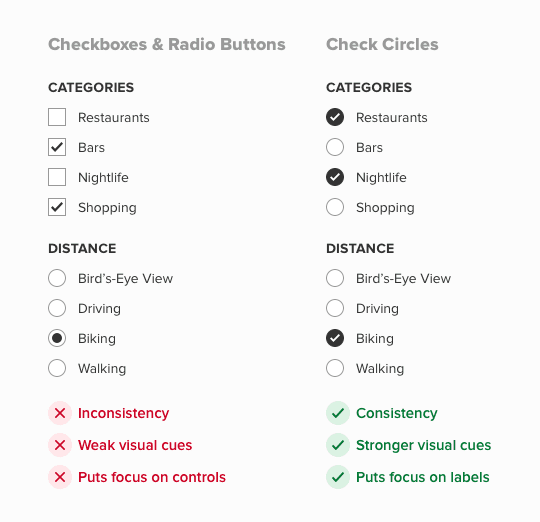
- use check circles for boths
- use singular / plurial

Use right-aligned monospace numeric values for statistical data
