BottomNavigationBar
底部导航条,可以很容易地在tap之间切换和浏览顶级视图,通常在3~5个 tap 间切换。

底部导航条有文本、图标组成,通常和 Scaffold 一起使用;
先看一个例子:
目录结构
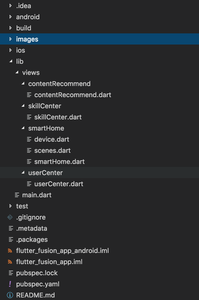
把不同tab 对应的视图分别放在各自的页面中,在 main.dart 文件中引入;
main.dart 页面代码:
import 'package:flutter/material.dart';
// 页面结构调试渲染模式
import 'package:flutter/rendering.dart';
// 引入视图
import './views/smartHome/smartHome.dart';
import './views/skillCenter/skillCenter.dart';
import './views/contentRecommend/contentRecommend.dart';
import './views/userCenter/userCenter.dart';

void main() {
  // debugPaintSizeEnabled = true; // 打开页面结构调试渲染模式
  runApp(MyApp());
}

class MyApp extends StatelessWidget {
  // This widget is the root of your application.
  @override
  Widget build(BuildContext context) {
    return MaterialApp(
      title: '融合 APP',
      theme: ThemeData(
        canvasColor: Color.fromRGBO(35, 38, 66, 1.0),
        primaryColor: Color.fromRGBO(35, 38, 66, 1.0), // appBar 会采用这个值为默认颜色
      ),
      home: MyHomePage(),
    );
  }
}
class MyHomePage extends StatefulWidget {
  @override
  _MyHomePageState createState() => _MyHomePageState();
}

class _MyHomePageState extends State<MyHomePage> {
  int _selectedIndex = 0;
    // item 对应的视图
  final _widgetOptions = <Widget>[
    new SmartHome(),
    new SkillCenter(),
    new ContentRecommend(),
    new UserCenter()
  ];

  final _labelStyle = TextStyle(
      color: Colors.white30
    );

  @override
  Widget build(BuildContext context) {
    return Scaffold(
        body: Container(
          child: _widgetOptions.elementAt(_selectedIndex)
        ),
        bottomNavigationBar: Material(
          // color: Color.fromRGBO(35, 38, 66, 1.0), // 无效
          // type: MaterialType.canvas, // 无效
          child: new BottomNavigationBar(
            items: <BottomNavigationBarItem>[
              BottomNavigationBarItem(
                // 图片颜色和文本标签颜色需要单独设置
                  icon: Icon(Icons.home, color: Colors.white30), title: Text("智能家居", style:  _labelStyle)),
              BottomNavigationBarItem(
                  icon: Icon(Icons.cake, color: Colors.white30), title: Text("技能中心", style: _labelStyle)),
              BottomNavigationBarItem(
                  icon: Icon(Icons.beach_access, color: Colors.white30), title: Text("内容推荐", style: _labelStyle)),
              BottomNavigationBarItem(
                  icon: Icon(Icons.kitchen, color: Colors.white30), title: Text("我的", style: _labelStyle))
            ],
            type: BottomNavigationBarType.fixed,
            fixedColor: Colors.blue,
            currentIndex: _selectedIndex,
            onTap: _onItemTapped,
            iconSize: 26.0,
          ),
        ));
  }

  void _onItemTapped(int index) {
    setState(() {
      _selectedIndex = index;
    });
  }
}
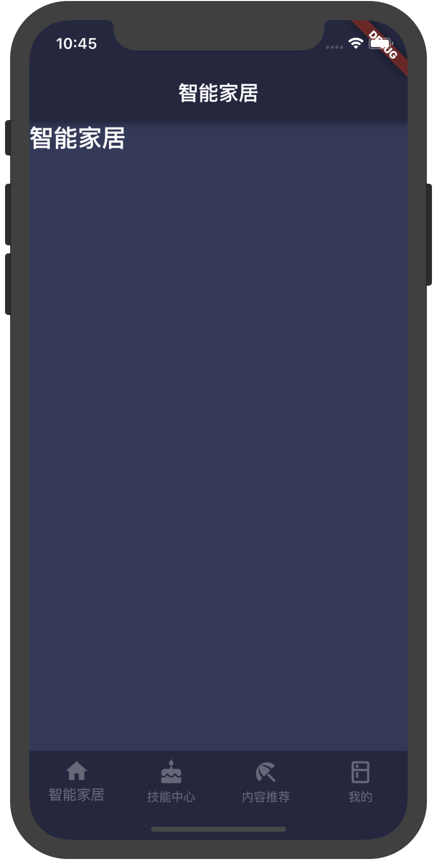
效果:
构造函数:
BottomNavigationBar({Key key, @required List<BottomNavigationBarItem> items, ValueChanged<int> onTap, int currentIndex: 0, BottomNavigationBarType type, Color fixedColor, double iconSize: 24.0 })
属性:
- items:
List<BottomNavigationBarItem> 一个BottomNavigationBarItem widget列表;
- currentIndex: `int``. 当前展示的 view 的索引;
- type:
BottomNavigationBarType.fixed 和BottomNavigationBarType.shifting两个值,控制底部导航的样式。
-
没有显示的设置此值时,默认值根据底部 tab 的个数自动设置。底部 tab 少于四个(不包括四个)时,默认值为BottomNavigationBarType.fixed,否则默认值为BottomNavigationBarType.shifting
-
BottomNavigationBarType.fixed:
- BottomNavigationBar的BottomNavigationBarItem具有固定的宽度,始终显示其文本标签,并且在点击时不会移位。
- 底部导航条的背景颜色默认为不透明的白色,如果设置了ThemeData.canvasColor则与ThemeData.canvasColor颜色值一致。
- BottomNavigationBarItem中设置 backgroundColor 失效。
- 选中的BottomNavigationBarItem的颜色为设置的 fixedColor 颜色,如果没有设置fixedColor属性,则与 ThemeData.primaryColor 颜色一致。
-
BottomNavigationBarType.shifting:
- BottomNavigationBar的BottomNavigationBarItem有位置和大小动画,并在点击时标注淡入淡出。只有选定的项目显示其文本标签。
- 底部导航条的背景颜色默认为白色,可以在BottomNavigationBarItem的backgroundColor属性中设置每个 item 的背景颜色值。底部导航条的背景色与当前选中的 item 的背景色一致,ThemeData.canvasColor在底部导航条的颜色失效。
- fixColor:
Color。当type值为 BottomNavigationBarType.fixed时,设置选中 item 的颜色。 我测试中没什么效果,不知道为什么。
- onTap:BottomNavigationBarItem 被点击时的回调
- iconSize:
double,图标的大小
BottomNavigationBarType.shifting时代码:
import 'package:flutter/material.dart';
import 'package:flutter/rendering.dart';

import './views/smartHome/smartHome.dart';
import './views/skillCenter/skillCenter.dart';
import './views/contentRecommend/contentRecommend.dart';
import './views/userCenter/userCenter.dart';

void main() {
  // debugPaintSizeEnabled = true;
  runApp(MyApp());
}

class MyApp extends StatelessWidget {
  // This widget is the root of your application.
  @override
  Widget build(BuildContext context) {
    return MaterialApp(
      title: '融合 APP',
      theme: ThemeData(
        canvasColor: Color.fromRGBO(35, 38, 66, 1.0),
        primaryColor: Color.fromRGBO(35, 38, 66, 1.0),
      ),
      home: MyHomePage(),
    );
  }
}

class MyHomePage extends StatefulWidget {
  @override
  _MyHomePageState createState() => _MyHomePageState();
}

class _MyHomePageState extends State<MyHomePage> {
  int _selectedIndex = 0;
  final _widgetOptions = <Widget>[
    new SmartHome(),
    new SkillCenter(),
    new ContentRecommend(),
    new UserCenter()
  ];

  final _labelStyle = TextStyle(
      color: Colors.white30
    );

  @override
  Widget build(BuildContext context) {
    return Scaffold(
        body: Container(
          child: _widgetOptions.elementAt(_selectedIndex)
        ),
        bottomNavigationBar: Material(
          // color: Color.fromRGBO(35, 38, 66, 1.0),
          // type: MaterialType.canvas,
          child: new BottomNavigationBar(
            items: <BottomNavigationBarItem>[
              BottomNavigationBarItem(
                  icon: Icon(Icons.home, color: Colors.white30), title: Text("智能家居", style:  _labelStyle), backgroundColor: Colors.blueGrey),
              BottomNavigationBarItem(
                  icon: Icon(Icons.cake, color: Colors.white30), title: Text("技能中心", style: _labelStyle), backgroundColor: Colors.blue),
              BottomNavigationBarItem(
                  icon: Icon(Icons.beach_access, color: Colors.white30), title: Text("内容推荐", style: _labelStyle), backgroundColor: Colors.purple),
              BottomNavigationBarItem(
                  icon: Icon(Icons.kitchen, color: Colors.white30), title: Text("我的", style: _labelStyle), backgroundColor: Colors.orangeAccent)
            ],
            type: BottomNavigationBarType.shifting,
            // fixedColor: Colors.blue,
            currentIndex: _selectedIndex,
            onTap: _onItemTapped,
            iconSize: 26.0,
          ),
        ));
  }

  void _onItemTapped(int index) {
    setState(() {
      _selectedIndex = index;
    });
  }
}
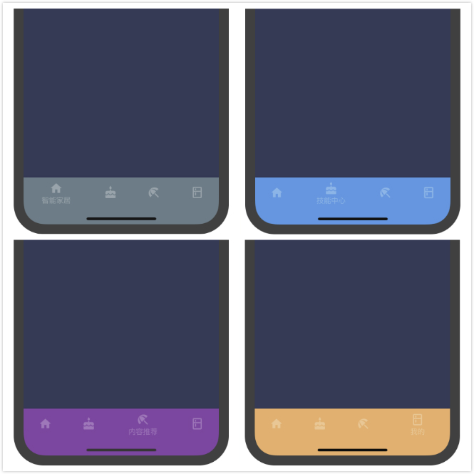
效果如图:
BottomNavigationBarItem
构造函数
BottomNavigationBarItem({@required Widget icon, Widget title, Widget activeIcon, Color backgroundColor })
BottomNavigationBar

底部导航条,可以很容易地在tap之间切换和浏览顶级视图,通常在3~5个 tap 间切换。
底部导航条有文本、图标组成,通常和 Scaffold 一起使用;
先看一个例子:

目录结构
把不同tab 对应的视图分别放在各自的页面中,在 main.dart 文件中引入;
main.dart 页面代码:
效果:

构造函数:
BottomNavigationBar({Key key, @required List<BottomNavigationBarItem> items, ValueChanged<int> onTap, int currentIndex: 0, BottomNavigationBarType type, Color fixedColor, double iconSize: 24.0 })属性:
List<BottomNavigationBarItem>一个BottomNavigationBarItemwidget列表;BottomNavigationBarType.fixed和BottomNavigationBarType.shifting两个值,控制底部导航的样式。没有显示的设置此值时,默认值根据底部 tab 的个数自动设置。底部 tab 少于四个(不包括四个)时,默认值为
BottomNavigationBarType.fixed,否则默认值为BottomNavigationBarType.shiftingBottomNavigationBarType.fixed:- BottomNavigationBar的BottomNavigationBarItem具有固定的宽度,始终显示其文本标签,并且在点击时不会移位。
- 底部导航条的背景颜色默认为不透明的白色,如果设置了
ThemeData.canvasColor则与ThemeData.canvasColor颜色值一致。- BottomNavigationBarItem中设置 backgroundColor 失效。
- 选中的BottomNavigationBarItem的颜色为设置的 fixedColor 颜色,如果没有设置fixedColor属性,则与
ThemeData.primaryColor颜色一致。BottomNavigationBarType.shifting:- BottomNavigationBar的BottomNavigationBarItem有位置和大小动画,并在点击时标注淡入淡出。只有选定的项目显示其文本标签。
- 底部导航条的背景颜色默认为白色,可以在BottomNavigationBarItem的backgroundColor属性中设置每个 item 的背景颜色值。底部导航条的背景色与当前选中的 item 的背景色一致,
ThemeData.canvasColor在底部导航条的颜色失效。Color。当type值为BottomNavigationBarType.fixed时,设置选中 item 的颜色。 我测试中没什么效果,不知道为什么。double,图标的大小BottomNavigationBarType.shifting时代码:
效果如图:

BottomNavigationBarItem
构造函数
BottomNavigationBarItem({@required Widget icon, Widget title, Widget activeIcon, Color backgroundColor })