
A website that provides information on sensory play and advice on sensory play activities as well as specific advice on how sensory play helps children cope with anxiety. Professionals can refer parents to use the site to assist with at home sensory play.
 Click Here to access the site.

I have established that my primary user is a parent of young children / a young child.
My secondary users would be Teachers, PSAs or Occupational Therapists referring parents to the website for support.

- Primary User
- I would like to learn about sensory play in a concise way.
- I would like to find sensory play activities that engage both of my children.
- Information and creative activities that directly address anxiety.
- I need a site that is straight forward and easy for me to use at home.
- Any feedback and recommendations would be useful.
- A way to contact the site owner to ask questions, provide feedback and recommendations.
- Secondary User One
- Easy to utilise resource, can be used by any parent or teacher.
- Somewhere I can refer parents to to help their child at home.
- New ways for parents to include daily activities that engage all five senses; sight, sound, smell, touch and taste.
- Straight forward and affordable activities that can engage multiple children at a time.
- An easy way to hear from other teachers and parents to learn from each other.
- Secondary User Two
- A clear direct and educational website educating and advising parents on sensual play.
- Ability for parents to ask questions.
- Secondary User Three
- Easy to understand explanation of sensory play.
- Straight forward and simple activities are a must.
- A resource which is intuitive as well as engaging.
I have taken some time to answer the following high-level strategic questions:
-
Is the content culturally appropriate?
The content needs to be aimed at an English speaking, everyday parent. This is not an academic article or a technically complicated site, it needs to be simple, user friendly and written in easy to understand language.
-
Is the content relevant?
A parent would like to see the following with regards to content:
- Easy to understand and to the point. They are not looking for an
academic article, rather a straight forward explanation as to what
sensory play is and how it can be utilised. - Visually pleasing but not overwhelming.
- Simple and intuitive navigation.
- Activities that are cost effective and easy to complete at home.
- Images and videos that they can watch and engage with to reinforce learning and understanding.
- Able to hear form other parents and teachers regarding their experience using the site as well as their feedback on sensory play.
- Able to engage and provide own feedback.
- For the secondary personas it is important to know that the content is reliable and easy to understand.
- Can we track and catalogue the content in an intuitive way?
- The content needs to be easily accessible. The website should be readable on any device in particular a mobile phone as many people don't have access to a desktop or a laptop.
- As a parent progresses through the site, it is important that questions are answered according to priority:
- What is sensory play?
- Why is it beneficial?
- What can I do with my child?
- How does it help with anxiety?
- What are others saying?
- Where can I engage to ask questions and provide feedback?
-
Is the technology appropriate?
The site is written in HTML and CSS which is more than adequate to create an informative and engaging website. The target audience, parents, will be able to access the website across all devices and the screen would render accordingly.
- Create a well thought-out and user friendly website.
- All content to be concise and easy to understand.
- The purpose of the website is to help parents.
- To be utilised by schools and occupational therapists to refer parents to for at home support.
The value lies in providing the content in an easy to use way to allow the parent to understand the concept and activities as quickly as possible and to be able to implement the learning at home with their child. How easy they find it to learn and whether they see the implemented learnings helping their child will determine how valuable they will deem the site to be. The more success that schools and Occupational Therapists see through referring the parents to the website, the greater the use of the site will be.
There are multiple sites available on sensory play and sensory play activities.
What makes this site special:
- The consistency and simplicity of the pages. Other sites have too much information and it is overwhelming.
- The flow of information as you browse through the site. Easy and intuitive navigation and the content leads on from one section to the next. Other sites have too many tabs and too much noise. It becomes easy to disengage.
- Consistent layout, colours, visual aids and messaging. The different pages speak to each other, reinforce the overall feel of the site whilst engaging the user.
- The way the site is packaged really determines whether the user's experience will be positive or negative.
Using the trade-off process to rank the importance and feasibility of the opportunities I have decided:
- To go ahead with 4/5 of the opportunities.
- For the parent "chat" section, I will change the "chat" feature to a simple site page that provides other parents feedback and recommendations for the first release of the site.
- The opportunity to unpack the "chat" opportunity and scale it will be a future consideration.

The below storyboard represents a high-level interpretation of the ideal user experience when a parent utilises the website:

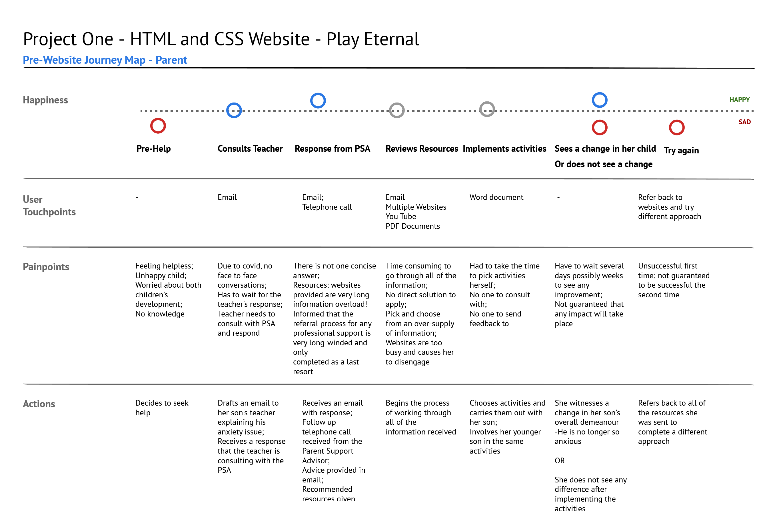
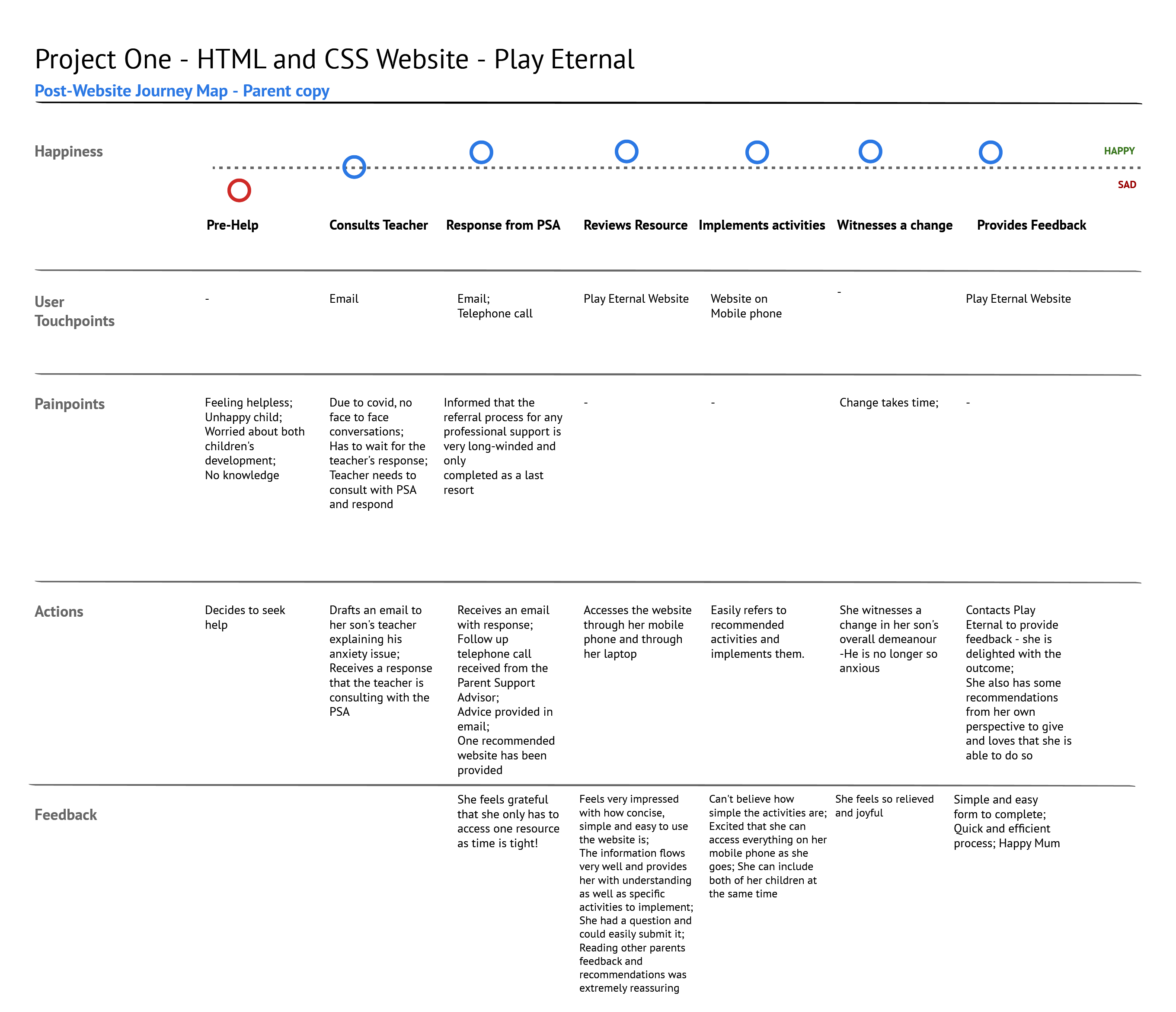
The following journey maps represent the user experience:
For the primary user - parents, to provide them with a user-friendly solution to understand and implement sensory play at home without the need to go through mass amounts of information. A reliable website that can be utilised by schools and occupational therapists to advise parents on sensory play and at home activities.
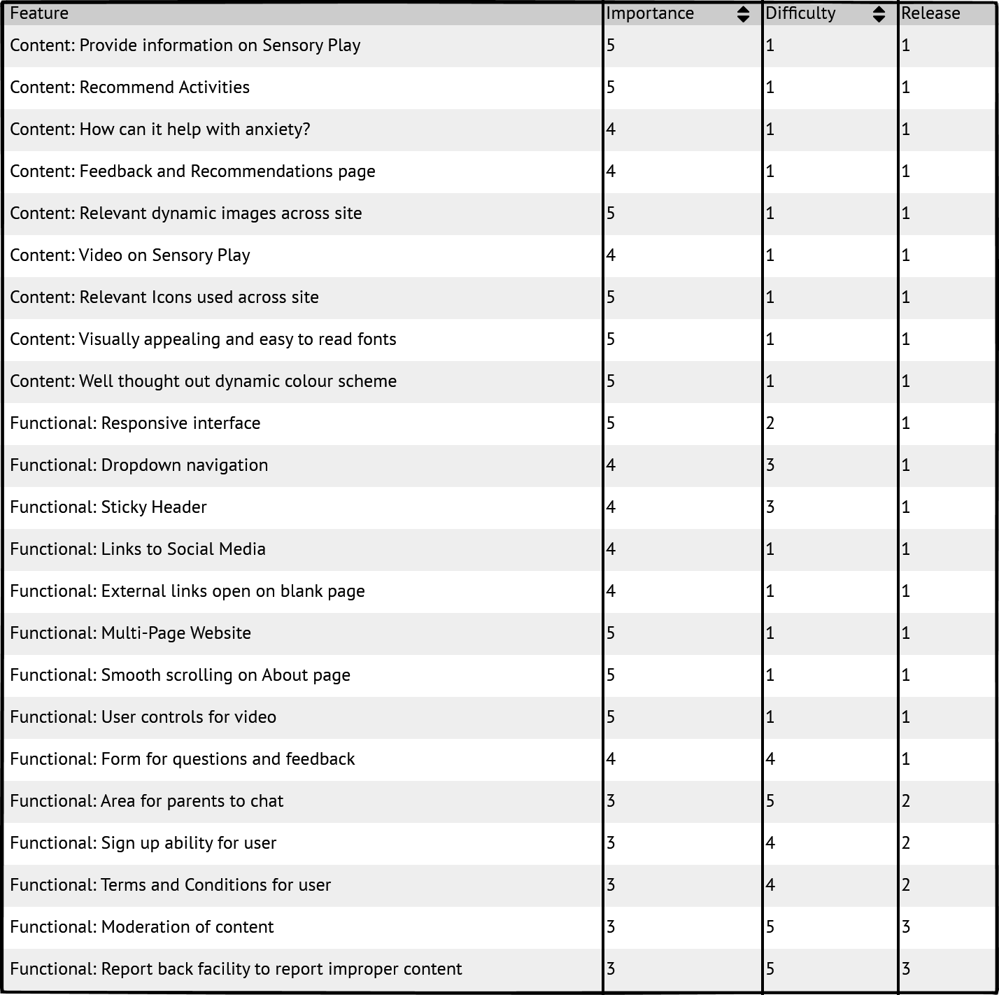
This site will be developed as a minimum viable product. Future releases could include additional functionality depending on the success of the first release. Additional to the table above, there is a potential selling opportunity to sell subscriptions to utilise the site to school boards and practices which again would depend on the performance of the initial site.
- Responsive interface
- Dropdown navigation
- Sticky header
- Links to social media
- External links open on blank page
- Multi-page website
- Smooth scrolling on About page
- User controls for video
- Form for questions and feedback
- Provide information on sensory play
- Recommend activities
- How can it help with anxiety?
- Feedback and recommendations page
- Relevant dynamic images across site
- Video on sensory play
- Relevant icons used across site
- Visually appealing and easy to read fonts
- Well thought out dynamic colour scheme
- Skill - Developer is learning HTML and CSS which affects her efficiency and ability. This is also her first time developing a website
- Time - limited time to complete and deliver the site
Development conventions and best practice have been applied as far as possible to ensure that user expectations are met. The breakdown of the structure is available further down in this document within the features section.

- Home Page
- What is Sensory Play and Play in Motion
- Sensory Play Activities
- Sensory Play and Anxiety
- Hear From Each Other
- Get in Touch
- Home Page
- What is Sensory Play and Play in Motion
- Sensory Play Activities
- Sensory Play and Anxiety
- Hear from Each Other
- Get in Touch
I chose the following colour palette because the pastel colours are soothing and calm, it allowed me to create a clean look and feel whilst still injecting a bit of fun - always essential when it comes to children.

I felt it was necessary to keep the pages clean and simple to prevent the user from feeling overwhelmed and disoriented. All images were chosen specifically for the sections they were added to and where possible they were set as square with the same border. The background colours were repeated across all pages. The font was set as default Itim Regular for headings and Montserrat for text, with Sans serif as a backup for both. It was important to create a fluid feeling across the site pages to provide continuity.
- Home Page
- What is Sensory Play and Play in Motion
- Sensory Play Activities
- Sensory Play and Anxiety
- Hear From Each Other
- Get In Touch
- The Home Page logo - Play Eternal - the icon utilised was chosen from Font Awesome and is not a child in a square as per the mock up.
- In the navigation bar - Contact Us was renamed Get In Touch for consistency with the page title.
- A sub-navigation menu for the All About Sensory Play page was included instead of featuring a second navigation on the page directly. This provides a more consistent navigation approach instead of creating an additional menu.
- The Learn More button colour was changed from orange to teal as visually it looked more appealing. The arrow icon was removed to keep the look clean and simple and to align with the look of the submit button.
- The All About Sensory Play page - the icons used are from Font Awesome and slightly different to those shown in the mock up.
- Originally it was planned to have a transparency applied to the colour background boxes, however it made the content more difficult to read and did not work as well as a solid background so this was changed.
- The tooltip was included on the help with anxiety page which was not in the mock up.
- The Hear From Each Other background colours are once again not transparent.
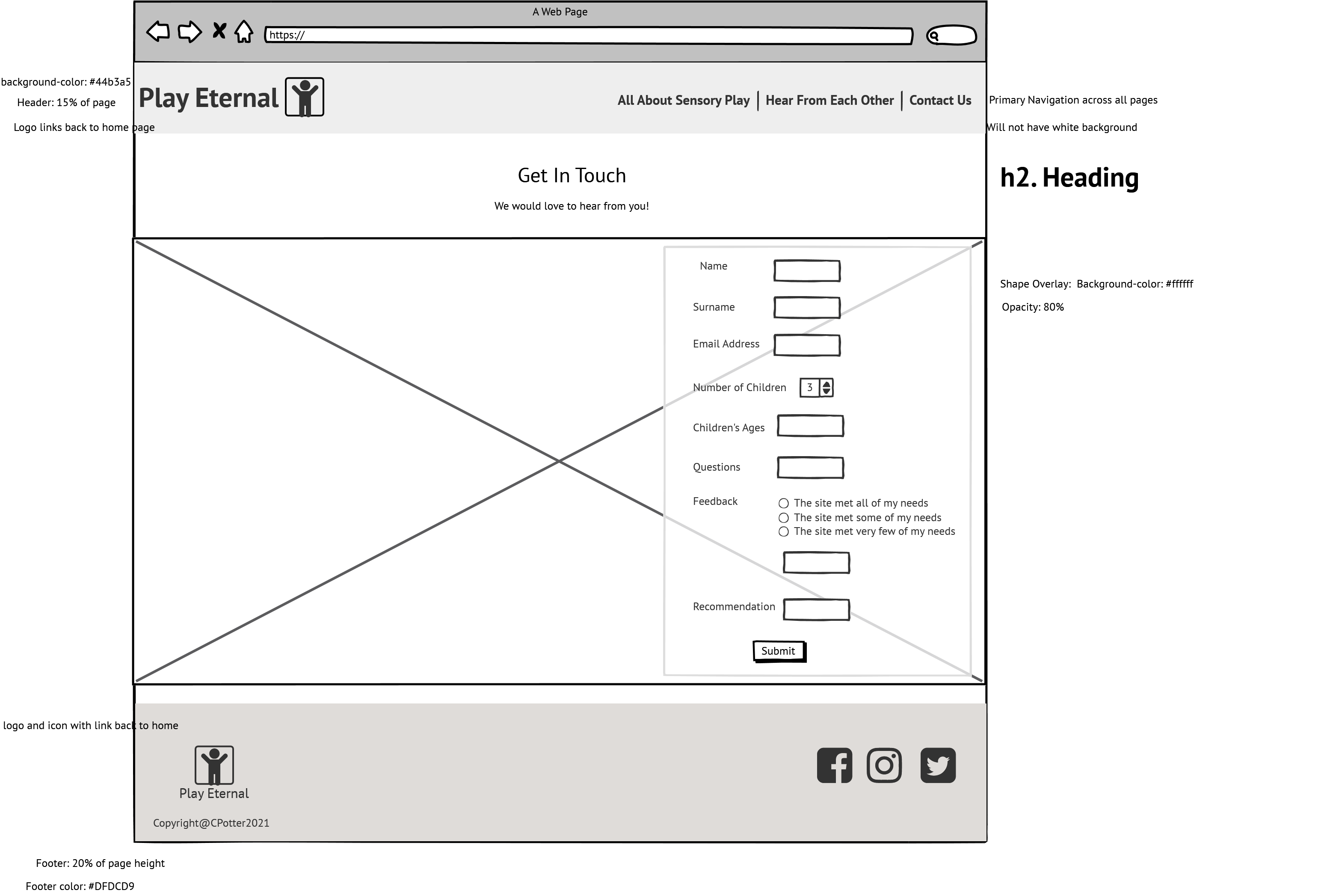
- The number of children question was removed from the form on the Get In Touch page, as a user would provide the children's ages in the question below and number of children can be deduced from there.
- The hover font colour for the navigation menu was changed from white to black for accessibility reasons.
- The green background colour was changed to a lighter version for accessibility reasons.
- The senses headers were changed from coloured-font to grey font for accessibility reasons.
- The footer layout has changed to be centered.
The following languages were used to create the website:
- HTML
- CSS
- JavaScript
Other technologies:
- Balsamiq Wireframes
- To create the personas, journey maps, storyboard wireframes and mock ups.
- Gitpod
- Platform used to develop and test site.
- Github
- Platform used to host repository and deployed site.
- Google Fonts
- Used for typography
- Font Awesome
- Used for Icons
- Squoosh Editor
- Used to resize images
- Free Formatter
- Used to format html and css code.
- StackEdit
- Used to edit Markdown
- Markdown Monster
- Used to edit Markdown
The Play Eternal site consists of the following Features:
 The Header is consistent across all four site pages. It contains the site logo and the navigation bar. Its display setting is flex and the flex-direction is set as row. For ease of use the Header has been fixed and made sticky across all pages so that as the user scrolls, the navigation is still available. To ensure that the site is responsive the flex-direction is changed to column for smaller screen widths.
- Header Logo

-
The logo is created using the Itim font from Google fonts with the letter spacing set at 3px and the hand holding heart icon from Font Awesome.
-
Navigation Bar

- The navigation bar is identical across all four pages to allow for easy navigation.
- The bar includes the following:
- The active page is highlighted with a different font colour and background colour. Font colour has been changed to black for accessibility reasons.

- The All About Sensory Play includes a drop-down menu to the separate page sections as this is the longest page with the most content.

- The navigation provides the user with the ability to navigate across all pages with ease.

The footer section is fixed to the bottom of the page and it includes a logo and social media icons. It is consistent across all four site pages.
- Footer Logo

-
The logo is a smaller version of the Header logo. Underneath the logo the social media icons and the page copyright are included. It includes a link back to the home page as this is common for websites to do.
-
Social Media Icons

- The Social Media Icons are grouped together and included after the footer logo. - The Icons contain links to Facebook, Instagram and Twitter and the social media sites will open on individual pages so they do not take the user away from our site. - They provide the user with an easy way to connect to Play Eternal's social media sites to be able to interact socially.

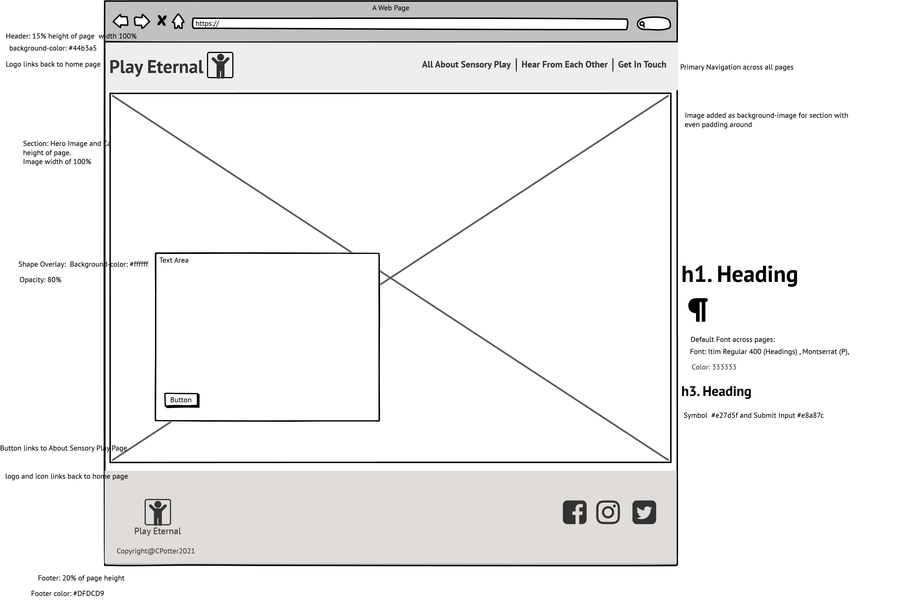
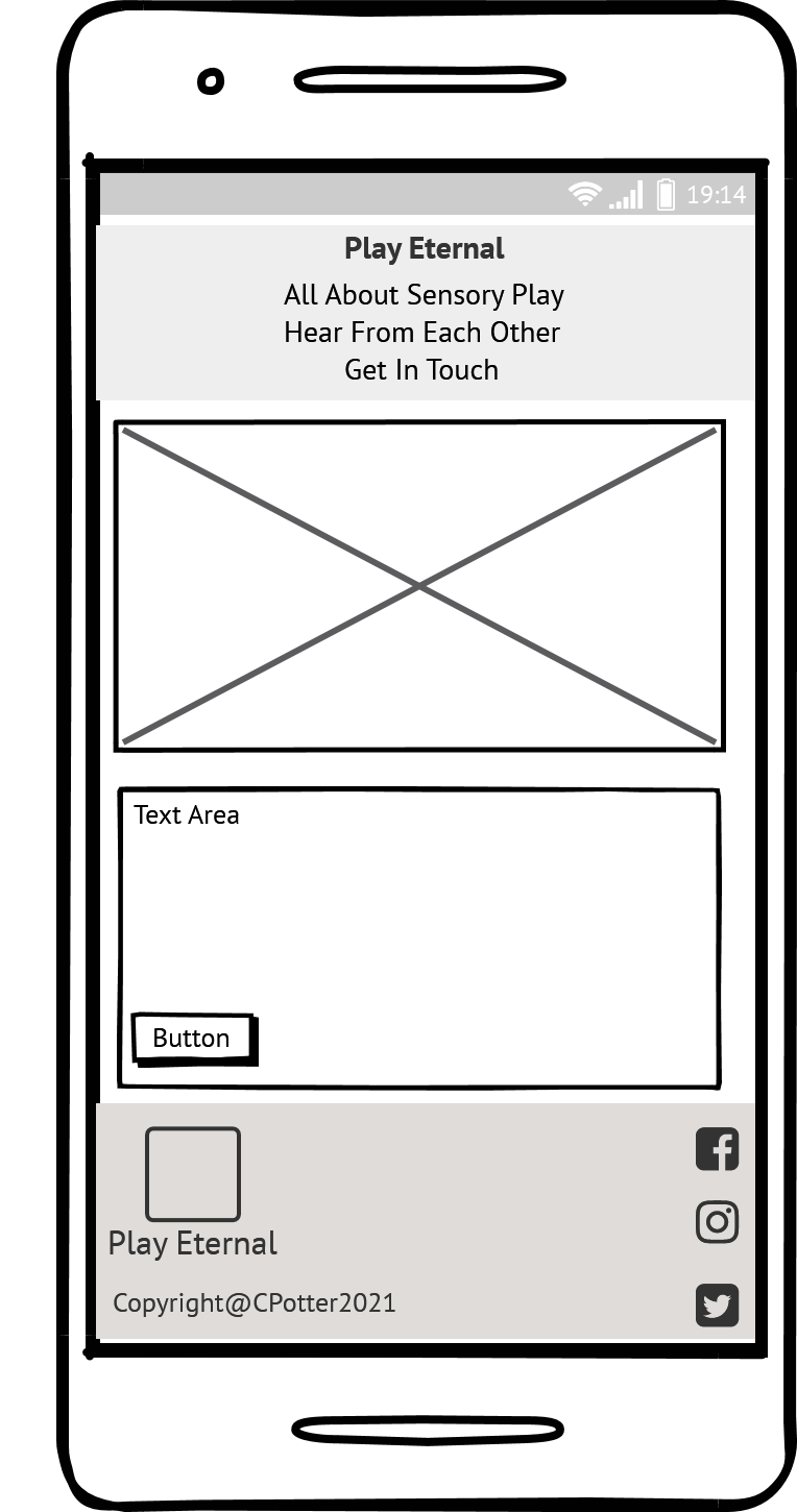
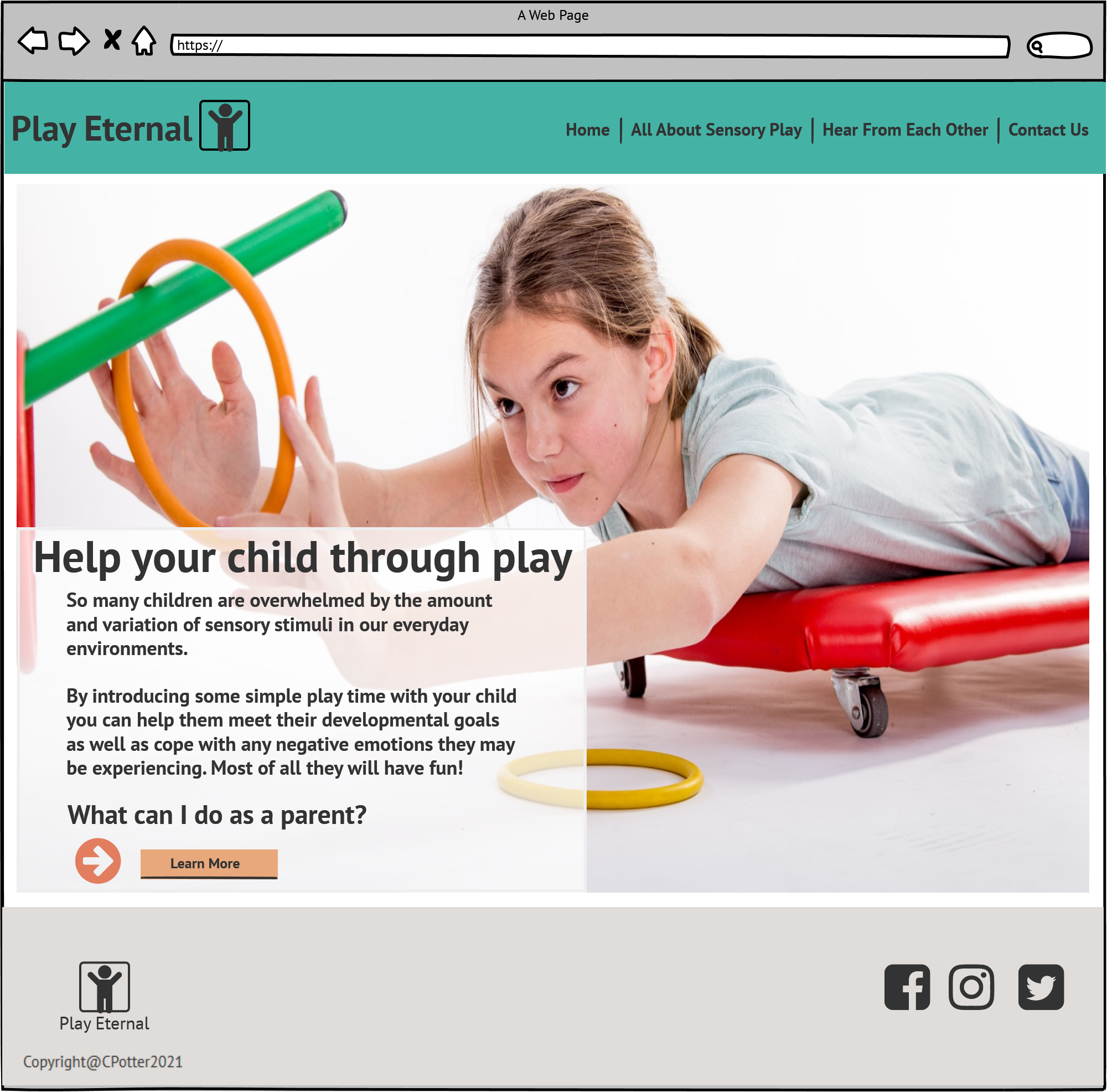
The Home Page has been created to include a Hero Image with a text box overlay. It has been kept simple with limited information, to create an invitation to the user to explore the rest of the site. It is like the cover of a book - inviting the user in to read/explore further.
-
The landing page image

-
The landing page image is a background image which is a photograph of a little girl playing with a hoop. The colours makes sense with the site colour scheme. The text area has been placed so that the little girl is looking directly at it, leading the user to read the information. The area is responsive and will resize. When the screen width is smaller, the image is replaced with a smaller image of a boy playing so that it fits and is clearly visible.



- The Text Area

-
The text area contains a call to action to parents, as our primary user, it provides description as to why they would need sensory play for their child and it then invites them to follow the learn more button to learn how to help their child. By utilising a call to action it entices the user to click to access the next page.
-
The Learn More Link

- The learn more link will take the user to the All About Sensory Play page. It is formatted to stand out within the text area and includes a shadow when the user hovers over it to provide the feeling of pushing a button.

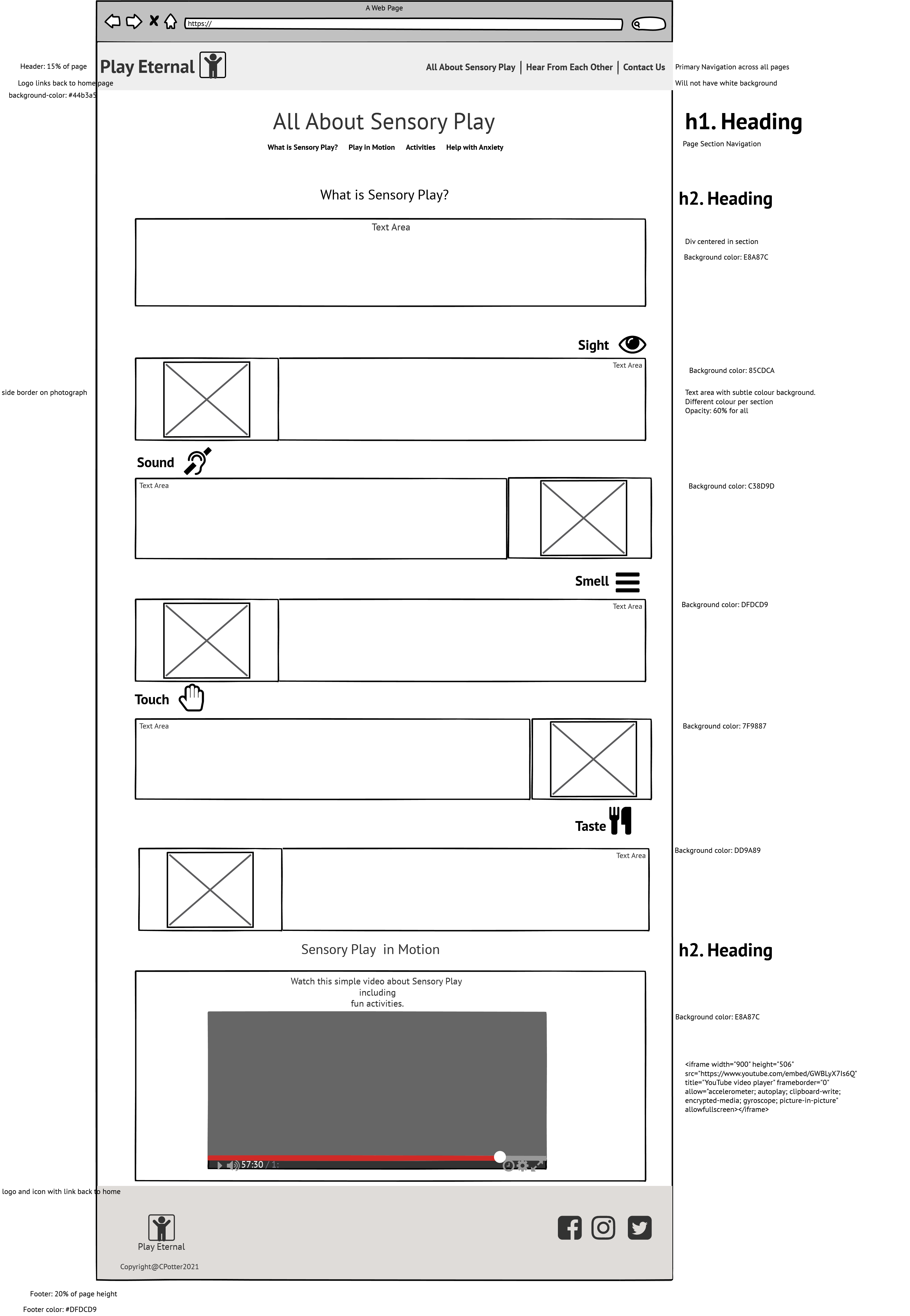
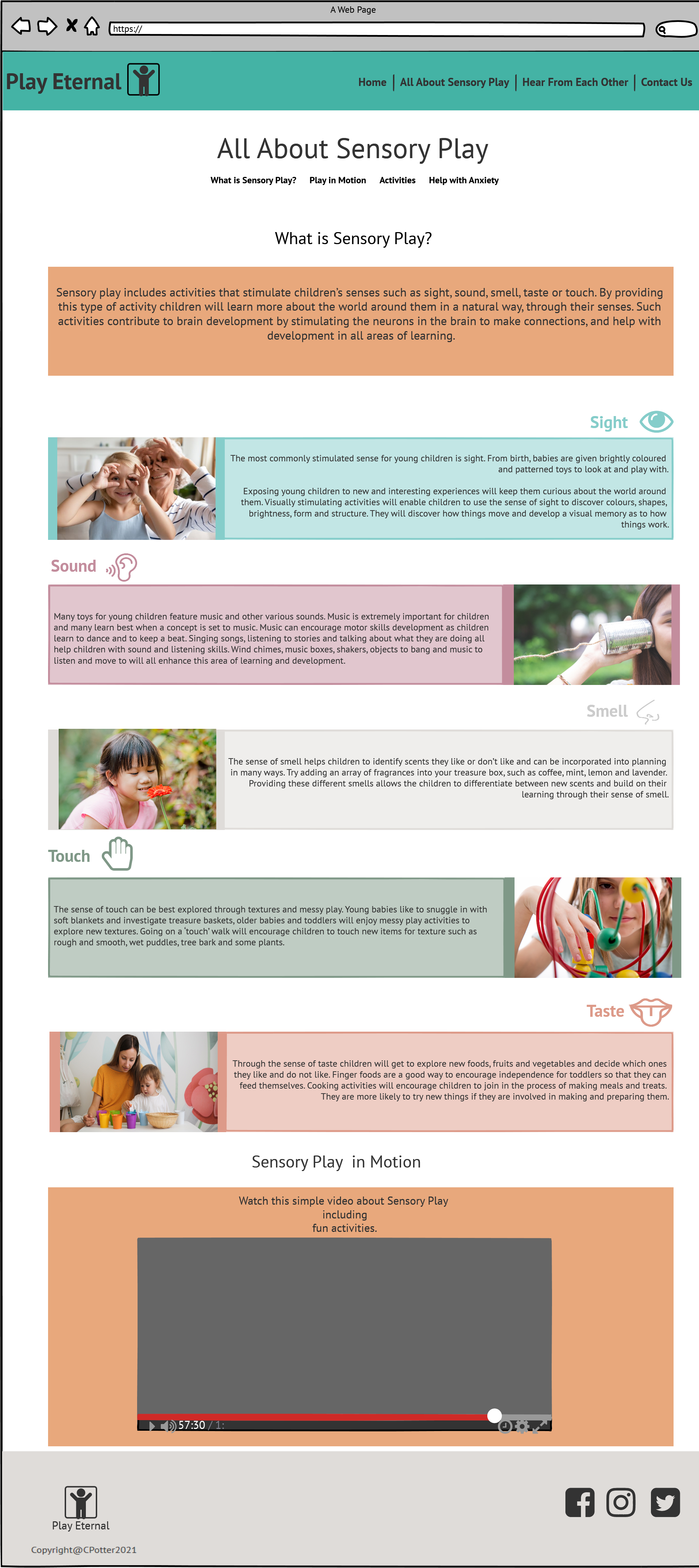
The All About Sensory Play page is the main content page of the site. Its purpose is to educate the user on what sensory play is, provide ideas on sensory play activities and explain how sensory play can assist with childhood anxiety. The page should encourage the user to pursue sensory play activities to see the benefit of including them to support their child's development. Our specific user has been seeking help for her child's anxiety, the help with anxiety section provides this. The page has been created as a continuous page with sections instead of separate pages as users are used to a continuous scroll action and it minimises the amounts of clicks required to access the site features. A scroll-behaviour setting set to smooth has been added to the html in the CSS to improve the ease of scrolling.
- What is Sensory Play ?

-
This section provides a simple explanation of sensory play. It is important to keep the information concise and to the point to ensure the user does not lose interest and keeps on exploring. - Each sub-point of information has an individually coloured background. The colours are repeated across the site to create a concise experience. - There is an explanation of sensory play across all the senses - Sight, Sound, Smell, Touch and Taste to help the user connect with their own senses and get an understanding of how to introduce sensory play into their child's life. - An engaging image is included per sense. The images all include children so as the user can relate the sense with playing with their child. - This user will see the value of sensory play through this section as it provides understanding as well as making it relatable.
-
Play in Motion

-
This section includes a six minute video clip on sensory play and play ideas in the home.
-
It provides the user with the option to explore the information in a visual format. It is important for a user to engage with material in a format that they are comfortable with. - The video is hosted on YouTube but plays directly on the site. It can be enlarged to full screen.
-
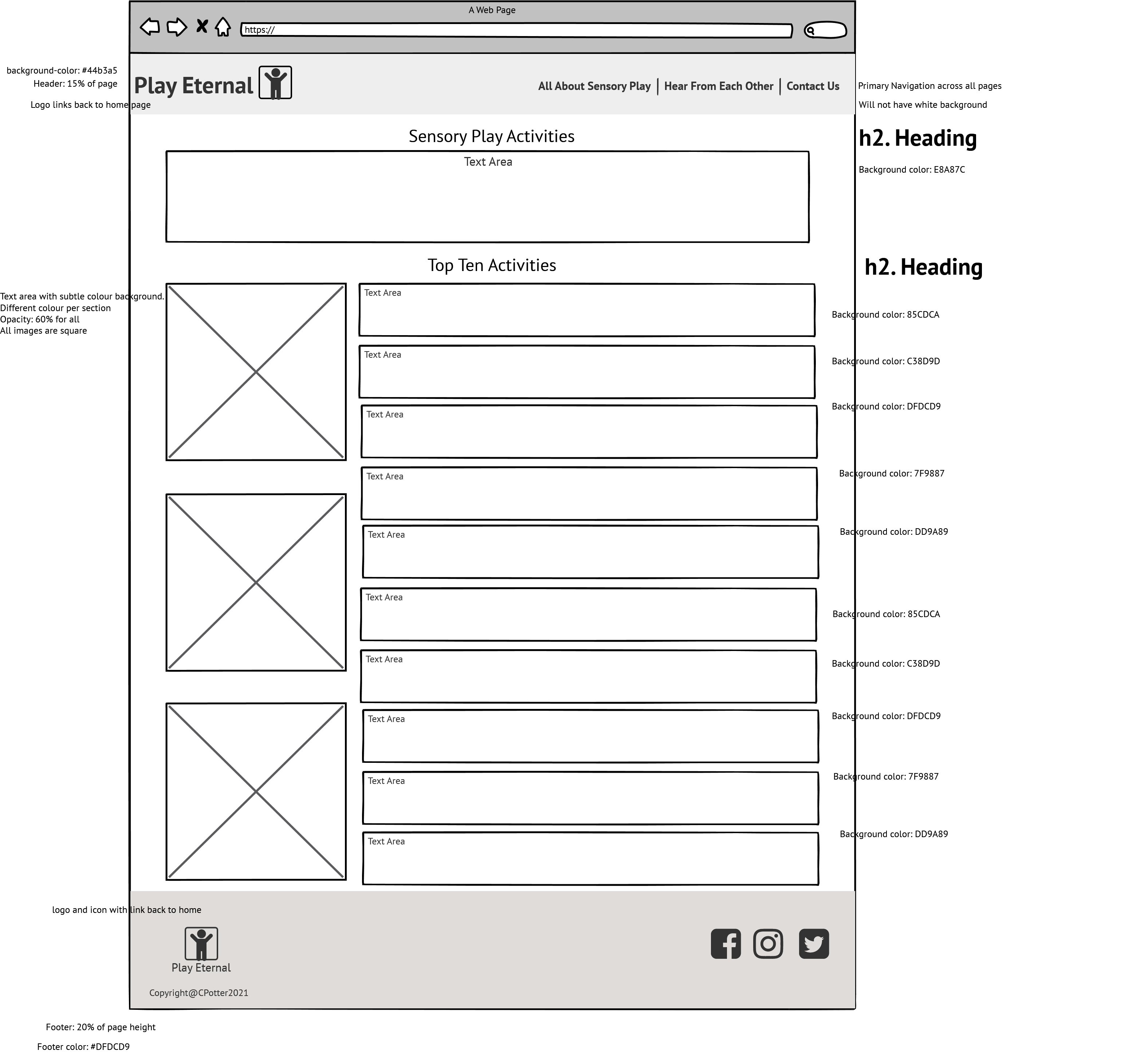
Activities

-
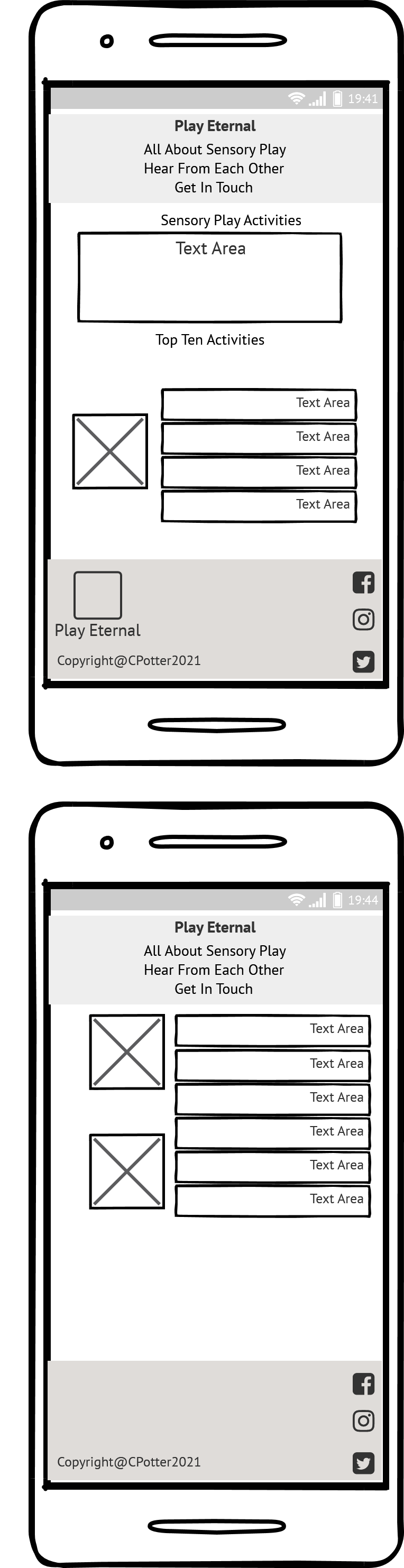
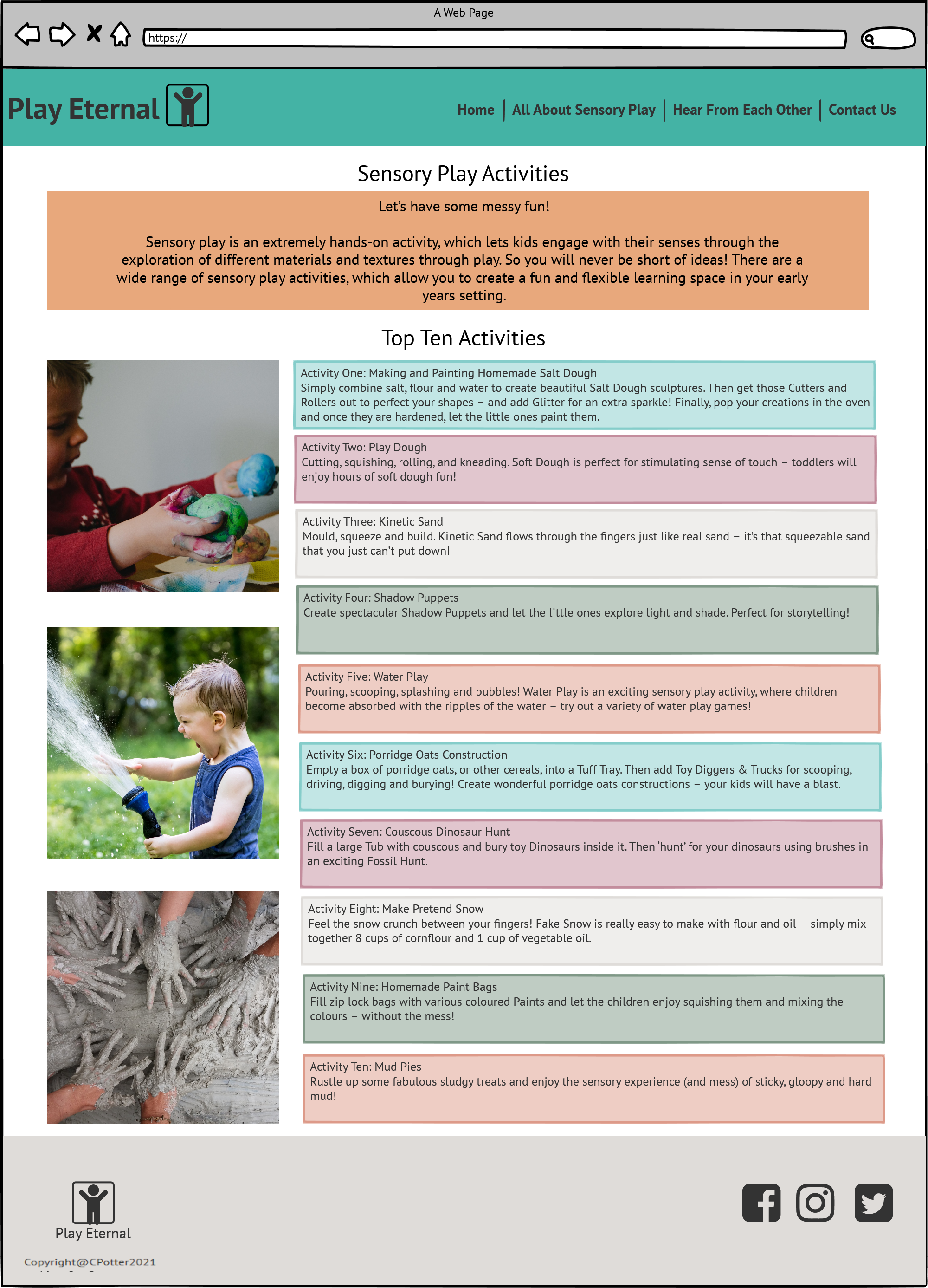
The Activities section introduces the user to the top ten recommended sensory play activities. All of the activities are very simple, easy and affordable to create at home. - The section adds value to the user as they will be able to use the information to create the activities in their own home without breaking the budget.
-
Each activity has its own coloured background just like the What is Sensory Play section, to continue the narrative of the page. - Three images are included alongside the activities to provide some colour and display of sensory play.
-
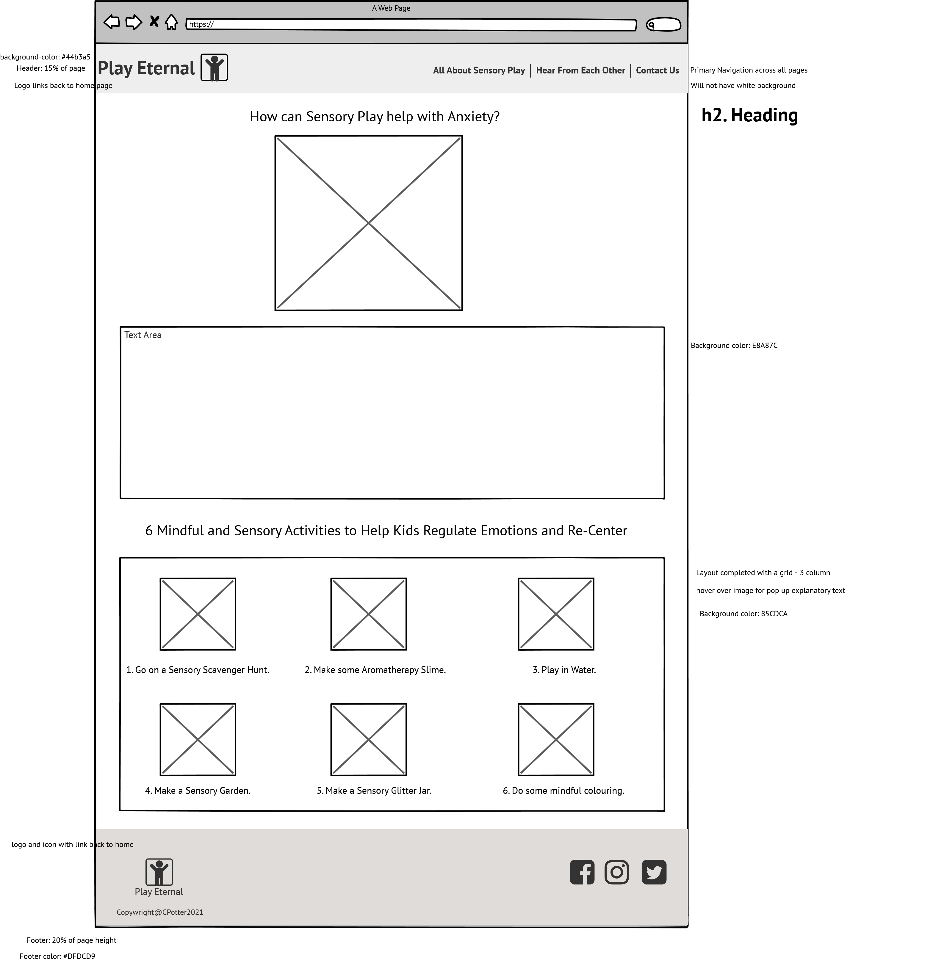
Help with Anxiety

- This page section directly answers our user's need for help with childhood anxiety.
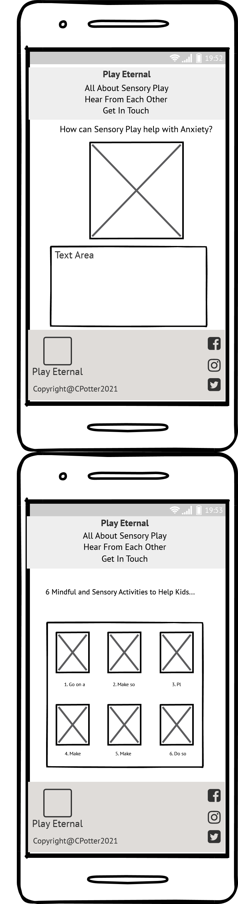
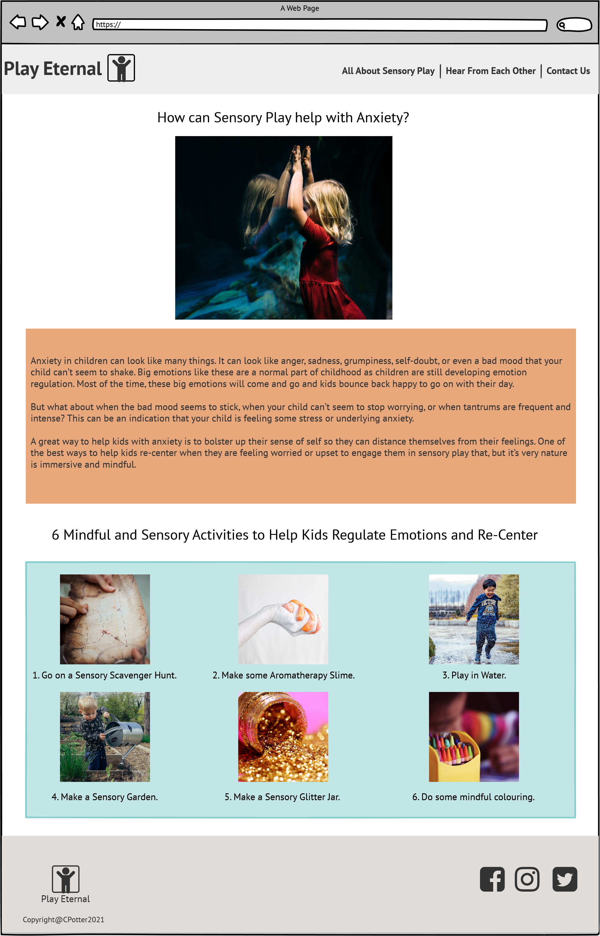
- It includes a brief explanation of what childhood anxiety might look like and what a parent can do to help. - It then provides some mindful and calming activities for the user to take away and do with their child.
- This section provides value to the user at it provides a practical solution to their problem.
- As there is a lot of written information on the page, the anxiety activities section is presented as a compact grid of six images with an image caption providing the activity name.
- By simply hovering over the image caption, a tool-tip pop-up provides a description of the activity. The user will be prompted to hover as the image caption has a dotted underline, which is commonly used to show tool-tips and is familiar to users.


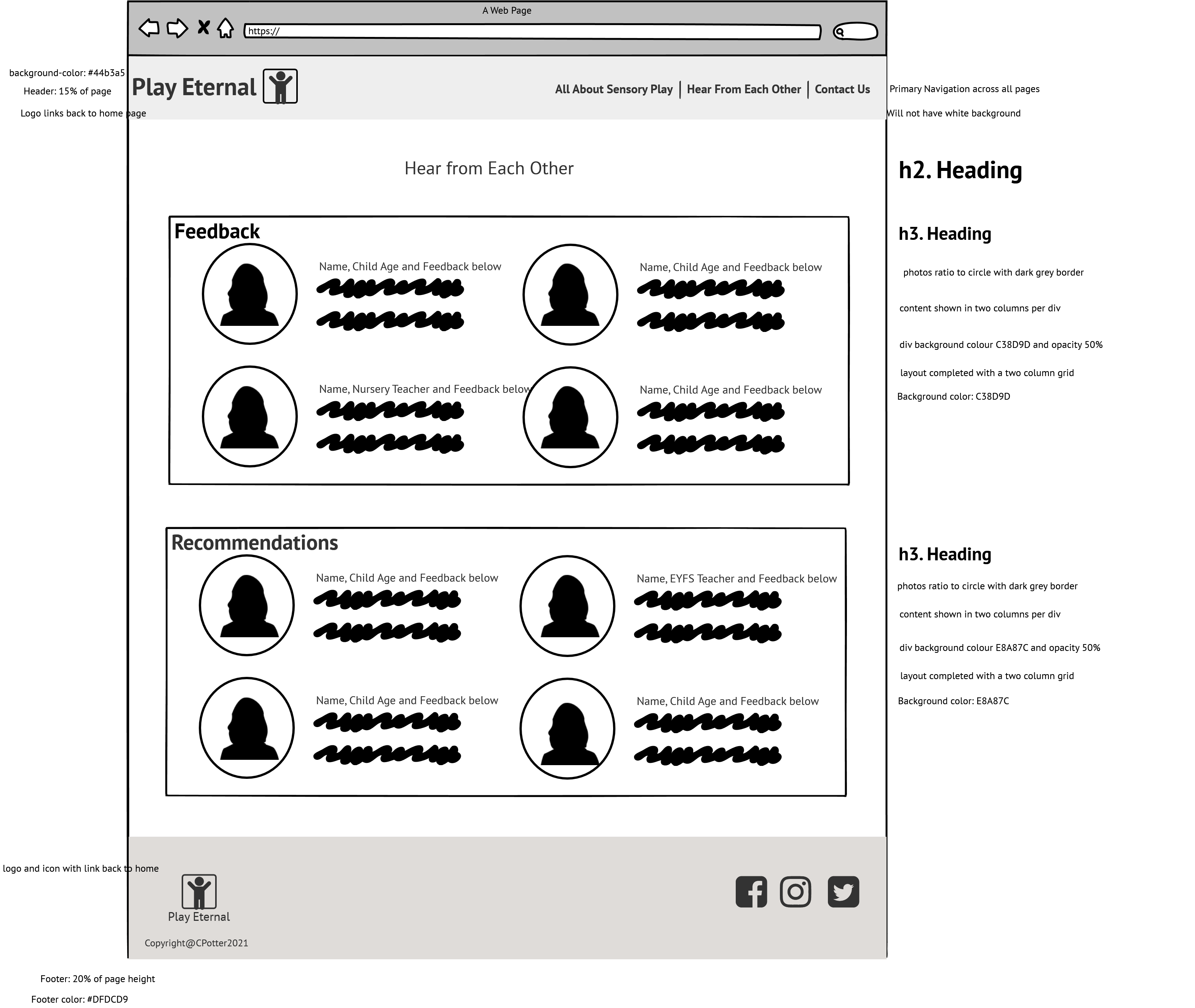
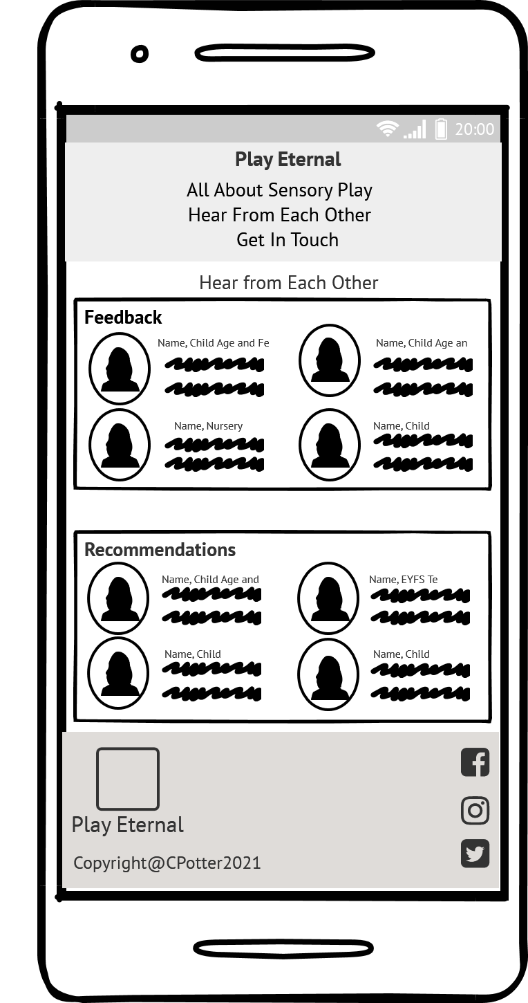
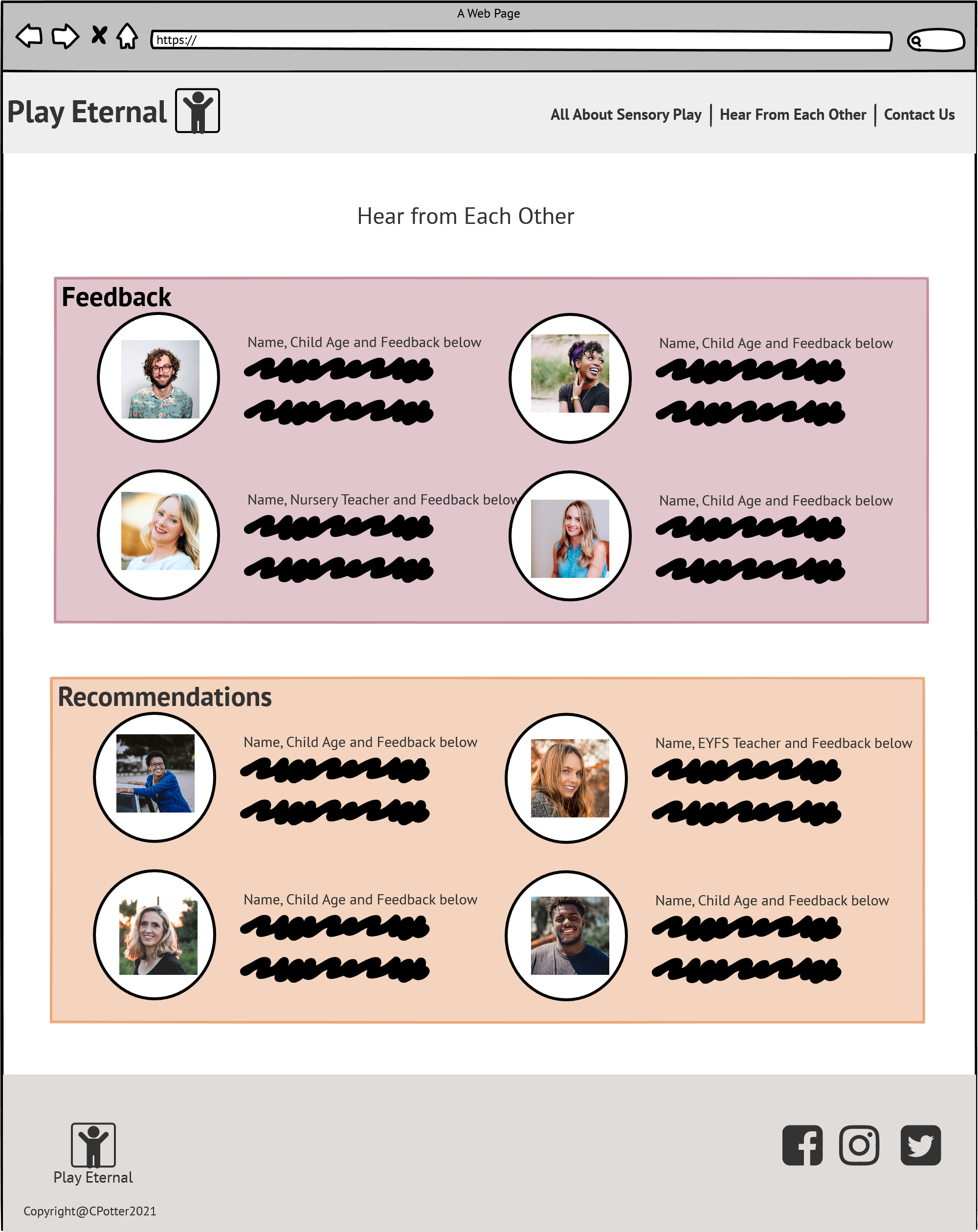
The Hear from Each Other section provides the user with the opportunity to hear from other parents, teachers and occupational therapists. It is important for the user to receive positive affirmation regarding sensory play directly from other users of the site.
- Feedback

-
The feedback section contains four individual feedback write ups. Each person has a profile picture and a heading with their name, children's ages or their role (for the teachers or occupational therapist). It is important for the user to build confidence in sensory play through reading the encouraging and positive feedback.
-
Recommendations

- The recommendations section mirrors the feedback section in its setup for consistency. It is important for parents and experts to be able to vocalise their own recommendations and for a user to be able to read them and use their suggestions or come up with their own own creative sensory play.

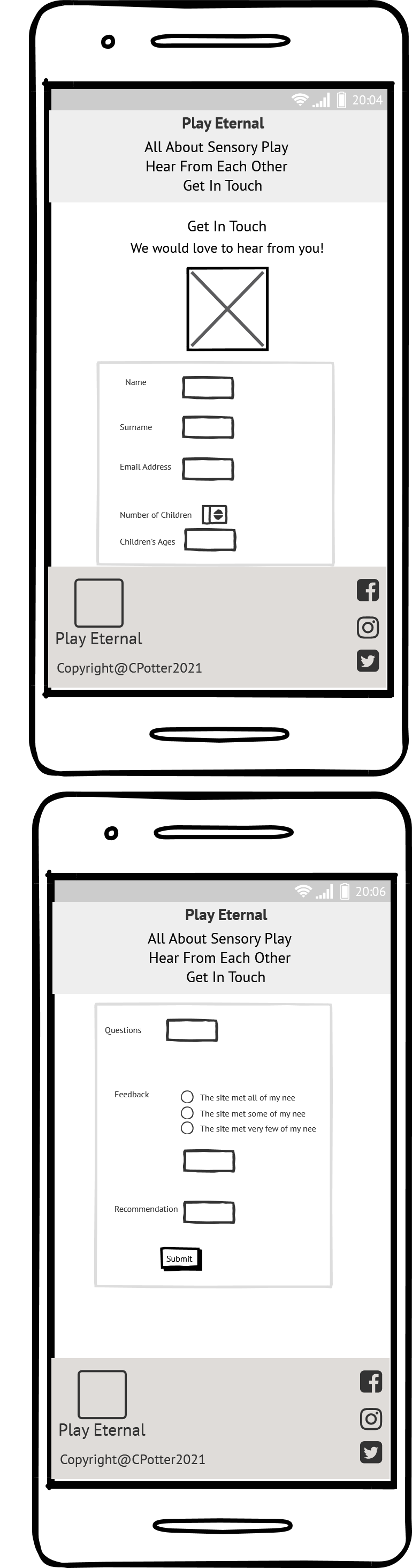
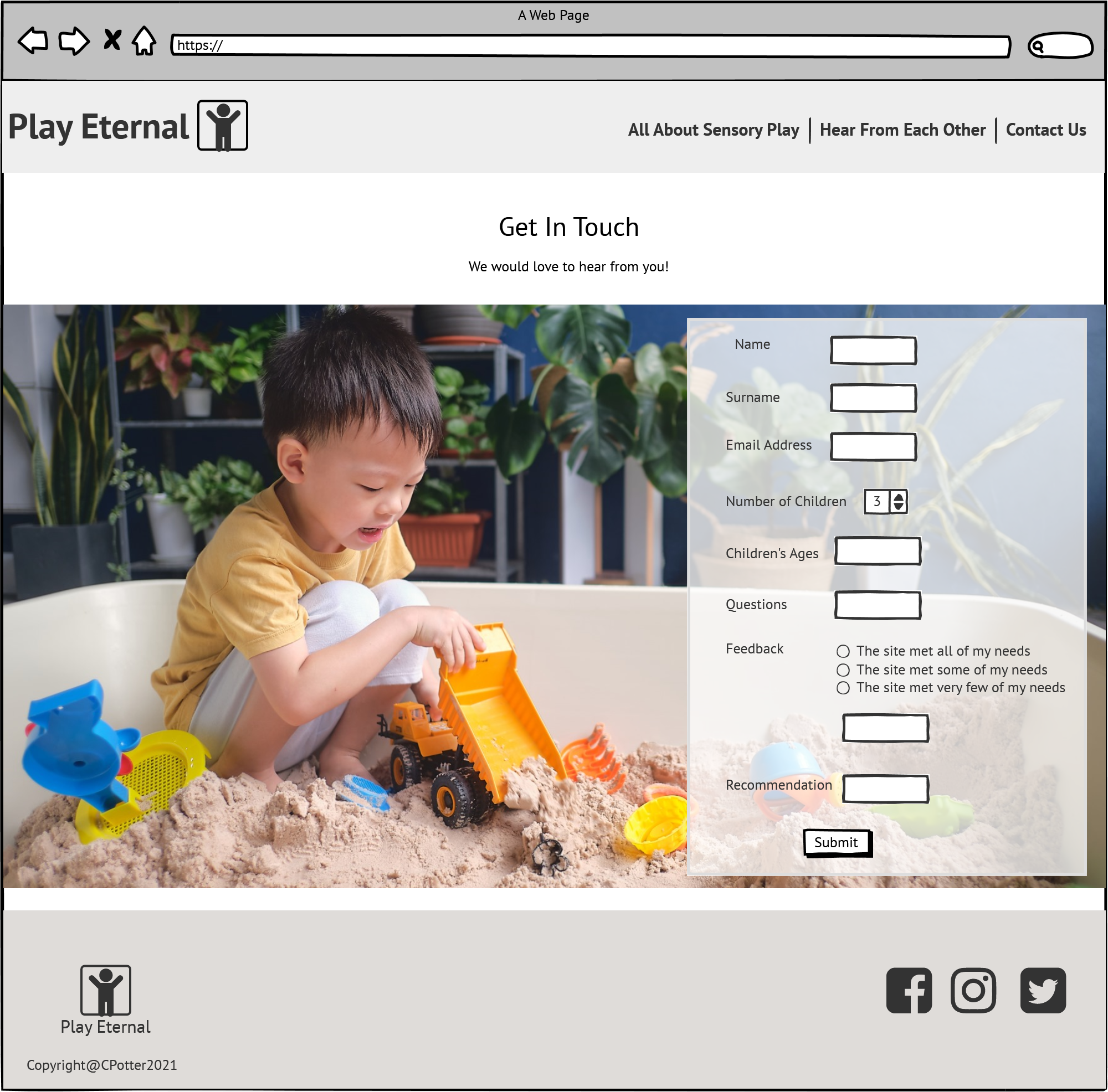
The get in touch section provides the user with the ability to contact the site owners. There is a background image of a little boy happily engaging in sensory play in his sand pit. It evokes a sense of accomplishment by reinforcing that sensory play can be easily implemented at home and benefit your child. It reflects the setup of the home page, like the back cover of a book, letting the user know they have reached the end of the site content.
- Form

- The form is added as an overlay on the background image to reflect the text area on the front page.
- The form layout and display is kept as simple as possible to convey the message to the user that it is simple and easy to complete.
- The name, surname, email, child/children's ages and feedback are added as input elements and are validated as required. The feedback on the website, questions and recommendations sections are added as text areas and are not required but optional.
- This is the area in which a user can ask any questions they may have and provide their own feedback and recommendations which could be featured on the Hear from Each Other Page.
- The Submit button reflects the same display options as the Learn More link found on the home page.
-
Chat Page
- A page in which users are able to chat to each other about sensory play, ask questions and receive answers from other users as well as from the site owner.
- Users would be able to add their own content through images and videos to recommend sensory play ideas.
- A terms and conditions disclaimer and the ability to setup a user profile would need to be introduced in order for a user to interact on the site page.
- Content posted by users would need to be monitored for propriety.
- The ability to report inappropriate comments and content would be required.
-
As this is the first release of the site, the chat page was not included in the implementation due to its complexities. Rather, a simplified version in the form of a Feedback and Recommendations page.
- The implementation of the chat page would depend on the page traffic generated by the live site and the level of interaction received from the users would help to deem its feasibility.
Please access the Play Eternal testing pack to view full testing of the site features.
The following issues were experienced during the course of development:
-
The Learn-More Link on the Home Page
- When the fixed Header with the navigation javascript was added, a z-index relationship had to be added to the page elements that had an absolute position, so that when scrolling they did not scroll over the Header but under. If the z-index was lower than the Header z-index, the elements scrolled under but the learn-more link could not be clicked. If the z-index was equal or higher to the Header z-index, the link would work but the elements would be on top of the Header. I tried moving the link in and out of divs and the page content div to get it right. I tried to change the link to a button with a link, then a div with a link. I tried setting various z-index values for the different elements.
- Through trial and error I came to a solution. The Learn-More link was added, inside the content div, inside the home-page div and inside the hero-text div with the following html code
- The hero-text div position was absolute and the z-index set to 1.
- The hero-area which contains the background image which the hero-text div sits on top of, the position was set to relative and the z-index to -1.
- The header did not have a position set but has a z-index set to 2.
-
The Javascript Sticky Navigation and Header
- Adding the javascript for the header and navigation bar to stick caused some issues with the ability to access the learn-more link above as well as the form input and submit. As per above by setting the header z-index to 2 and not adding a named position the issue was resolved. I also experienced issues with getting the content padding correct for before scroll and after scrolling across various screen sizes, this too was resolved through trial and error.
-
I found media queries tricky. I was focusing on trying to get the screen to render appropriately with the same page layout for all screen sizes. I eventually removed all of the media queries to start with a clean slate as it had got very messy. Using the Responsively App to test how the screen renders for different devices and screen widths, really helped me to visualise and test the media queries. I changed multiple elements display to flex I was then easily able to change flex directions for different screen sizes which helped with the previous issues I experienced. Setting the font to rem also helped with consistency of the display.

- The site has been testing using the following browsers - Safari, Chrome, Firefox, Edge and Opera. The site is compatible and accessible across all browsers.
Please click here to view browser testing screenshots.
- Devices and Screen Sizes
-
The site was tested using the Responsively App as well as the Google Chrome device tool bar. The site has been setup to render effectively across multiple screen sizes and devices. I have tested using the following device displays:
-
Responsively App:
- 5K Display 5120 * 2880
- 4K Display 3840 * 2160
- MacBook Pro 16 inch 3072 * 1920
- MacBook Pro 15 inch 2880 * 1800
- MacBook Pro 13 inch 2560 * 1600
- Laptop with HiDPi Screen 1440 * 900
- Laptop 1400 * 1000
- MacBook Air 1440 * 900
- Laptop with MDPi Screen 1280 * 800
- Generic Laptop 1280 * 950
- iPad Pro 1024 * 1366
- Kindle Fire HDX 800 * 1280
- iPad 768 * 1024
- Microsoft Lumia 550 640 * 360
- Blackberry Playbook 600 * 1024
- Nokia N9 480 * 854
- iPhone 6/7/8 Plus 414 * 736
- iPhone 6/7/8 375 * 667
- Galaxy S 5 360 * 640
- iPhone 4 320 * 480
- JioPhone 2 240 * 320
- Responsive Mode - change the screen width to test various sizes
-
Google Chrome device tool bar:
- Galaxy Note 3
- Galaxy Note II
- Galaxy S III
- KindleFire HDX
- LG Optimus L70
- Laptop with HiDPI screen
- Laptop with MDPI screen
- Laptop with touch
- Microsoft Lumia 550
- Microsoft Lumia 950
- Moto G4
- Galaxy S5
- Pixel 2
- Pixel 2 XL
- iPhone 5/SE
- iPhone 6/7/8
- iPhone 6/7/8 Plus
- iPhone X
- iPad
- iPad Pro
- Surface Duo
- Galaxy Fold
- Responsive Mode
- W3C HTML Code Validator
- The code for the following html pages was entered into the validator and all pages passed:
- index.html
- about.html
- feedback.html
- contact.html
- W3C CSS Jigsaw Validator
- The code for the stylesheet.css was entered into the validator and passed.
Please click here to view the screenshots.
The Wave Evaluation Tool was used to test the Accessibility of the site. The following changes were made to pass the evaluation with no errors:

Please click here to view the Wave Evaluation screenshots.
Click here to access Google Lighthouse performance reports.
The website was tested end to end after deployment to ensure that the functionality, content and style matches that of the development site. It was tested across multiple screen sizes and browsers. All post-deployment testing passed.
This website was developed on Gitpod using the Code Institute student template with changes frequently committed to git then pushed onto GitHub from the Gitpod terminal.
The deployed version of the website is the master.
To maintain the code the following actions are taken:
- Log into GitHub
- Go to the repositories tab at the top of the screen
- Click on the repository named Play-Eternal

- Once in the repository select the green icon GitPod to open the code on GitPod

- Gitpod will load
- The Play Eternal Master will open
- The Play Eternal folders and files will be visible on the left hand side

8.The HTML files will be at top level and are called:
- index.html - this is the home page
- about.html - this is the all about sensory play page
- feedback.html - this is the hear from each other page
- contact.html - this is the get in touch page
- The assets folder contains the following sub-folders:
- css
- contains the stylesheet.css file
- images
- contains all images used on the site
- javascript
- contains the javascript file for the sticky header
-
Open the file in which the code needs to be maintained or changed
-
Make the required changes

-
Select Cntrl S to save changes (the white dot against the tab in which the code was changed will now disappear)
-
In the terminal type in "python3 -m http.server" and select enter

- Select to open the browser

- The preview of the site will load to check and test changes

- To save the changes back to github the following process needs to be followed:
- open a new terminal by selecting the menu icon, going to Terminal and selectiong New Terminal

- Add the code to gitpod by typing in "git add ." in the new terminal and press enter

- Commit the code to gitpod by typing in "git commit -m "Add a short message here" and press enter

- Push the code back down to github by typing in "git push" select enter

- From the github side, refresh the repository page and the commit will reflect

- Open the item to view the commit changes

The website was deployed on GitHub using the following steps:
- Log into GitHub
- Go to the repositories tab at the top of the screen
- Click on the repository named Play-Eternal
- Once in the repository, click on the settings tab on right handside of the top menu

- Click on the pages tab located in the left handside menu

- Under source, select master as the input

- In the next input, select /root if not already selected by default

- Click save and the url should be displayed above the source section

- Now that the link is displayed, the website is deployed and can be accessed in the browser by clicking on the url
- To be able to fork the repository, you will need your own github and gitpod accounts with linked permissions

- From your github home page in the search bar search for Claire-Potter
- Under Users select the user Claire-Potter
 4. On the repository page choose to open the Play-Eternal repository

- At the top of the page on the right-hand side select to Fork the repository

- Your own version of the repository will create

- Select the green GitPod icon to open the workspace on GitPod
- Follow the steps in the Maintaining Code section above to make and save changes to your own repository
The following were used for any general queries or guidance required:
- Code Institute LMS
- W3Schools - https://www.w3schools.com/
- Mediag - https://mediag.com/blog/popular-screen-resolutions-designing-for-all/
- Developer.Mozilla - https://developer.mozilla.org/en-US/docs/Web/CSS
- The scroll behavior code is from https://css-tricks.com/sticky-smooth-active-nav/
- The dropdown menu code is adapted from W3 school tutorial- adjusted for this site https://www.w3schools.com/css/tryit.asp?filename=trycss_dropdown_navbar
- The Tooltip code is from W3 school tutorial and adapted for site https://www.w3schools.com/css/tryit.asp?filename=trycss_tooltip_arrow_bottom
- The Javascript from W3 schools tutorial for sticky nav bar https://www.w3schools.com/howto/tryit.asp?filename=tryhow_js_navbar_sticky
- The vertical line code is from https://stackoverflow.com/questions/31140935/how-do-i-add-vertical-line-on-my-menu-item-in-html-css
- Shadow code from W3 school tutorials - buttons shadows - https://www.w3schools.com/css/css3_buttons.asp
The following sites were used as reference sites for design inspiration and website best practices:
- Awwwards - https://www.awwwards.com/
- Dribble - https://dribbble.com/
- Alistapart - https://alistapart.com/
- Orbitmedia - https://www.orbitmedia.com/blog/web-design-tips/
- AdEspresso - https://adespresso.com/blog/call-to-action-examples
- JustinMind - https://www.justinmind.com/blog/single-page-vs-multi-page-websites-design-battle/
The content on the Home Page and the Hear From Each Other Page was written by myself.
The content on the All About Sensory Play Page is from the following sites:
- What is Sensory Play?
- Sensory Play Activities
- Help With Anxiety
-
The colour scheme utilised is from the following website:
- Visme - option 1 Colorful and Balanced - https://visme.co/blog/website-color-schemes/
-
The typography utilised is from Google Fonts:
-
The Icons utilised are from Font Awesome:
- Font Awesome - https://fontawesome.com/
-
The following Images are from Shutterstock - https://www.shutterstock.com
-
The following Images are from Unsplash - https://unsplash.com/
-
The iframe video is from YouTube - https://www.youtube.com/embed/GWBLyX7Is6Q
-
The mockup image in the ReadMe was created using the following site:


A huge thank you to my mentor Brian Macharia. The guidance and advice that you have provided has been invaluable. I could have never completed this project without you.
Thank you to Code Institute for providing such well-thought out and put together course material and for the constant guidance and advice provided through Slack.
The Slack Code Institute Community - for always being there for a chat or help when needed.
Finally, to my wonderful husband and children, thank you for your understanding and support through this process.