
theme 是 OpenHarmony/HarmonyOS ArkUI like-ios 组件体系的基础 token 库,提供色调、色板、毛玻璃 material、圆角、间距、阴影和语义色。它不是单个可视 UI 组件,主要给各独立组件库复用,也可以直接被业务页面读取。
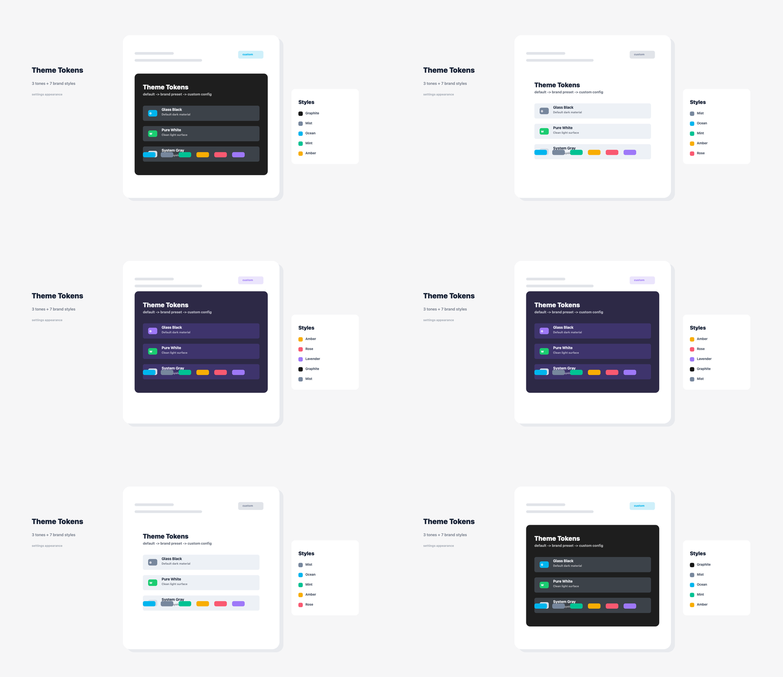
下面展示 theme 提供的色板和毛玻璃 material token:
ohpm install themeimport {
getSwiftUIGlassMaterial,
getSwiftUIPalette,
SwiftUITone
} from 'theme'
@Component
struct BrandGlassSurface {
build() {
Column() {
Text('业务内容')
.fontSize(16)
}
.width('100%')
.padding(16)
.backgroundColor(getSwiftUIGlassMaterial(SwiftUITone.GlassBlack).fill)
.border({
width: 1,
color: getSwiftUIGlassMaterial(SwiftUITone.GlassBlack).border
})
.borderRadius(16)
.shadow({
radius: 20,
color: getSwiftUIGlassMaterial(SwiftUITone.GlassBlack).shadow,
offsetX: 0,
offsetY: 8
})
}
}const palette = getSwiftUIPalette(SwiftUITone.GlassBlack)
const primaryColor = palette.primary
const surfaceColor = palette.surfaceMuted完整最小示例见 example/SwiftUIThemeUsage.ets。该示例演示如何读取色板、毛玻璃 material 和链式配置对象,适合作为业务页面接入 theme 的起点。
| API | 说明 |
|---|---|
SwiftUITone |
三个基础颜色枚举:GlassBlack 黑色毛玻璃、PureWhite 白色毛玻璃、SystemGray 灰色毛玻璃 |
SwiftUIHeaderStyle |
Neutral、Care、Tasks、Records、Family 头图风格 |
SwiftUIBrandStyle |
七组业务风格预设:Graphite、Mist、Ocean、Mint、Amber、Rose、Lavender |
SwiftUIPalette |
页面、文本、主色、强调色和表面色 |
SwiftUIGlassMaterial |
毛玻璃填充色、边框色、叠色、高光和阴影 |
SwiftUIComponentConfig |
SwiftUI modifier 风格配置对象 |
swiftUIConfig |
创建链式配置对象,支持 withTone()、withWidth()、withHeight()、withRadius()、withFillColor()、withBorder()、withShadow()、withPadding() 等方法 |
swiftUIConfigForStyle |
基于 SwiftUIBrandStyle 生成可继续链式覆盖的风格配置 |
SwiftUIMetricItem |
指标组件数据结构 |
SwiftUIRowItem |
列表行组件数据结构 |
getSwiftUIPalette |
获取指定色调的完整色板 |
getSwiftUIGlassMaterial |
获取指定色调的毛玻璃 material |
getHeaderGradientStops |
获取页面头图渐变色 |
getHeaderAccentColor |
获取页面头图强调色 |
swiftUIColorWithOpacity |
生成带透明度的颜色字符串 |
- 默认 token 偏向 like-ios 黑色优先的纯色毛玻璃风格。
- 业务方如果要完全接入自己的设计系统,可以直接跳过 token 默认值,在各 UI 组件中传入自定义颜色和尺寸,或通过
swiftUIConfig()复用一组链式配置。
SwiftUITone 继续保持三个基础颜色枚举:GlassBlack、PureWhite、SystemGray。如果业务希望更快套用品牌风格,可以从 theme 引入 SwiftUIBrandStyle 与 swiftUIConfigForStyle(),当前提供 Graphite、Mist、Ocean、Mint、Amber、Rose、Lavender 七组预设。预设只是快捷入口,仍可继续叠加 withFillColor()、withTintColor()、withColor()、withAccentColor()、withBorder()、withShadow()、withRadius()、withPadding()、withSize()、withTitleFontSize()、withSubtitleFontSize()、withTextFontSize()、withIconSize()、withSpacing() 等链式方法做高度自定义。
import { SwiftUIBrandStyle, swiftUIConfigForStyle } from 'theme'

const oceanStyle = swiftUIConfigForStyle(SwiftUIBrandStyle.Ocean)
  .withRadius(8)
  .withPadding(14)
  .withBorder('#6657C7F7', 1.2)
  .withShadow('#241D4ED8', 20)