1| # Slider button card by @mattieha
2| [![GitHub Release][releases-shield]][releases]
3| 
light, switch, fan, cover, input_boolean, media_player, climate, lock entities.
6|
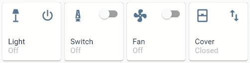
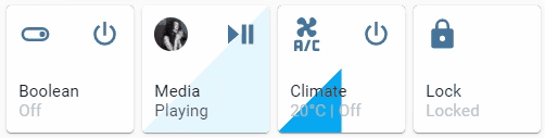
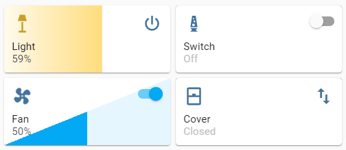
7| ![Preview][preview]
8| ![Preview 2][preview-2]
9|
10| #### Please ⭐️ this repo if you find it useful
11|
12| ## TOC
13| - Installation
14| - HACS
15| - Manual
16| - Configuration
17| - Visual Editor
18| - Options
19| - Icon options
20| - Slider options
21| - Action button options
22| - Tap action
23| - Styles
24| - Examples
25| - Minimal working config
26| - Per feature
27| - General
28| - Icon
29| - Action button
30| - Slider
31| - Full examples
32| - Fan
33| - Switch
34| - Cover
35| - Media player
36| - Climate
37| - Lock
38| - In a grid
39| - Group support
40| - Known issues
41| - Languages
42| - Credits
43|
44| ## Installation
45|
46| ### HACS
47| This card is available in [HACS][hacs] (Home Assistant Community Store).
48| Just search for Slider Button Card in Frontend tab.
49|
50| ### Manual
51|
52| 1. Download slider-button-card.js file from the [latest-release].
53| 2. Put slider-button-card.js file into your config/www folder.
54| 3. Go to Configuration → Lovelace Dashboards → Resources → Click Plus button → Set Url as /local/slider-button-card.js → Set Resource type as JavaScript Module.
55| 4. Add custom:slider-button-card to Lovelace UI as any other card (using either editor or YAML configuration).
56|
57| ## Configuration
58|
59| ### Visual Editor
60|
61| Slider Button Card supports Lovelace's Visual Editor.
62|
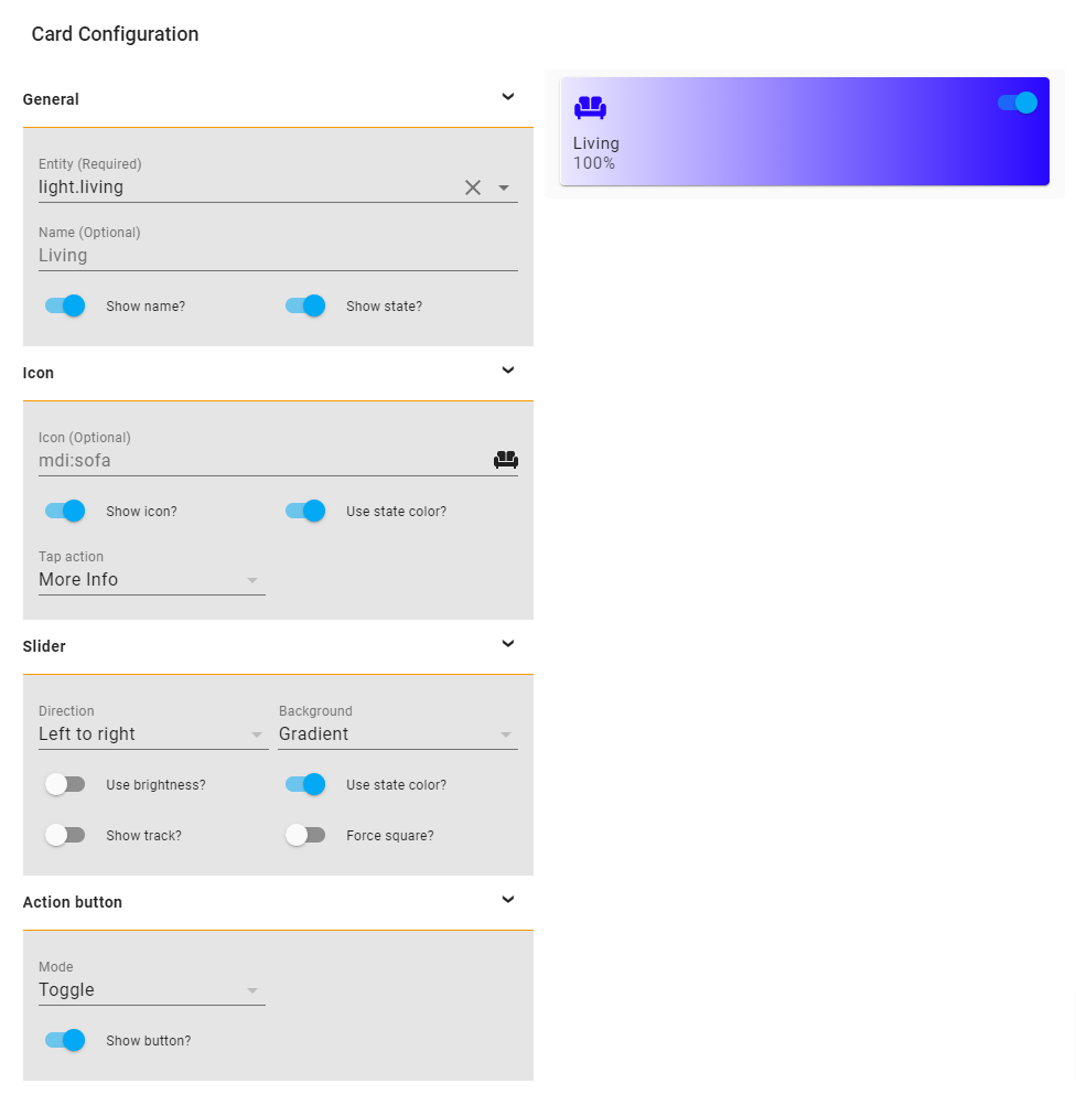
Show screenshot
63| 64| ![Visual Editor][visual-editor] 65|custom:slider-button-card |
73| | entity | string | Required | HA entity ID from domain light, switch, fan, cover, input_boolean, media_player, climate, lock | |
74| | name | string | Optional | Name | entity.friendly_name |
75| | show_name | boolean | Optional | Show name | true |
76| | show_state | boolean | Optional | Show state | true |
77| | compact | boolean | Optional | Compact mode, display name and state inline with icon. Useful for full width cards. | false |
78| | icon | object | Optional | Icon options | |
79| | slider | object | Optional | Slider options | |
80| | action_button | object/array | Optional | Action button options - Can be a single object or array of up to 5 buttons | |
81|
82| ### Icon Options
83|
84| | Name | Type | Requirement | Description | Default |
85| | ----------------- | ------- | ------------ | ------------------------------------------- | ------------------- |
86| | icon | string | Optional | Icon | default entity icon |
87| | show | boolean | Optional | Show icon | true |
88| | use_state_color | boolean | Optional | Use state color | true |
89| | tap_action | object | Optional | Action to take on tap | action: more-info |
90|
91| ### Slider Options
92|
93| | Name | Type | Requirement | Description | Default |
94| | ----------------- | ------- | ------------ | ------------------------------------------- | ------------------- |
95| | direction | string | Optional | Direction left-right, top-bottom, bottom-top | left-right |
96| | background | string | Optional | Background solid, gradient, triangle, striped, custom | gradient |
97| | use_state_color | boolean | Optional | Use state color | true |
98| | use_percentage_bg_opacity | boolean | Optional | Apply opacity to background based on percentage | true |
99| | show_track | boolean | Optional | Show track when state is on | false |
100| | always_show_track | boolean | Optional | Always show slider track, even when entity is Off or at 0 | false |
101| | track_background_color | string | Optional | Card track background color for non-filled area. Use any valid CSS color or transparent | #2b374e |
102| | track_size_percent | number | Optional | Set length of slider track as percentage of card height/width (1-100). Based on slider direction. | 100 |
103| | force_square | boolean | Optional | Force the button as a square | false |
104| | toggle_on_click | boolean | Optional | Force the slider to act as a toggle, if true sliding is disabled | false |
105| | attribute | string | Optional | Control an attribute for light or cover entities | |
106| | invert | boolean | Optional | Invert calculation of state and percentage, useful for cover entities | falsetrue for cover |
107|
108| ### Attributes
109| Light:
110| - brightness_pct default
111| - brightness
112| - color_temp
113| - hue
114| - saturation115| 116| Warning options other than
brightness_pct and brightness may give strange results
117|
118| For example when color_temp is selected as attribute and the current color_mode of the light is not color_temp there is no value available for the slider, so the min value will be displayed.
119|
120| Cover:
121| - position default
122| - tilt
123| ### Action button Options
124|
125| | Name | Type | Requirement | Description | Default |
126| | ----------------- | ------- | ------------ | ------------------------------------------- | ------------------- |
127| | mode | string | Optional | Mode toggle, custom | toggle |
128| | show | boolean | Optional | Show the action button | true |
129| | icon | string | Optional | Icon when mode is custom | mdi:power |
130| | show_spinner | boolean | Optional | Show spinner when mode is custom | true |
131| | tap_action | object | Optional | Action to take on tap | action: toggle |
132|
133| #### Multiple Action Buttons
134|
134| Support for up to 5 action buttons. Configure as an array:
135|
135| yaml 136| action_button: 137| - mode: custom 138| icon: mdi:power 139| show: true 140| tap_action: 141| action: toggle 141| - mode: custom 142| icon: mdi:brightness-high 143| show: true 144| tap_action: 145| action: call-service 146| service: light.turn_on 147| service_data: 148| entity_id: light.living_room 149| brightness_pct: 100 150| - mode: custom 151| icon: mdi:palette 152| show: true 153| tap_action: 154| action: call-service 154| service: scene.turn_on 155| service_data: 156| entity_id: scene.party 157| - mode: custom 158| icon: mdi:music 159| show: true 159| tap_action: 160| action: call-service 160| service: media_player.media_play_pause 161| service_data: 162| entity_id: media_player.bedroom 163| - mode: custom 164| icon: mdi:home 164| show: true 165| tap_action: 166| action: navigate 166| navigation_path: /lovelace/media 167|
168|
169| ### Action Options
170|
171| | Name | Type | Requirement | Description | Default |
172| | --------------- | ------ | ------------ | -------------------------------------------------------------------------------------------------------------------------------------- | ----------- |
173| | action | string | Required | Action to perform (more-info, toggle, call-service, navigate url, none) | more-info |
174| | navigation_path | string | Optional | Path to navigate to (e.g. /lovelace/0/) when action defined as navigate | none |
175| | url | string | Optional | URL to open on click when action is url. The URL will open in a new tab | none |
176| | service | string | Optional | Service to call (e.g. media_player.media_play_pause) when action defined as call-service | none |
177| | service_data | object | Optional | Service data to include (e.g. entity_id: media_player.bedroom) when action defined as call-service | none |
178| | haptic | string | Optional | Haptic feedback for the Beta IOS App success, warning, failure, light, medium, heavy, selection | none |
179| | repeat | number | Optional | How often to repeat the hold_action in milliseconds. | non |
180| ### Styles
181| Custom styles can be set by using Card mod
182| yaml 183| style: | 184| :host { 185| --VARIABLE: VALUE; 186| } 187|
188|
189| | Variable | Description | Default |
190| | ----------------------- | ------------------------------------------- | ------------------- |
191| | --icon-color | Color of the icon when icon.use_state_color === false | var(--paper-item-icon-color) |
192| | --label-color-on | Color of the label when state is on | var(--primary-text-color, white) |
193| | --label-color-off | Color of the label when state is off | var(--primary-text-color, white) |
194| | --state-color-on | Color of the state value when state is on | var(--label-badge-text-color, white) |
195| | --state-color-off | Color of the state value when state is off | var(--disabled-text-color) |
196| | --action-icon-color-on | Color of the action button icon when state is on | var(--paper-item-icon-color, black) |
197| | --action-icon-color-off | Color of the action button icon when state is off | var(--paper-item-icon-color, black) |
198| | --action-spinner-color | Color of the spinner action button | var(--label-badge-text-color, white) |
199|
200| ## Examples
201|
202| ### Minimal working config
203|
204|
205|
206|
208|
209|
210|
212|
227|
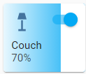
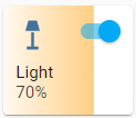
228| | Minimal working config 207| | |
 211| |
213|
214| yaml 215| type: custom:slider-button-card 216| entity: light.couch 217| slider: 218| direction: left-right 219| background: gradient 220| icon: 221| tap_action: 222| action: more-info 223| action_button: 224| mode: toggle 225| 226| |
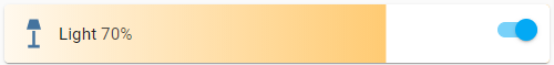
| Compact, best used in full width (not in grid) 238| | |
 242| |
244|
245| yaml 246| compact: true 247| 248| |
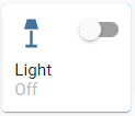
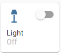
| Minimal config 258| | |
 262| |
264|
265| yaml 266| icon: 267| tap_action: 268| action: more-info 269| 270| |
| Icon override 278| | |
 282| |
284|
285| yaml 286| icon: 287| icon: mdi:lightbulb 288| tap_action: 289| action: more-info 290| 291| |
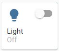
| Minimal config 302| | |
 306| |
308|
309| yaml 310| action_button: 311| mode: toggle 312| show: true 313| 314| |
| Custom 322| | |
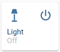 326| |
328|
329| yaml 330| action_button: 331| mode: custom 332| show: true 333| tap_action: 334| action: toggle 335| 336| |
| Custom icon and tap action 344| | |
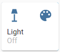 348| |
350|
351| yaml 352| action_button: 353| mode: custom 354| show: true 355| icon: mdi:palette 356| tap_action: 357| action: call-service 358| service: scene.turn_on 359| service_data: 360| entity_id: scene.test 361| 362| |
| Minimal config 372| | |
 376| |
378|
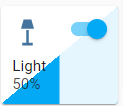
379| yaml 380| slider: 381| direction: left-right 382| background: gradient 383| 384| |
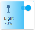
| Background uses color or color_temp if available 391| | |
 395| |
397|
398| yaml 399| slider: 400| direction: left-right 401| background: gradient 402| use_state_color: true 403| 404| |
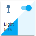
| Show track, best used in full width or triangle 412| | |
 416| |
418|
419| yaml 420| slider: 421| direction: left-right 422| background: triangle 423| use_state_color: true 424| show_track: true 425| 426| |
| Force square 434| | |
 437| |
439|
440| yaml 441| slider: 442| direction: left-right 443| background: triangle 444| use_state_color: true 445| show_track: true 446| force_square: true 447| 448| |
| Always show track with custom track background color 456| | |
 460| |
461|
462| yaml 463| slider: 464| direction: left-right 465| background: triangle 466| use_state_color: true 467| always_show_track: true 468| track_background_color: rgba(200, 200, 200, 0.5) 469| 470| |
| Track with 50% size and transparent background 478| | |
 482| |
484|
485| yaml 486| slider: 487| direction: left-right 487| background: gradient 488| always_show_track: true 489| track_size_percent: 50 490| track_background_color: transparent 491| 491| |
| Icon rotate animation 503| | |
 507| |
509|
510| yaml 511| type: custom:slider-button-card 512| entity: fan.living_fan 513| slider: 514| direction: left-right 515| background: triangle 516| show_track: true 517| icon: 518| tap_action: 519| action: more-info 520| action_button: 521| tap_action: 522| action: toggle 523| mode: custom 524| name: Fan 525| 526| |
slider.toggle_on_click: true so the slider acts as a toggle (sliding is disabled).
532|
533|
534|
535|
537|
538|
539|
541|
561|
562| | Toggle on click 536| | |
 540| |
542|
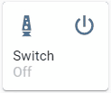
543| yaml 544| type: custom:slider-button-card 545| entity: switch.socket 546| slider: 547| direction: left-right 548| background: custom 549| toggle_on_click: true 550| icon: 551| use_state_color: true 552| tap_action: 553| action: more-info 554| action_button: 555| tap_action: 556| action: toggle 557| mode: custom 558| name: Switch 559| 560| |
slider.direction: top-bottom and slider.background: striped;
566|
566|
567|
568|
570|
571|
572|
574|
592|
593| | Direction top to bottom, custom action icon 569| | |
 573| |
575|
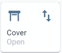
576| yaml 577| type: custom:slider-button-card 577| entity: cover.living_cover 578| slider: 579| direction: top-bottom 580| background: striped 581| icon: 582| show: true 583| tap_action: 584| action: more-info 585| action_button: 586| tap_action: 586| action: toggle 587| mode: custom 588| icon: mdi:swap-vertical 589| name: Cover 590| 591| |
| Action button to toggle play/pause 602| | |
 606| |
608|
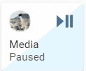
609| yaml 610| type: custom:slider-button-card 611| entity: media_player.spotify_mha 612| slider: 613| direction: left-right 614| background: triangle 615| show_track: true 616| icon: 616| tap_action: 617| action: more-info 618| action_button: 619| mode: custom 620| icon: mdi:play-pause 621| tap_action: 622| action: call-service 622| service: media_player.media_play_pause 623| service_data: 624| entity_id: media_player.spotify_mha 625| name: Media 626| 627| 628| |
| Target temperature and state disabled in card 638| | |
 642| |
644|
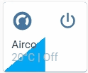
645| yaml 646| type: custom:slider-button-card 645| entity: climate.harmony_climate_controller 646| slider: 647| direction: left-right 648| background: triangle 649| show_track: true 650| icon: 650| tap_action: 651| action: more-info 652| action_button: 653| mode: custom 653| tap_action: 654| action: toggle 655| name: Airco 656| 657| 658| |
slider.toggle_on_click: true
664|
664|
665|
666|
668|
669|
670|
672|
688|
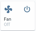
689| | Action button hidden 667| | |
 671| |
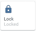
673|
674| yaml 675| type: custom:slider-button-card 675| entity: lock.virtual_lock 676| slider: 677| direction: left-right 678| background: solid 679| toggle_on_click: true 680| icon: 680| use_state_color: true 681| tap_action: 682| action: more-info 683| action_button: 684| show: false 685| name: Lock 686| 687| |
| 4 columns, square: false 696| | |
 700| |
702|
703| yaml 704| type: grid 704| cards: 705| - type: custom:slider-button-card 706| entity: light.couch 707| slider: 708| direction: left-right 709| background: gradient 710| use_state_color: true 711| icon: 711| tap_action: 712| action: more-info 713| use_state_color: true 714| action_button: 714| mode: toggle 715| - type: custom:slider-button-card 716| entity: switch.socket 716| slider: 717| direction: left-right 718| background: custom 719| toggle_on_click: true 720| icon: 720| use_state_color: true 721| tap_action: 722| action: more-info 723| action_button: 724| tap_action: 724| action: toggle 725| mode: toggle 726| name: Switch 727| - type: custom:slider-button-card 727| entity: fan.living_fan 728| slider: 728| direction: left-right 729| background: triangle 730| show_track: true 731| icon: 731| tap_action: 732| action: more-info 733| action_button: 733| tap_action: 734| action: toggle 735| mode: custom 736| name: Fan 737| - type: custom:slider-button-card 737| entity: cover.living_cover 738| slider: 738| direction: top-bottom 739| background: striped 740| icon: 740| show: true 741| tap_action: 742| action: more-info 743| action_button: 743| tap_action: 744| action: toggle 744| mode: custom 745| icon: mdi:swap-vertical 746| name: Cover 747| square: false 747| columns: 4 748| 749| 750| |
group entities are not supported, if you want to control multiple
756| - lights use Light group
757| - covers use Cover group
758| - media players use Media player group
759|
760| ## Known issues
761| When you discover any bugs please open an issue.
762|
763| ## Languages
764|
764| This card supports translations. Please, help to add more translations and improve existing ones. Here's a list of supported languages:
765|
766| - English
767| - French
768| - German
769| - Hebrew
770| - Nederlands (Dutch)
771| - Polish (polski)
772| - Portuguese
773| - Russian
774| - Korean
775| - [Your language?][add-translation]
776|
777| ## Credits
778| - Inspired by Slider entity row
778|
779| ---
780|  780|
781|
782| [hacs]: https://hacs.xyz
783| [add-translation]: https://github.com/mattieha/slider-button-card/blob/main/CONTRIBUTE.md#adding-a-new-translation
784| [visual-editor]: https://raw.githubusercontent.com/mattieha/slider-button-card/main/assets/card-editor.png
785| [preview]: https://raw.githubusercontent.com/mattieha/slider-button-card/main/assets/preview.gif
786| [preview-2]: https://raw.githubusercontent.com/mattieha/slider-button-card/main/assets/preview-2.gif
787| [grid]: https://raw.githubusercontent.com/mattieha/slider-button-card/main/assets/grid-not-square.png
788| [full-width]: https://raw.githubusercontent.com/mattieha/slider-button-card/main/assets/grid-full-width.png
789| [latest-release]: https://github.com/mattieha/slider-button-card/releases/latest
790| [releases-shield]: https://img.shields.io/github/release/mattieha/slider-button-card.svg?style=for-the-badge
791| [releases]: https://github.com/mattieha/slider-button-card/releases
792| [icon-minimal]: https://raw.githubusercontent.com/mattieha/slider-button-card/main/assets/grid-full-width.png
793|
780|
781|
782| [hacs]: https://hacs.xyz
783| [add-translation]: https://github.com/mattieha/slider-button-card/blob/main/CONTRIBUTE.md#adding-a-new-translation
784| [visual-editor]: https://raw.githubusercontent.com/mattieha/slider-button-card/main/assets/card-editor.png
785| [preview]: https://raw.githubusercontent.com/mattieha/slider-button-card/main/assets/preview.gif
786| [preview-2]: https://raw.githubusercontent.com/mattieha/slider-button-card/main/assets/preview-2.gif
787| [grid]: https://raw.githubusercontent.com/mattieha/slider-button-card/main/assets/grid-not-square.png
788| [full-width]: https://raw.githubusercontent.com/mattieha/slider-button-card/main/assets/grid-full-width.png
789| [latest-release]: https://github.com/mattieha/slider-button-card/releases/latest
790| [releases-shield]: https://img.shields.io/github/release/mattieha/slider-button-card.svg?style=for-the-badge
791| [releases]: https://github.com/mattieha/slider-button-card/releases
792| [icon-minimal]: https://raw.githubusercontent.com/mattieha/slider-button-card/main/assets/grid-full-width.png
793|