Project Lux is a redesign project aimed to improve the current features of the UCLA Mobile app. The countless number of resources that our school offers are often difficult to find for students. In response, the UCLA Mobile app attempts to collect all of these resources, but fails to address the important needs of the student body in their everyday lives. With this app redesign, UCLA students at any stage of their college career would be able to have essential, but often overlooked, questions answered.
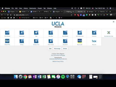
My first impression of UCLA Mobile was that despite its clean design, its purpose is unclear. The app's components lead to external website links, which could have been found by searching online. In short, the app isn't user-centered because it adds steps to the user's journey. Students face many challenges and go under a large amount of pressure in college—UCLA Mobile should make the college experience not more difficult, but easier to handle. By offering simple bits of information, such as the location to the nearest bathroom or printer and a reminder to finish a class assignment due the next week, Project Lux could improve the daily life of the thousands of students on campus.
At the beginning of this project, my goal was to improve the design and flow of the UCLA Mobile app. I started off with doing a heuristic test to explore in greater depth the areas of the app that could be improved. I analyzed issues particularly in its flexibility and efficiency of use and its consistency and standards.
(Read more about my heuristics test here)
By performing a usability test, I wanted to understand the reason for the confusion and difficulty that I felt when performing my heuristic review of UCLA Mobile. I provided my tester with 3 tasks: Searching for vegan options in the dining halls, signing up for wheelchair basketball practices, and finding the Bruin Bus times to Target. With the usability test, I was able to measure the ease of navigating through the app, the complexity of the app's structure, the consistency of parts in the app, and the level of knowledge needed to successfully utilize the app in its current state.
(Read more about my usability test here)
I was able to learn a lot from the usability test that I performed, but I needed more information about what and how a UCLA student utilizes the technology that they have to navigate through college. I decided that my target user would be the average UCLA student, as well as less of a focus on faculty. I got a volunteer to participate in this inquiry and gathered video, audio, and notes as I interviewed them about how they would utilize their current tools to find out a specific event for the next day and a resource that they may need for their campus life. My user notably mentioned their personal difficulty with navigating campus as a new person and the lack of commuincation between academic departments which led to outdated information.
(Read more about my contextual inquiry here)
I decided to create my three user personas based off of a student who has attended UCLA for a couple of years, a student who just began their college career, and a faculty member of UCLA. The large student population can be categorized into their different needs—for example, a 4th year will most likely be interested in upcoming events that may relate to their career, while a new 1st year just wants to figure out where they could find the nearest color printer. The faculty and staff which make up the rest of the UCLA population may want to be aware of the student events and facilities on campus as well, and has the potential to bridge the social gap between students, faculty, and staff. The journey maps for each user focuses on the individual need, search, and discovery of information. The new student user persona and his journey map is shown below.
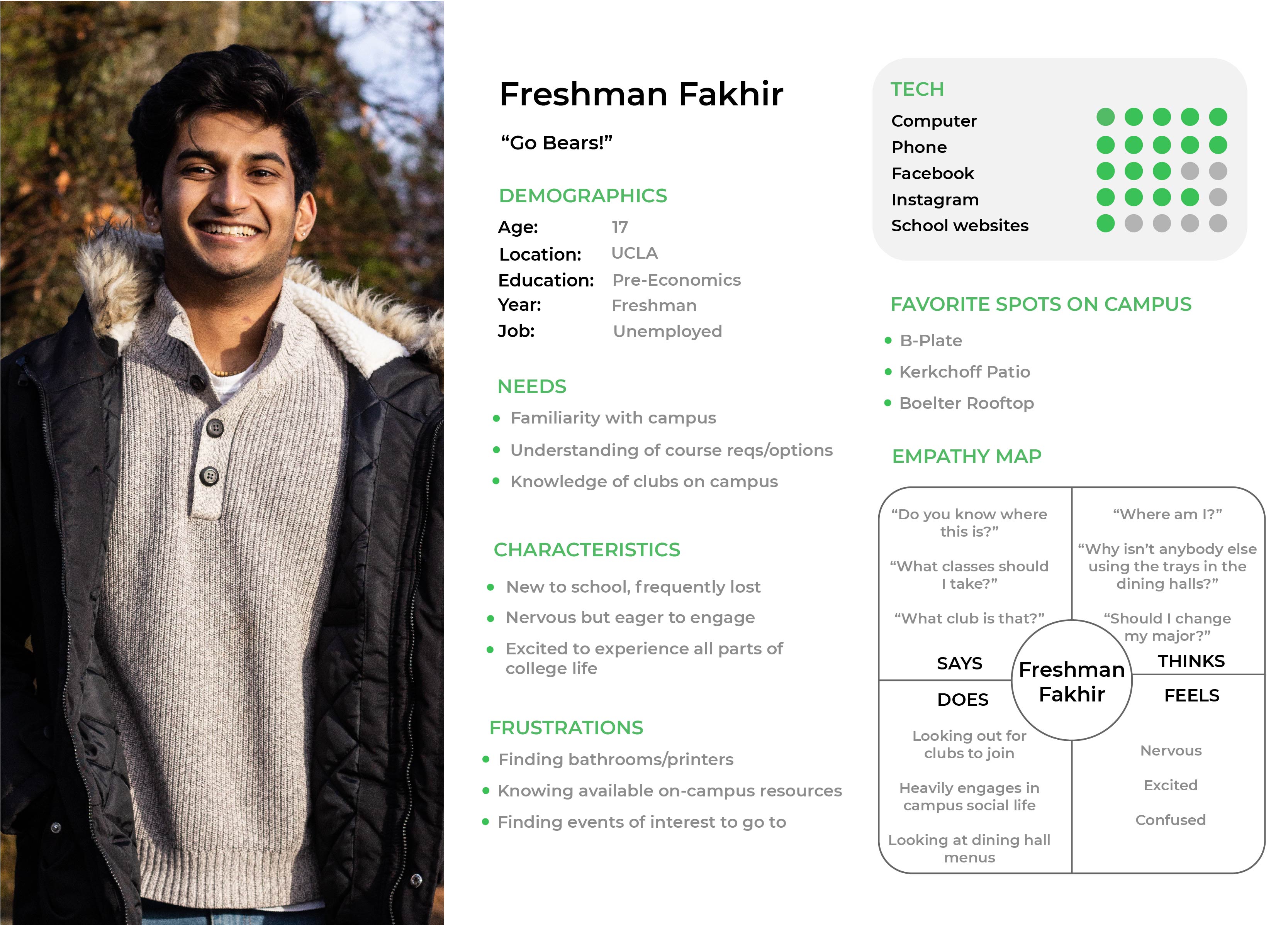
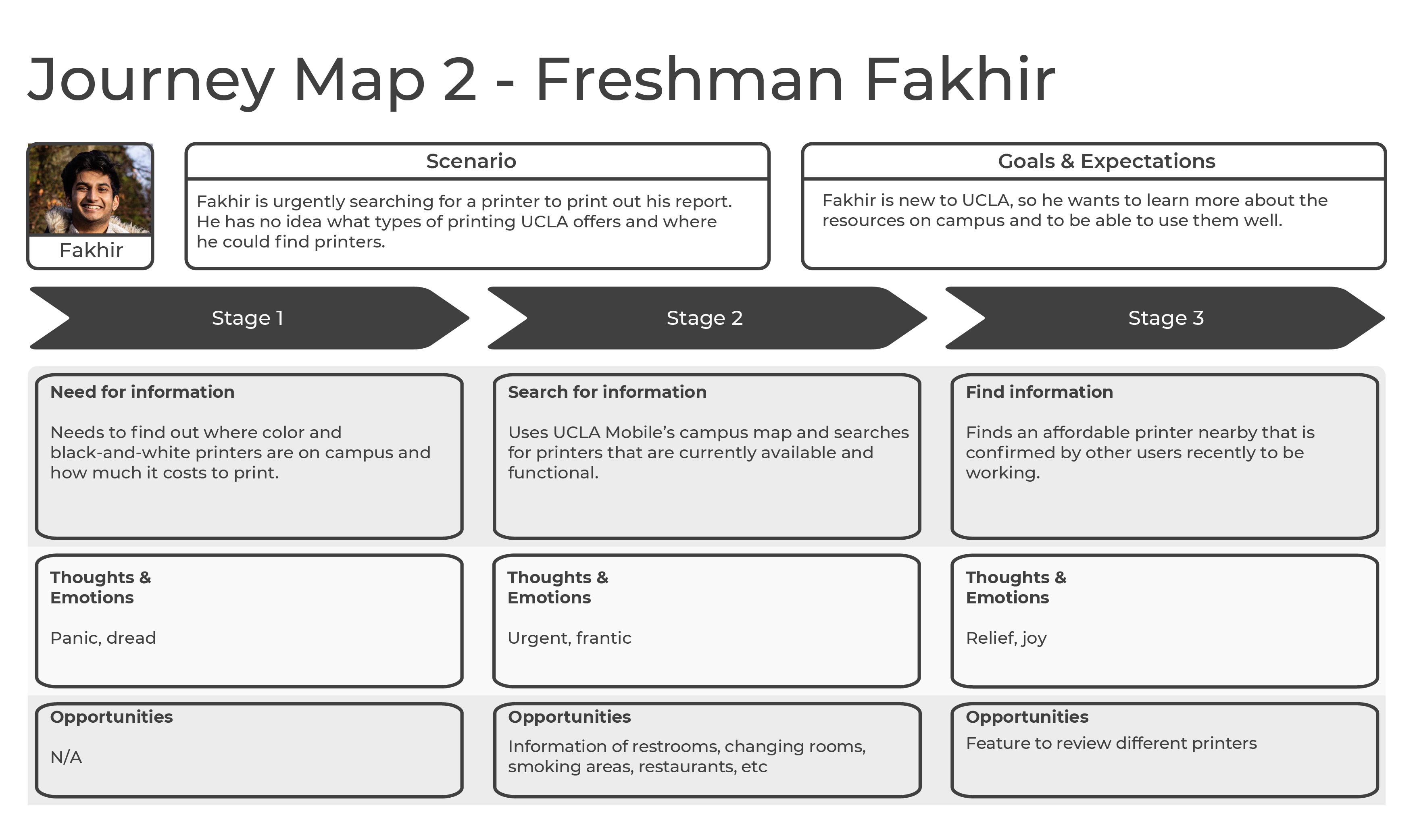 (See the other personas and scenarios here)
From the usability testing, contextual inquiry, and user personas and scenarios, I decided on three tasks to hold priority for the student population at UCLA: knowing where things are on campus, such as buildings, offices, printers, and bathrooms; keeping track of courses and knowing what deadlines to keep in mind; and keeping up to date on the events on campus. I created a low-fidelity prototype to demonstrate how these tasks would work on a redesigned app, and had a user test the paper prototype with a highlighter. The unfamiliarity of using an app on paper proved to be difficult, because implied actions like scrolling did not catch on with my test user for the low-fidelity prototype, but was caught on by the user for the high-fidelity prototype.
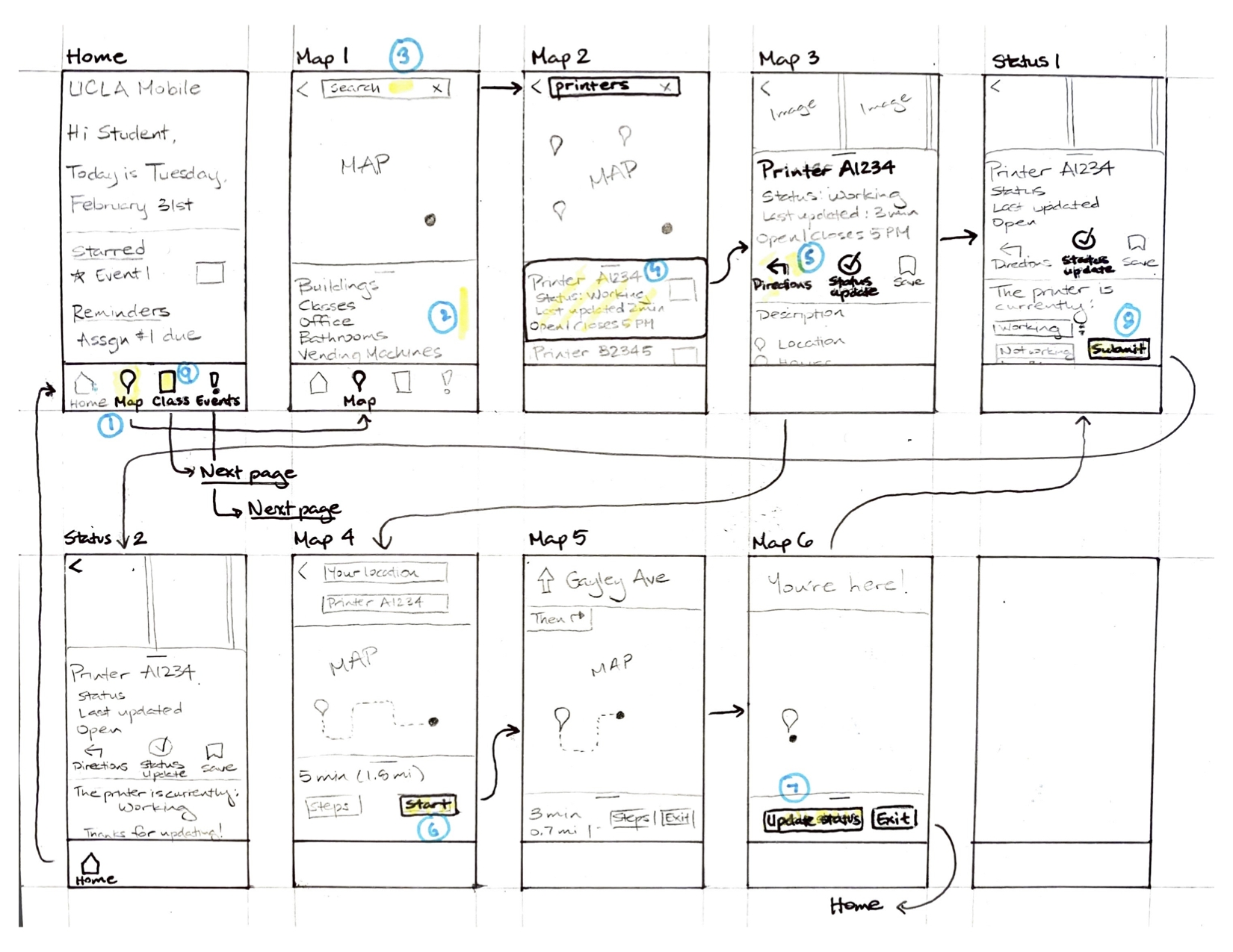 (See more of the low-fidelity prototype here)
When creating the high-fidelity prototype, I wanted an interface that was familiar and comfortable for the average student to use. The interface that is used on the original UCLA Mobile app is not familiar and makes the overall user experience much more difficult than necessary, so I referenced heavily from Facebook and Google Maps to design the map and event feature, and UCLA's CCLE app for the classes feature. The color scheme is simple to avoid creating disctractions on the screen: the main colors are a light UCLA blue, white, and three shades of grey.
Link to interactive prototype
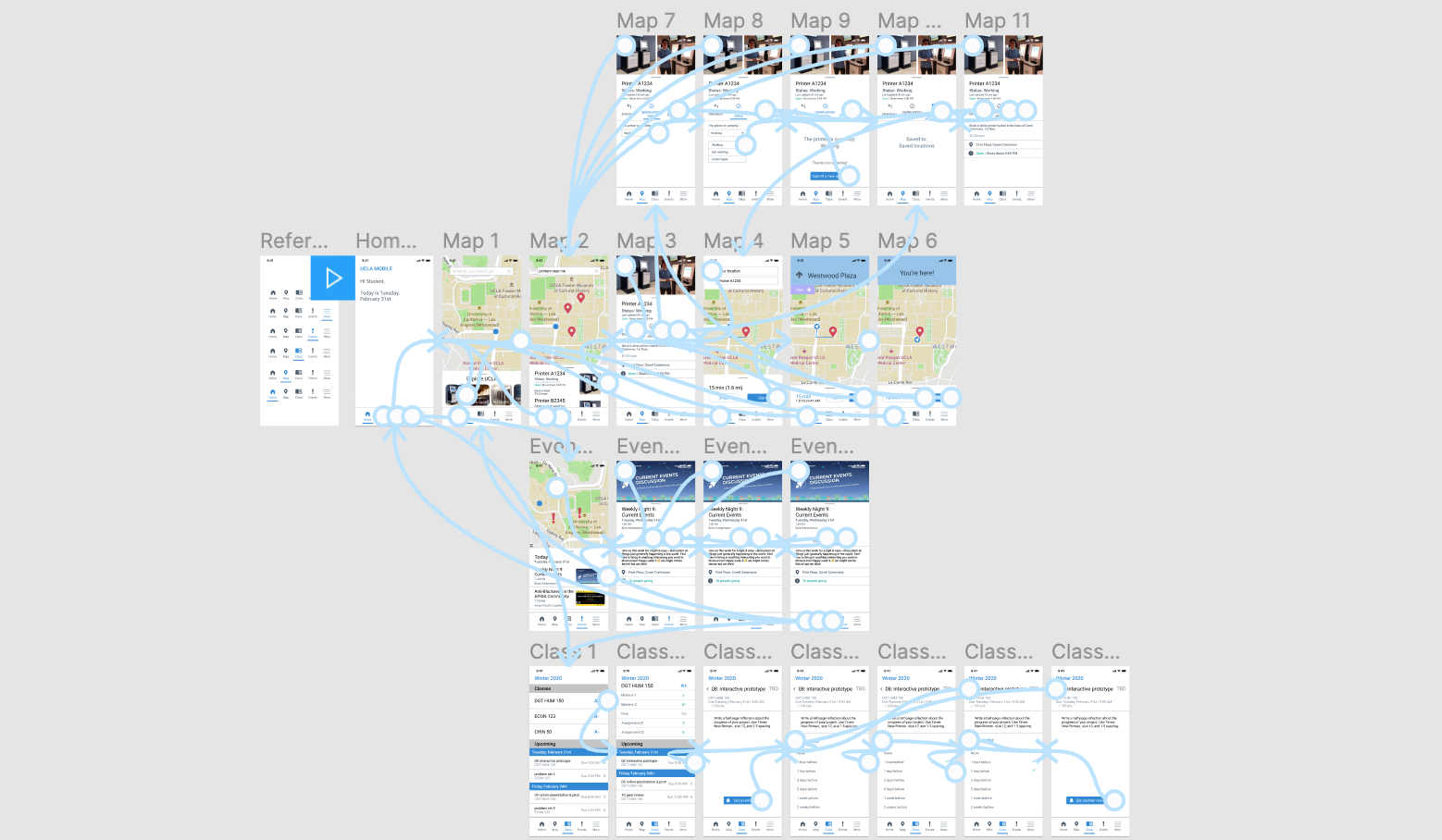 (See more of the high-fidelity prototype here)
I learned that the target audience, students, seem to want a way to interact with their college environment as much as possible, to fully utilize their time there. The test users noted frustrations with not knowing local information that they expect to be easily accessible, and said that they would find use from an app that consolidated all of their college needs into one space. By testing my prototypes, I realized how many reaction cues that users depend on in order to navigate through an app, such as differences in color, motion, and design. I was able to realize the importance of putting myself in my user's shoes through the techniques that we learned in the course, like the usability test and the contextual inquiry. It was also interesting to learn that the essential aspects needed to make a user-friendly app/website/product can be broken down and checked throughout the iteration processes to track the project's development. I never thought about the importance of the accessibility of a website until this class. I had a lot of fun working on my own UX project throughout this quarter, because my technical skills were challenged every step of the way.