Repository navigation
feat(website): add standalone TeamAI site and use-case contribution entry - #1206
MertensMing wants to merge 2 commits into
Conversation


|
No confident findings in the specified PR diff. The PR description meets the testing requirement: it records post-build real-CLI checks and two real-CLI E2E tests. The reported full-suite failures alone do not establish a defect introduced by this diff. Review was read-only; I did not run, build, or install anything from the PR. |

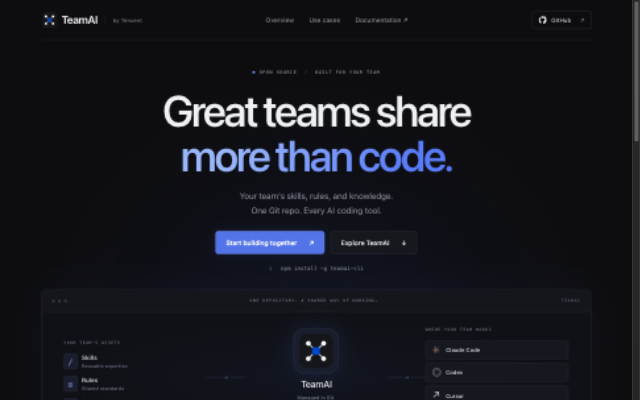
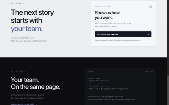
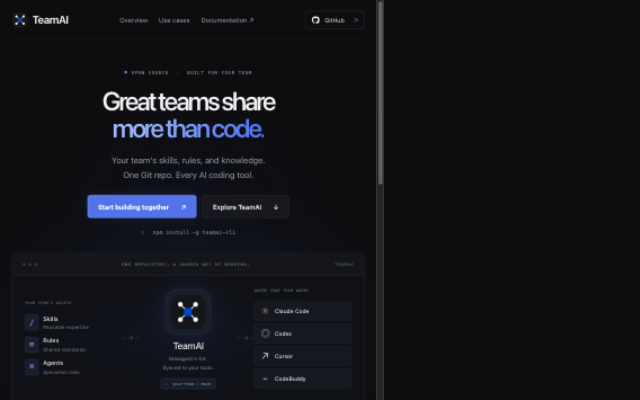
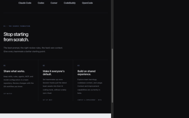
📱 Visual preview & responsive layout walkthroughNote This visual walkthrough is provided purely for tracking and reference purposes to show how the proposed static site layout adapts across different viewports and devices. This is neither an acceptance nor a rejection of the proposed design, but rather a visual reference to facilitate discussion and review. 🎨 Theme & Appearance (Light / Dark Mode)
📐 Responsive Breakdown by Screen Size
|
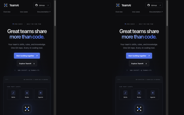
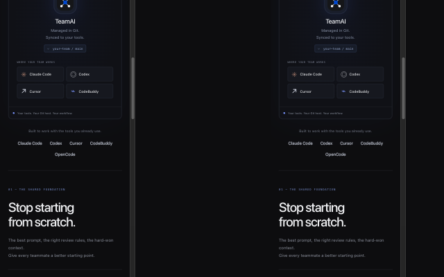
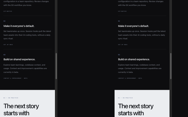

|
Thanks @SaulMoro for the visual walkthrough and the screenshots across desktop, tablet, and mobile. I've reviewed the theme observations against the implementation. The page currently uses a fixed dark palette with a light community section; it does not offer a full light theme or a theme switcher. I suggest keeping that scope for this initial version while the overall design is being discussed. A full light theme can be considered separately if maintainers would like one. Since the walkthrough documents the current behavior and does not request a specific change, I'm leaving the implementation unchanged for now. This PR remains a draft pending confirmation of the scope in #1131 and design feedback. |
|
Following up on my earlier comment: I took another pass through the responsive layouts and pushed c9521c1 with a few targeted improvements.
Validation: website build and both website tests passed; root build and the built CLI --version passed (0.22.0). Browser checks at 320, 390, 650, 651, 768, 800, 801, 1024, and 1280px showed no page-level horizontal overflow or clipped headings/buttons. Keyboard horizontal scrolling was checked at 320px. The full CLI test suite was not rerun for these HTML/CSS changes. The theme remains unchanged, and this PR is still a draft pending scope/design confirmation. |
3 participants


Summary
Add a standalone static TeamAI site under
website/, with a product overview, Git-to-tool sync diagram, getting-started links, and an entry for community use cases.The site asks for real setups and workflows through #1131. No use cases are invented:
website/use-cases/stays empty until a real contribution arrives; the build creates the empty directory on fresh checkouts. English and Chinese instructions explain how to propose and contribute a page.Type of Change
Test Plan
npm run build --prefix websiteandnpm test --prefix website: 2 tests pass, checking public output isolation and homepage assets/anchors.npm run build,npx tsc --noEmit, andnpm run lintpassed with Node 20.19.5.node dist/index.js --versionreturned0.22.0;--helpcompleted.npx vitest run --config vitest.e2e.config.ts src/__tests__/e2e/init-unattended.test.ts --maxWorkers=2: 2 real-CLI E2E tests passed in isolated fixtures.npm pack --dry-run --json: website files are excluded from the CLI package.hooks-reconcile-scope.test.ts(project-gate real-shell test) andproject-hook-rules.test.ts(ZCode doctor test). The former also fails in isolation with ENOTDIR accessing.git/hooks/post-checkoutin this worktree, where.gitis a file. The latter is not yet diagnosed. No CLI/hooks source changes are included.Related Issues
Related to #1131.
Notes for Reviewers
Draft for scope/design review while full-suite validation remains unresolved. Plain HTML/CSS and Node built-ins; no framework or added dependencies. A dedicated workflow checks the site.
Hosting, domain, and automatic publication remain to be agreed with maintainers. This PR does not deploy a site. Replace the empty case state only after a real community contribution.