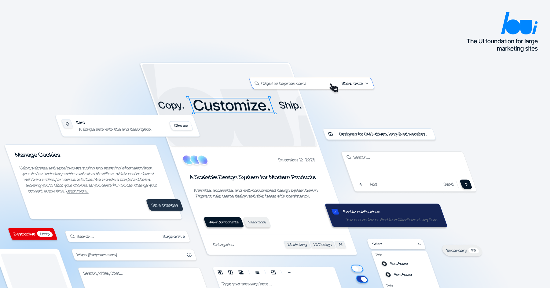


Astro UI components you copy into your project. Zero-JS by default, built on Tailwind CSS v4, following the shadcn/ui approach.
- Astro-native — Pure
.astrocomponents, no framework runtime - Zero-JS by default — Most components ship no client JavaScript
- Tailwind CSS v4 — Modern utility-first styling
- 26+ components — Buttons, cards, dialogs, menus, and more
- shadcn registry compatible — Same schema, familiar patterns
- CLI included — Scaffold projects and add components in seconds
Interactive components use @data-slot — headless behavior primitives we built as the "Radix for vanilla JS". Unlike other Astro shadcn ports that bundle interaction code into copied components, @data-slot keeps behavior as a dependency. When we fix an accessibility bug, you get the fix with a version bump instead of re-copying code.
npx bejamas@latest initThen add components:
npx bejamas@latest add button---
import Button from "@/ui/Button.astro";
---
<Button>Click me</Button>Visit ui.bejamas.com to view the full documentation.
Please read the contributing guide.
Licensed under the MIT license.