

Cross-platform simple dialogs for React Native based on the native Modal component.
React Native Simple Dialogs provides flexible, easy-to-use dialogs (Custom, Confirm, and Progress) for React Native with zero native linking, Safe Area support via the safeAreaInsets prop, and platform-tailored aesthetics for Android and iOS.


Quick Start · Why · Screenshots · Compatibility · Installation · Usage · API Reference · Platform Notes · Contributing
# 1. Install dependency
yarn add react-native-simple-dialogs
# or: npm install --save react-native-simple-dialogs
import React, { useState } from 'react';
import { Button, View, Text } from 'react-native';
import { ConfirmDialog } from 'react-native-simple-dialogs';
export default function App() {
const [visible, setVisible] = useState(false);
return (
<View style={{ flex: 1, justifyContent: 'center', alignItems: 'center' }}>
<Button title="Show Confirm Dialog" onPress={() => setVisible(true)} />
<ConfirmDialog
title="Confirm Action"
message="Are you sure you want to proceed?"
visible={visible}
onTouchOutside={() => setVisible(false)}
onRequestClose={() => setVisible(false)}
positiveButton={{
title: 'YES',
onPress: () => {
setVisible(false);
alert('Confirmed!');
},
}}
negativeButton={{
title: 'NO',
onPress: () => setVisible(false),
}}
/>
</View>
);
}- ⚛️ Pure React Native. Built on top of React Native's built-in
ModalandActivityIndicator. Zero native pods, zero linking errors, zero native compilation hassles. - 📱 Cross-Platform Elegance. Automatically adapts to platform conventions: Material Design elevation and uppercase action styling on Android, and clean Cupertino styling on iOS.
- 🎛️ 3 Ready-to-Use Dialog Types. Ships with
Dialog(fully custom content & buttons),ConfirmDialog(message prompt with positive/negative actions), andProgressDialog(loading indicator). - 🛡️ Safe Area Insets Support. Accepts a
safeAreaInsetsprop compatible withreact-native-safe-area-contextto cleanly avoid notches, status bars, and home indicators. - 👆 Backdrop & Hardware Back Dismiss. Effortless dismissal via
onTouchOutsidetaps and native Android hardware back button events (onRequestClose). - 🎨 Deep Styling Freedom. Fine-grained control over title, message, dialog card, buttons container, and backdrop overlay styles.
- ⌨️ Keyboard-Friendly Scrolling. Forwards
keyboardDismissModeandkeyboardShouldPersistTapsto the dialog'sScrollView, for dialogs with form inputs. - 📘 First-Class TypeScript. Bundled with strict TypeScript definitions and IntelliSense documentation for all props.
| Dialog Type | Android | iOS |
|---|---|---|
| Custom Dialog | 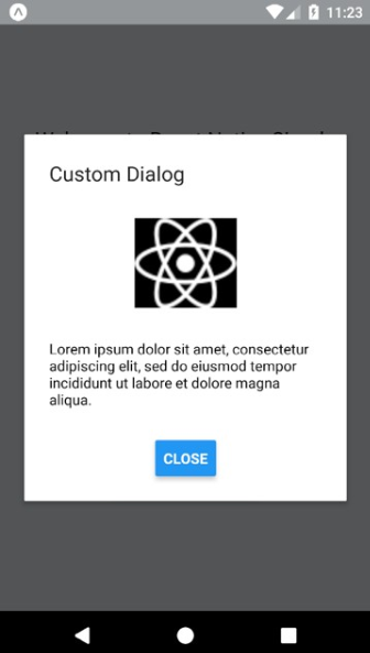 |
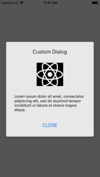 |
| Confirm Dialog | 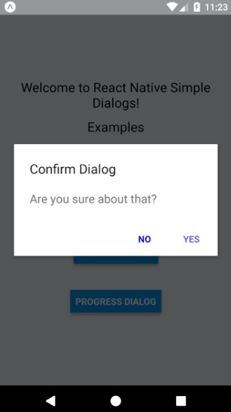 |
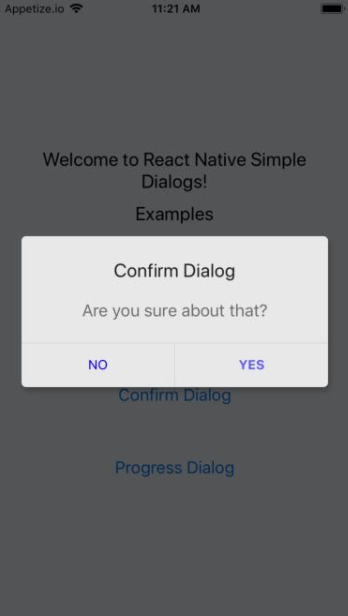 |
| Progress Dialog | 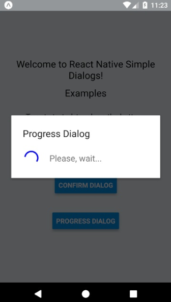 |
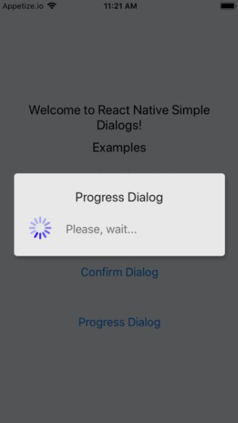 |
Try the dialogs directly in your browser or device using the Expo Snack Example.
| React Native Version | Recommended Library Version | Notes |
|---|---|---|
RN >= 0.58.0 |
react-native-simple-dialogs@latest (^3.0.0) |
TypeScript support, safe area insets |
RN 0.56.0 ... 0.57.8 |
react-native-simple-dialogs@1.0.0 |
Legacy compatibility |
RN 0.44.0 ... 0.55.4 |
react-native-simple-dialogs@0.3.1 |
Initial release line |
Add the library to your project dependencies:
# Using Yarn
yarn add react-native-simple-dialogs

# Using npm
npm install --save react-native-simple-dialogs
Note
Because react-native-simple-dialogs is implemented entirely in TypeScript / JavaScript over React Native core components, no native linking or pod install step is required. It works seamlessly with both Expo (Managed & Bare workflows) and standard React Native CLI projects.
Render arbitrary React elements inside the dialog body, with optional header title and action buttons:
import React, { useState } from 'react';
import { View, Text, Button, StyleSheet } from 'react-native';
import { Dialog } from 'react-native-simple-dialogs';

export function CustomDialogExample() {
  const [dialogVisible, setDialogVisible] = useState(false);

  return (
    <View>
      <Button title="Open Custom Dialog" onPress={() => setDialogVisible(true)} />

      <Dialog
        visible={dialogVisible}
        title="Custom Dialog"
        onTouchOutside={() => setDialogVisible(false)}
        onRequestClose={() => setDialogVisible(false)}
        animationType="fade"
        buttons={
          <View style={styles.buttonRow}>
            <Button title="DISMISS" onPress={() => setDialogVisible(false)} />
          </View>
        }
      >
        <View style={styles.dialogContent}>
          <Text style={styles.contentText}>
            This is custom dialog content! You can render any React Native component hierarchy here.
          </Text>
        </View>
      </Dialog>
    </View>
  );
}

const styles = StyleSheet.create({
  buttonRow: {
    flexDirection: 'row',
    justifyContent: 'flex-end',
    padding: 8,
  },
  dialogContent: {
    paddingVertical: 12,
  },
  contentText: {
    fontSize: 16,
    color: '#333333',
  },
});import React, { useState } from 'react';
import { View, Button } from 'react-native';
import { ConfirmDialog } from 'react-native-simple-dialogs';
export function ConfirmMessageExample() {
const [dialogVisible, setDialogVisible] = useState(false);
return (
<View>
<Button title="Open Confirm" onPress={() => setDialogVisible(true)} />
<ConfirmDialog
title="Delete Item"
message="Are you sure you want to delete this record? This action cannot be undone."
visible={dialogVisible}
onTouchOutside={() => setDialogVisible(false)}
onRequestClose={() => setDialogVisible(false)}
positiveButton={{
title: 'YES',
onPress: () => {
setDialogVisible(false);
console.log('Action confirmed');
},
}}
negativeButton={{
title: 'NO',
onPress: () => setDialogVisible(false),
}}
/>
</View>
);
}ConfirmDialog also accepts children, allowing you to embed complex custom views while retaining the standardized positive and negative button bar:
import React, { useState } from 'react';
import { View, Text, TextInput, Button } from 'react-native';
import { ConfirmDialog } from 'react-native-simple-dialogs';

export function ConfirmCustomContentExample() {
  const [dialogVisible, setDialogVisible] = useState(false);
  const [inputVal, setInputVal] = useState('');

  return (
    <View>
      <Button title="Prompt Dialog" onPress={() => setDialogVisible(true)} />

      <ConfirmDialog
        title="Quick Feedback"
        visible={dialogVisible}
        onTouchOutside={() => setDialogVisible(false)}
        onRequestClose={() => setDialogVisible(false)}
        positiveButton={{
          title: 'SUBMIT',
          onPress: () => {
            setDialogVisible(false);
            console.log('Submitted:', inputVal);
          },
        }}
        negativeButton={{
          title: 'CANCEL',
          onPress: () => setDialogVisible(false),
        }}
      >
        <View style={{ paddingVertical: 10 }}>
          <Text style={{ marginBottom: 8 }}>Please leave a short comment:</Text>
          <TextInput
            value={inputVal}
            onChangeText={setInputVal}
            placeholder="Type your message..."
            style={{ borderWidth: 1, borderColor: '#ccc', borderRadius: 6, padding: 8 }}
          />
        </View>
      </ConfirmDialog>
    </View>
  );
}Displays a modal loading indicator alongside a descriptive message:
import React, { useState } from 'react';
import { View, Button } from 'react-native';
import { ProgressDialog } from 'react-native-simple-dialogs';

export function ProgressDialogExample() {
  const [loading, setLoading] = useState(false);

  const handleStartTask = () => {
    setLoading(true);
    setTimeout(() => {
      setLoading(false);
    }, 3000);
  };

  return (
    <View>
      <Button title="Start Async Task" onPress={handleStartTask} />

      <ProgressDialog
        visible={loading}
        title="Processing"
        message="Please, wait..."
        activityIndicatorColor="#3fd0ff"
        activityIndicatorSize="large"
      />
    </View>
  );
}Due to the deprecation of React Native's legacy SafeAreaView, Dialog supports a safeAreaInsets prop to guarantee appropriate padding around notches, dynamic islands, status bars, and home indicators.
You can combine it with react-native-safe-area-context:
import React, { useState } from 'react';
import { View, Text } from 'react-native';
import { useSafeAreaInsets } from 'react-native-safe-area-context';
import { Dialog } from 'react-native-simple-dialogs';

export function SafeAreaDialogExample() {
  const [visible, setVisible] = useState(true);
  const insets = useSafeAreaInsets();

  return (
    <Dialog
      visible={visible}
      title="Safe Area Aware"
      safeAreaInsets={insets}
      onTouchOutside={() => setVisible(false)}
      onRequestClose={() => setVisible(false)}
    >
      <View>
        <Text>This dialog respects device insets and notches cleanly.</Text>
      </View>
    </Dialog>
  );
}
See the complete runnable implementation in the Sample project.
The base dialog component upon which ConfirmDialog and ProgressDialog are built.
| Prop | Type | Default | Description |
|---|---|---|---|
visible |
boolean |
false |
Controls modal visibility. |
onRequestClose |
() => void |
() => null |
Callback invoked when the user presses the Android hardware back button. |
animationType |
'none' | 'slide' | 'fade' |
'none' |
Controls how the modal transition animates. |
onShow |
() => void |
undefined |
Callback invoked once the modal is fully displayed. |
onTouchOutside |
() => void |
undefined |
Callback invoked when the user taps the overlay outside the dialog box. |
children |
React.ReactNode |
undefined |
Custom content elements rendered inside the dialog body. |
title |
string |
undefined |
Modal title text displayed at the top. |
titleStyle |
StyleProp<TextStyle> |
undefined |
Custom style applied to the title text. |
dialogStyle |
StyleProp<ViewStyle> |
undefined |
Custom style applied to the dialog card container. |
contentStyle |
StyleProp<ViewStyle> |
undefined |
Custom style applied to the dialog body content wrapper. |
buttonsStyle |
StyleProp<ViewStyle> |
undefined |
Custom style applied to the buttons container wrapper. |
overlayStyle |
StyleProp<ViewStyle> |
undefined |
Custom style applied to the full-screen backdrop overlay. |
buttons |
React.ReactNode |
undefined |
Custom button element(s) rendered at the bottom of the dialog. |
safeAreaInsets |
EdgeInsets |
undefined |
Inset offsets { top, bottom, left, right } to avoid notches and status bars. |
supportedOrientations |
ModalProps['supportedOrientations'] |
['portrait'] |
Supported orientations on iOS (e.g. 'portrait', 'landscape'). |
onOrientationChange |
() => void |
undefined |
iOS callback triggered on device orientation changes while the dialog is visible. |
statusBarTranslucent |
boolean |
undefined |
Android: Determines whether the modal backdrop extends underneath the system status bar. |
keyboardDismissMode |
'none' | 'on-drag' | 'interactive' |
undefined |
Determines whether the keyboard is dismissed in response to a drag. |
keyboardShouldPersistTaps |
'always' | 'never' | 'handled' | boolean |
undefined |
Controls whether the keyboard stays visible after tapping inside the dialog scroll view. |
contentInsetAdjustmentBehavior |
ScrollViewProps['contentInsetAdjustmentBehavior'] |
'never' |
Specifies how safe area insets modify the scroll area. |
testID |
string |
undefined |
Test identifier used to locate the dialog in end-to-end testing suites. |
accessible |
boolean |
undefined |
Indicates whether the dialog view is an accessibility element. |
accessibilityLabel |
string |
undefined |
Overrides the text read by screen readers. |
accessibility* / role |
ModalProps |
undefined |
Additional accessibility props (accessibilityActions, accessibilityRole, accessibilityState, accessibilityHint, accessibilityValue, onAccessibilityAction, importantForAccessibility, role) forwarded directly to Modal. |
Inherits all props from <Dialog> except buttons (which ConfirmDialog renders itself from positiveButton and negativeButton), plus:
| Prop | Type | Default | Description |
|---|---|---|---|
positiveButton |
ConfirmDialogButtonPropsType |
REQUIRED | Configuration object for the primary / positive action button. |
negativeButton |
ConfirmDialogButtonPropsType |
undefined |
Optional configuration object for the secondary / cancel action button. |
message |
string |
undefined |
Message text displayed in the body of the confirm dialog. |
messageStyle |
StyleProp<TextStyle> |
undefined |
Custom style applied to the message text. |
| Field | Type | Default | Description |
|---|---|---|---|
title |
string |
REQUIRED | Button text label. |
onPress |
() => void |
REQUIRED | Callback triggered when the button is pressed. |
disabled |
boolean |
false |
Disables button interactions when true. |
titleStyle |
StyleProp<TextStyle & { colorDisabled?: string }> |
undefined |
Custom text styling, with optional colorDisabled. |
style |
StyleProp<ViewStyle & { backgroundColorDisabled?: string }> |
undefined |
Custom button view styling, with optional backgroundColorDisabled. |
Inherits all props from <Dialog>, plus:
| Prop | Type | Default | Description |
|---|---|---|---|
message |
React.ReactNode |
undefined |
Text or node displayed alongside the activity indicator. |
messageStyle |
StyleProp<TextStyle> |
undefined |
Custom text style applied to the message. |
activityIndicatorColor |
ColorValue |
undefined |
Tint color of the activity indicator spinner. |
activityIndicatorSize |
'small' | 'large' | number |
undefined |
Size of the activity indicator. (Numeric size is supported on Android only). |
activityIndicatorStyle |
StyleProp<ViewStyle> |
undefined |
Custom style applied directly to the ActivityIndicator. |
Used by safeAreaInsets to calculate boundary padding:
interface EdgeInsets {
  top: number;
  right: number;
  bottom: number;
  left: number;
}- Android Hardware Back Button: Always pass
onRequestClose; its default is a no-op, so the back button does nothing otherwise.onTouchOutsideonly handles taps on the backdrop. - Translucent Status Bar (Android): When your application uses a translucent status bar, supply
statusBarTranslucent={true}to ensure the overlay backdrop dims the entire screen seamlessly. - Orientation Changes (iOS): When supporting multiple device orientations on iOS, configure
supportedOrientations={['portrait', 'landscape']}and optionally attach anonOrientationChangecallback. - Expo Friendly: Zero native code means
react-native-simple-dialogsworks out-of-the-box in Expo Go and EAS Build without custom native dev clients.
Bug fixes, improvements, and documentation suggestions are welcome!
- Fork the repository and create your topic branch (
git checkout -b feature/my-feature). - Verify code quality with TypeScript build and lint checks (
yarn buildandnpx eslint src). - Commit your changes using Conventional Commits.
- Push to your branch and open a descriptive Pull Request.
For questions, bug reports, and feature proposals, please open an issue.
If this library saved you development time, consider supporting the maintainer:


The MIT License (MIT)

Copyright (c) 2017 Douglas Nassif Roma Junior
See the full license file.

Discover more open-source libraries, creative animation engines, and developer tools at douglasjunior.work.