

PROPS is a library of free, open-source sections for Shopify themes. Each section is a single Liquid file that carries its own styles, script and theme editor settings, so adding one to a store is a copy and a paste.
Browse the library · Install guide · Report a theme issue
- Copy the code. Pick a section below, follow its Code link and press GitHub's Copy raw file button at the top right of the file.
- Open the code editor. In your Shopify admin, go to Online Store → Themes, press the ⋯ button beside Customize and choose Edit code.
- Create a file. In the Sections folder, choose Add a new section and name it after the file, for example
props-bg-media-hero. Shopify adds the.liquidending. - Paste and save. Replace the starter code Shopify generates with the code you copied, then save.
- Open Customize. The section now appears under Add section.
- Customize and publish. Place it on a page, adjust its settings in the sidebar and save.
The install guide shows each step with a screenshot.
12 sections so far. Each one links to a live preview on the PROPS site and to its code in this repository.
 BG Media Hero A full-width hero section with a background image or video. Preview · Code |
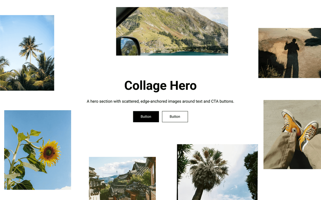 Collage Hero A hero section with scattered, edge-anchored images around text and CTA buttons. Preview · Code |
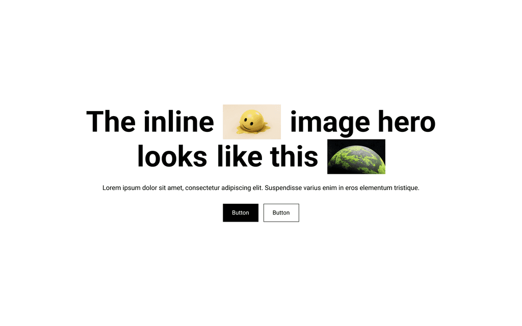 Inline Image Hero A hero section with images embedded directly inside the heading text. Preview · Code |
 Gallery Grid A clean, responsive gallery with customizable layouts. Preview · Code |
 Slider Gallery A two-column section with a horizontal image slider. Preview · Code |
 Logo Marquee Display partner, client, or brand logos in a continuously scrolling ticker. Preview · Code |
 Logo Showcase Display logos in a responsive grid, in two layouts. Preview · Code |
 Looping Testimonials (Ticker) An infinite-scrolling horizontal ticker of testimonial cards. Preview · Code |
 Testimonials Slider A testimonial slider with image, quote, author info, and logo. Preview · Code |
 Timeline An animated timeline that supports text blocks, images, and links. Preview · Code |
 Before / After Slider An interactive image comparison slider with draggable handle. Preview · Code |
 Ticker (Infinite Loop) Infinite-scrolling horizontal ticker for images, text, or a mix of both. Preview · Code |
Sections are written to work in any Online Store 2.0 theme: their own class names carry a props- prefix, styles are scoped to the section, and no section loads a library or needs another file from the theme.
We test on Dawn, Shopify's reference theme, and not yet on others. If a section misbehaves in your theme, a theme report tells us where to look, and a report that a section works in a theme we haven't tried is just as useful.
sections.json lists every section with its category, tags, version, a one-line description and the raw URL of its file. Installing a section programmatically means fetching that one file and saving it to sections/ in a theme.
Theme reports, bug reports and section requests all help. CONTRIBUTING.md explains how each one works and the standard a section is built to.
MIT. Use the sections in your own store, in client work or inside a theme you sell, and change them however you like. Keep the comment at the top of each file so the license travels with the code.
PROPS is made by House of Brilliant Ideas, an agency that does design, strategy and development.