Project: I chose these two website, Handshake and Glassdoor, because I am a senior and am commonly using websites like these to look for potential employers. It is really important for these websites to follow all 10 heuristics to ensure that user's can reach out to companies and find jobs.
Link: https://joinhandshake.com/
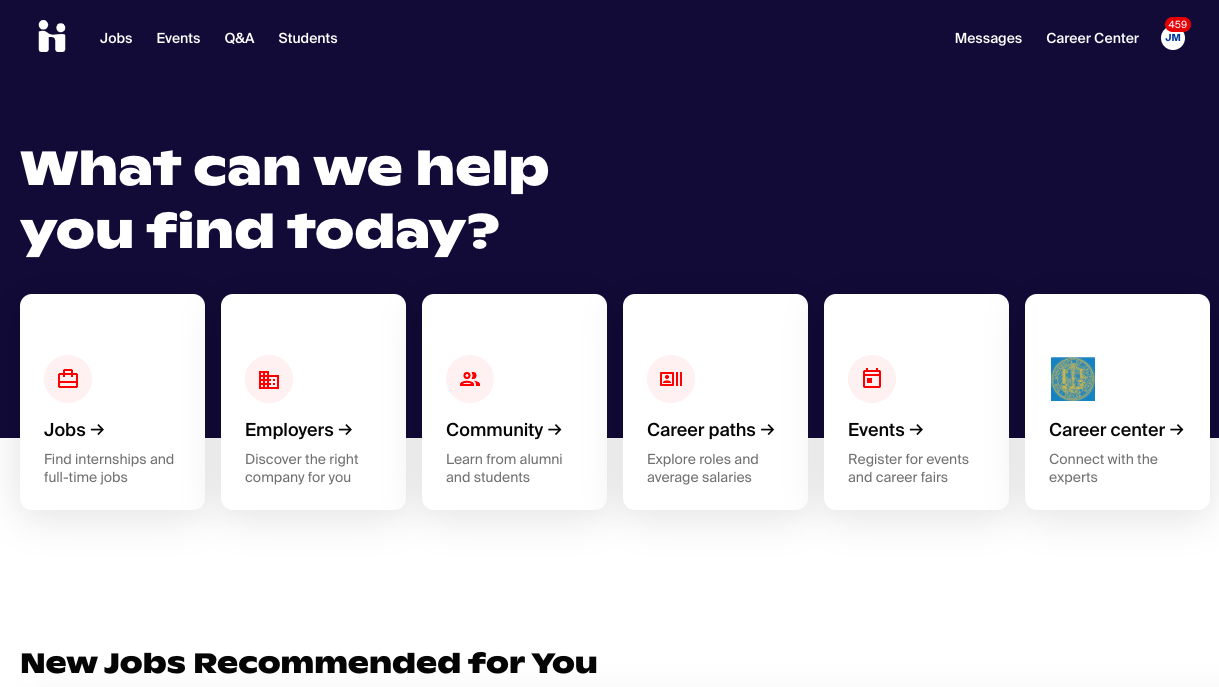
Handshake is a website where students and recent graduates can look at companies who are hiring. You can discover jobs and internships, directly message with employers, and connect with alumni and current employees. There are also student reviews of employers, links to virtual events, and applications you can fill out directly on the site.
| Heuristics Description | Evaluation | Improvements |
|---|---|---|
| 1. Visibility of system status: The user receives feedback from actions taken on the website promptly. | Good: The site loads fairly quickly when switching between pages, and a spinning circle shows that the site is being loaded. When hovering over words, they become underlined to show the user where they are on the page. The bottom of the jobs page has a page number at the bottom of the search. | Improvements: The line under words during hovering could be replaced by highlighting the words so it becomes more clear. The underline is somewhat far from the word so it may not be immediately clear.(Level 1 priority) The page number should also be at the top of the searches so that it is more easily seen.(Level 2 priority) |
| 2. Match between system and real world: Phrases and concepts on the site should be easily understood by the user. Information on the site should proceed in a logical order. | Good: The site bases the pages off of the user profile inlcuding their major so all the words should be understood by the user. Many headings include short explanations below them for further clarification. Bad: The homepage does not present the information in the most clear and natural way. There is a mix of information that causes it to be slightly confusing. On the jobs page there are immediately results without searching that can be very overwhelming. | Improvements: Allow for the flow of the page to be more natural, clarify the headings and information on the homepage. On the jobs page, allow for the user to search before offering results.(Level 1 priority) |
| 3. User control and freedom: The user has the ability to opt out or exit in the case they make a mistake or get confused. | Good: The user is able to go back to the homepage at any point when using the site. Bad: The home button is an icon that is not necessarily very clear, there is no "back" button. | Improvements: Add a homepage button that is clearly labeled, add a back button at the top of the search. (Level 3 priority) |
| 4. Consistency and standards: The website is standardized in language and design across all pages. | Bad: Every page looks different. The homepage is navy with white writing, every other page is white with black writing. Each page: jobs, students, events has a different layout. In jobs the search is at top, but in students, the search is on the side. The search filters are not the same, buttons boxes etc. | Improvements: Standardize the look across all pages on the site. Alter the search and filters so that they resemble all the others. (Level 2 priority) |
| 5. Error Prevention: Ensure that any common errors can be avoided. In addition, providing the user with pop-ups to make sure that the user is aware of all of their actions, such as confirmation messages. | Good: There are save functions so the user can save events and jobs to compile and look at later. Bad: The saved events cannot be easily found. There are no popups with warnings or confirmations. | Improvements: Make saved jobs and events into a new tab instead of being hard to find. (Level 2. priority) |
| 6. Recognition rather than recall: Provide all the necessary information in a clear manner so the user does not have to search for the information they need. | Good: There are many filters that allow the user to easily see considerations without having to search. There are also sorting functions so that you can view results by relevance, date posted, etc. Each posting has details under it so the user does not need to do additional research. Many headings include short explanations below them for further clarification. | Improvements: The site has met this requirement (No priority). |
| 7. Flexibility and efficiency of use: Provide shortcuts to make the user's experience more streamlined. This may also include customization or personalization based on the user's preferences. | The first step on the site is to sign into a profile. This tailors the information on the site to the individual user. Most of the jobs, events, students, etc has already gone through initial sorting as a shortcut for the user. | Improvements: The discover page is not filtered at all and includes irrelevant postings. This should be rectified to include more pertinent listings.(Level 2 priority) |
| 8. Aesthetic and minimalist design: Make sure that the website is clear, readable, and aesthetically pleasing. Eliminate any unnecessary or irrelevant information that clutters the page. | Good: The homepage has large font and the message is clear.Bad: When scrollng down the homepage, the information provides should be in other tabs, there is too much information on the first page. All other tabs have a lack of aesthetic and color. | Improvements: The homepage is way too cluttered and should be simplified. Additional tabs should include more color and design to make it more aesthetic. (Level 2 priority) |
| 9. Help users recognize, diagnose, and recover from errors: Any error message should express the problem and how to fix it in clear language. | Good: Under the profile button, there is a help tab that includes instructions on how to recover from errors they may encounter | Improvements: This location should be more clear and listed on the homepage. (Level 1 priority) |
| 10. Help and documentation: Provide easy to locate documentation to help with commonly asked questions and allow the user to quickly find answers. | Good: There Q&A tab at the top of the homepage. This makes it very quick to access. The largest message on the homepage is "What can we help you find today?" This ensures that the user feels comfortable and says that the website is willing and able to help | Improvements: The font size should be increased to make it more prominent.(Level 1 priority) |
Priority system used in the chart above
| Rating | Importance |
|---|---|
| 1 | Cosmetic problem only: need not be fixed unless extra time is available on project |
| 2 | Minor usability problem: fixing this should be given low priority |
| 3 | Major usability problem: important to fix, so should be given high priority |
Credit: Nielson Norman Group- https://www.nngroup.com/articles/how-to-rate-the-severity-of-usability-problems/)
Link: https://www.glassdoor.com/index.htm
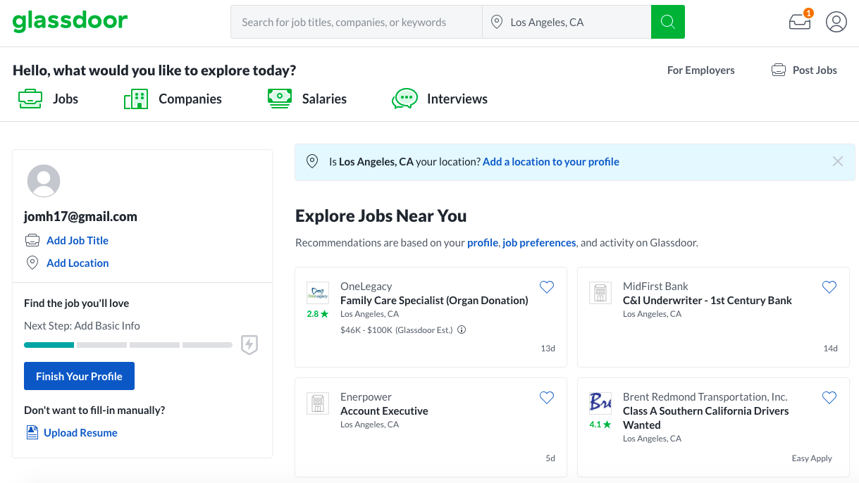
Glassdoor is a competing website where current and former employees rate companies and submit salaries anonymously. It also caters to users seeking to apply for open job listings. This allows users to see what working at a company would be like and seeing if they fit in the atmosphere before applying.
| Heuristics Description | Evaluation | Improvements |
|---|---|---|
| 1. Visibility of system status: The user receives feedback from actions taken on the website promptly. | Good: The site loads fairly quickly when switching between pages, and a spinning circle shows that the site is being loaded. There is a scroll bar within certain postings. Bad: There are no page numbers that tell the user where they are during their search. There was a loading error within the first 2 minutes of using the site. | Improvements: Page numbers need to be added so the user knows where they are.(Level 3 priority) Make sure that the website loads properly. (Level 3 priority) |
| 2. Match between system and real world: Phrases and concepts on the site should be easily understood by the user. Information on the site should proceed in a logical order. | Good: The users on the site should have a base knowledge of the phrases used on the site. Many of the phrases used on the site are very simple for easy understanding. Bad: The homepage does not proceed in a standard order the user would expect. | Improvements: Reorganize the information on the homepage for a more streamlined and simple reading experience.(Level 1 priority) |
| 3. User control and freedom: The user has the ability to opt out or exit in the case they make a mistake or get confused. | Good: The user is able to go back to the homepage at any point when using the site. Bad: The home button is an icon that is not necessarily very clear, there is no "back" button. | Improvements: Add a homepage button that is clearly labeled, add a back button at the top of the search. (Level 3 rating) |
| 4. Consistency and standards: The website is standardized in language and design across all pages. | Good Even though I do not like the design, most pages have a similar look that standardises the site. The language is very similar across all pages. Bad: The jobs and companies pages look alike but look nothing like the salaries and interviews pages. | Improvements: Standardize all pages so that the site is consistent.(Level 2 priority) |
| 5. Error Prevention: Ensure that any common errors can be avoided. In addition, providing the user with pop-ups to make sure that the user is aware of all of their actions, such as confirmation messages. | Good: There are save functions so the user can save events and jobs to compile and look at later. There is also a job alert button so the site can email you and update of any new job postings in the interested area.Bad: There was a loading error message that gave no information about how to fix the issue. The saved jobs cannot be accessed from the homepage. | Improvements: Saved jobs should be more prominently placed on the homepage. Error messages should provide helpful information. (Level 2 priority) |
| 6. Recognition rather than recall: Provide all the necessary information in a clear manner so the user does not have to search for the information they need. | Good: Each posting has details under it so the user does not need to do additional research. Many headings have drop down menus that include specific expansions under the topic for further clarification. | Improvements: Filters and sorting functions should be added near the search function so that searches can be narrowed down easily. (Level 3 priority) Headings should have short explanations underneath them for added clarity. (Level 1 priority) |
| 7. Flexibility and efficiency of use: Provide shortcuts to make the user's experience more streamlined. This may also include customization or personalization based on the user's preferences. | Good: The first step on the site is to create a profile. This includes things such as major, location, etc and tailors the information on the site to the individual user. Most of the jobs, events, students, etc has already gone through initial sorting as a shortcut for the user.Bad: The site requires an account to be made before using and asks questions that stusents looking for jobs cannot answer. The information asked in the profile is required to make an account. For example, it asked for information about your current employer which is not applicable to everyone | Improvements: The discover page is not filtered at all and includes irrelevant postings. This should be rectified to include more pertinent listings.(Level 2 priority) The site should be able to be used without making an account (Level 3 priority) |
| 8. Aesthetic and minimalist design: Make sure that the website is clear, readable, and aesthetically pleasing. Eliminate any unnecessary or irrelevant information that clutters the page. | Bad: The homepage does not have nice graphics or colors. There is too much information on the homepage that could be placed into different tabs. The resulting page looks ver cluttered and hard to read | Improvements: Add design and colors to all pages on the site, as well as simplify the information on the homepage so that the user is not overwhelmed. (Level 2 priority) |
| 9. Help users recognize, diagnose, and recover from errors: Any error message should express the problem and how to fix it in clear language. | Good: Under the profile button, there is a help tab that includes instructions on how to recover from errors they may encounter. Bad: There was a loading error message that gave no information about how to fix the issue. | Improvements: This location should be more clear and listed on the homepage. (Level 1 priority) Error messages should provide helpful information. (Level 2 priority) |
| 10. Help and documentation: Provide easy to locate documentation to help with commonly asked questions and allow the user to quickly find answers. | Bad: There is no section for frequently asked questions. This prevents the user from feeling comfortable on the site if anything goes wrong. | Improvements: A Q&A section needs to be added, that can be accessed from the homepage, so that users can easily get help. (Level 3 priority) |
Priority system used in the chart above
| Rating | Importance |
|---|---|
| 1 | Cosmetic problem only: need not be fixed unless extra time is available on project |
| 2 | Minor usability problem: fixing this should be given low priority |
| 3 | Major usability problem: important to fix, so should be given high priority |
Credit: Nielson Norman Group- https://www.nngroup.com/articles/how-to-rate-the-severity-of-usability-problems/)