Hi,
First thanks for this contribution, it is sure useful to have a tool to easily compute CCM in python!
I am unable to reproduce with exactitude your demonstration from "Quick Example" section in the docs (https://skccm.readthedocs.io/en/latest/quick-example.html).
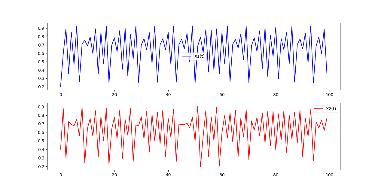
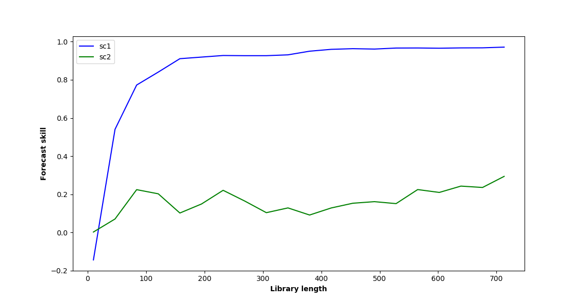
The last graph I obtain where I plot sc1 and sc2 (blue and green curve) differ a little bit from yours. Also, when I change the initial time series parameters to b12=0.2 and b21=0.05, the two curves almost perfectly overlap (which I found surprising since b12 is still 4 times bigger than b21).
See below for the script I used (the main part is code from your tutorial, I just added sections to plot the curves).
Am I missing something?
import numpy as np
import matplotlib.pyplot as plt
import skccm.data as data
import skccm as ccm
from skccm.utilities import train_test_split

# GRAPH 1
rx1 = 3.72 #determines chaotic behavior of the x1 series
rx2 = 3.72 #determines chaotic behavior of the x2 series
b12 = 0.2 #Influence of x1 on x2
b21 = 0.01 #Influence of x2 on x1
ts_length = 1000
x1,x2 = data.coupled_logistic(rx1,rx2,b12,b21,ts_length)

plt.figure(figsize=(15,8))
plt.subplot(2,1,1)
plt.plot(x1[:100], color='blue', label='X1(t)')
plt.legend(loc='best')
plt.subplot(2,1,2)
plt.plot(x2[:100], color='red', label='X2(t)')
plt.legend(loc='best')
plt.show()

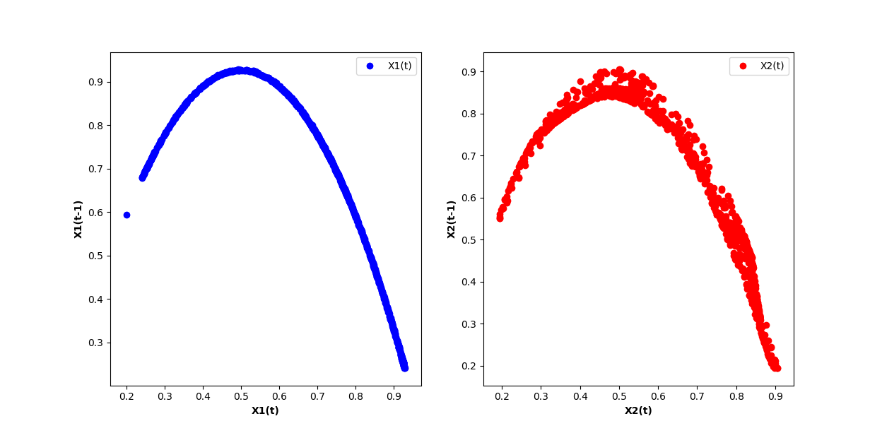
# GRAPH 2
lag = 1
embed = 2
e1 = ccm.Embed(x1)
e2 = ccm.Embed(x2)
X1 = e1.embed_vectors_1d(lag,embed)
X2 = e2.embed_vectors_1d(lag,embed)

plt.figure(figsize=(15,8))
plt.subplot(1,2,1)
plt.scatter(X1[:,0], X1[:,1], color='blue', label='X1(t)')
plt.xlabel('X1(t)', fontweight='bold')
plt.ylabel('X1(t-1)', fontweight='bold')
plt.legend(loc='best')
plt.subplot(1,2,2)
plt.scatter(X2[:,0], X2[:,1], color='red', label='X2(t)')
plt.xlabel('X2(t)', fontweight='bold')
plt.ylabel('X2(t-1)', fontweight='bold')
plt.legend(loc='best')
plt.show()

# GRAPH 3
#split the embedded time series
x1tr, x1te, x2tr, x2te = train_test_split(X1,X2, percent=.75)

CCM = ccm.CCM() #initiate the class

#library lengths to test
len_tr = len(x1tr)
lib_lens = np.arange(10, len_tr, len_tr/20, dtype='int')

#test causation
CCM.fit(x1tr,x2tr)
x1p, x2p = CCM.predict(x1te, x2te,lib_lengths=lib_lens)

sc1,sc2 = CCM.score()

plt.figure(figsize=(15,8))
plt.plot(lib_lens, sc1, color='blue', label='sc1')
plt.plot(lib_lens, sc2, color='green', label='sc2')
plt.xlabel('Library length', fontweight='bold')
plt.ylabel('Forecast skill', fontweight='bold')
plt.legend(loc='best')
plt.show()
Hi,
First thanks for this contribution, it is sure useful to have a tool to easily compute CCM in python!
I am unable to reproduce with exactitude your demonstration from "Quick Example" section in the docs (https://skccm.readthedocs.io/en/latest/quick-example.html).
The last graph I obtain where I plot sc1 and sc2 (blue and green curve) differ a little bit from yours. Also, when I change the initial time series parameters to b12=0.2 and b21=0.05, the two curves almost perfectly overlap (which I found surprising since b12 is still 4 times bigger than b21).
See below for the script I used (the main part is code from your tutorial, I just added sections to plot the curves).
Am I missing something?