
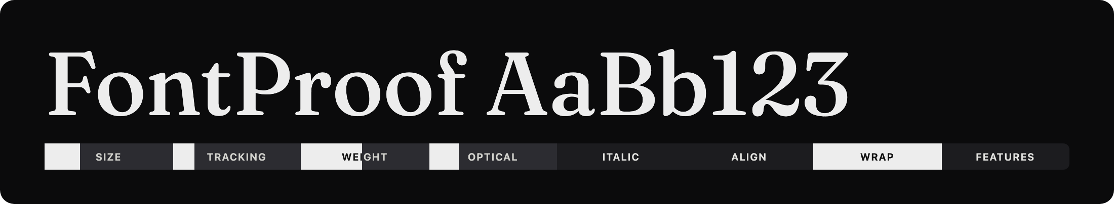
A micro toolbar for testing type on the web — a compact bar of controls over a live, editable sample. Accessible and dependency-free: adjust size, tracking, weight, italic, alignment, line-wrap, and composable OpenType features live. Ships a framework-agnostic vanilla core and an optional React component.
Formerly published as
type-tester-tdf(and brieflytypebar-tdf); renamed to FontProof to reflect what it really is — a focused type-proofing toolbar: a compact bar of controls over a live sample.
v2 is a ground-up rewrite. The legacy jQuery + jQuery UI + BigText widget (v1) is preserved at the
v1.0.0git tag. v2 has no runtime dependencies, builds accessible native controls, escapes all input (noeval, noinnerHTML), composes multiple OpenType features at once, and auto-fits withResizeObserver. See Migrating from v1.
- Install
- Vanilla JS · full guide in docs/vanilla.md
- React · full guide in docs/react.md
- Options
- Controls
- OpenType features
- Accessibility
- Migrating from v1
- Development
npm install fontproofImport the stylesheet once (optional — the component works without it):
import "fontproof/styles.css";import { FontProof } from "fontproof";
import "fontproof/styles.css";
const tester = new FontProof(document.querySelector("#demo"), {
text: "Typography",
fontFamily: "Inter",
size: 96,
controls: { size: true, tracking: true, weight: true, italic: true, features: true },
});
// later…
tester.destroy();<div
data-fontproof
data-font="Inter"
data-size="96"
data-text="Typography"
data-controls="size,tracking,weight,italic,align,features"
></div>
<script type="module">
import { autoInit } from "fontproof";
import "fontproof/styles.css";
autoInit(); // initialises every [data-fontproof] element
</script>autoInit() is idempotent — already-initialised elements are skipped.
import { FontProofComponent } from "fontproof/react";
import "fontproof/styles.css";

export function Demo() {
  return (
    <FontProofComponent
      text="Typography"
      fontFamily="Inter"
      size={96}
      controls={{ size: true, weight: true, features: true }}
      onChange={(state) => console.log(state)}
    />
  );
}
React is a peer dependency (>=17); the core stays dependency-free.
new FontProof(host, options) / <FontProofComponent {...options} />:
| Option | Type | Default | Description |
|---|---|---|---|
text |
string |
"" |
Initial sample text. |
fontFamily |
string |
— | Primary family to test. |
fallback |
string |
"sans-serif" |
Fallback stack appended after the family. |
size |
number | "fit" |
80 |
Px size, or "fit" to auto-fit the container. |
tracking |
number |
0 |
Letter-spacing in em. |
weight |
number |
400 |
Font weight (or variable wght axis). |
italic |
boolean |
false |
Italic state. |
align |
"left" | "center" | "right" |
"left" |
Text alignment. |
wrap |
boolean |
true |
Multi-line wrap vs single line. |
features |
string[] |
[] |
Initially active OpenType feature tags. |
editable |
boolean |
true |
Whether the sample is user-editable. |
placeholder |
string |
"Type to test…" |
Empty-state placeholder (CSS, not real text). |
controls |
ControlsConfig |
{} |
Which controls to render (see below). |
showValues |
boolean |
false |
Show each control's value inline (e.g. Size: 96px). |
variable |
Record<tag, AxisConfig> |
— | Variable-font axes (see below). |
palette |
string |
"normal" |
Initial colour-font palette (font-palette). |
synthesis |
boolean |
true |
Allow faux bold/italic. false for honest proofing. |
ariaLabel |
string |
"Sample text" |
Accessible name for the editable region. |
onChange |
(state) => void |
— | Called on every state change. |
When fontFamily is set, FontProof asks the browser (Font Loading API) to load
the matching weight/style as you change them, so toggling italic or weight uses
the real glyphs instead of a heavier-looking fallback.
controls selects which interactive controls appear. A true value uses the
default range; an object overrides it:
controls: {
  size: { min: 12, max: 240, step: 1 }, // or `true`
  tracking: true,                       // em slider
  weight: true,                         // 100–900, or the variable axis
  italic: true,                         // aria-pressed toggle button
  align: true,                          // native <select>
  wrap: true,                           // single-line toggle
  features: true,                       // full OpenType list (or string[] subset)
  axes: true,                           // a slider per variable axis (or string[] subset)
  palette: ["normal", "light", "dark"], // colour-font palette <select> (or `true`)
}
Default ranges: size 8–300px, tracking -0.1–0.5em, weight 100–900 step 100.
Variable axes. Configure any axis by its 4-character tag in variable, then
enable sliders with controls.axes. wght is special — it drives the weight
control; all other axes (opsz, slnt, wdth, ital, or custom GRAD/SOFT/
WONK…) get their own slider and compose into one font-variation-settings.
new FontProof(el, {
  fontFamily: "Fraunces",
  variable: {
    wght: { min: 100, max: 900 },
    opsz: { min: 9, max: 144, default: 40, label: "Optical" },
    slnt: { min: -10, max: 0 },
  },
  controls: { weight: true, axes: true }, // weight = wght; opsz + slnt = axis sliders
});
When an opsz axis is configured, font-optical-sizing: none is set so your
manual value isn't overridden by the browser's automatic optical sizing.

Colour fonts (COLR/CPAL — e.g. Nabla, Bungee Spice). They render in colour
automatically; expose palette switching with controls.palette (sets
font-palette). Use the keywords normal/light/dark, or custom palettes you
define with @font-palette-values:
@font-palette-values --brand {
  font-family: Nabla;
  base-palette: 2;
}
controls: { palette: ["normal", "light", "dark", "--brand"] }
Honest proofing. Set synthesis: false to apply font-synthesis: none, so a
missing bold/italic renders as the real font rather than a faux (synthesised)
style — useful when proofing which weights/styles a family actually ships.
Static, bitmap (sbix/CBDT), SVG, emoji and icon fonts all work too — they need no special controls beyond size/features.
Unlike v1 (one feature at a time), features compose: selecting Small Caps
and Oldstyle Figures yields font-feature-settings: "smcp" 1, "onum" 1.
import { FEATURES, featureSettings } from "fontproof";

featureSettings(["smcp", "onum"]); // => '"smcp" 1, "onum" 1'
Supported tags include ligatures (liga, dlig, hlig, clig), case (smcp,
c2sc, case, cpsp), figures (lnum, onum, pnum, tnum, zero, ordn),
fractions (frac, afrc), alternates (swsh, calt, salt, hist, nalt),
position (sups, subs), and stylistic sets ss01–ss20. Restrict the offered
set with controls: { features: ["smcp", "onum", "ss01"] }.
- Native
<input type="range">,<button aria-pressed>,<select>, and checkbox feature toggles — full keyboard support out of the box. - Editable region is a labelled
role="textbox"witharia-multiline; the placeholder is CSS-only, so screen readers never read stale text. - The features panel manages focus, closes on
Escape/ outside click, and exposesaria-expanded/aria-haspopup. - State changes are announced via a polite live region.
- Toggle states use weight + colour (not colour alone); animations respect
prefers-reduced-motion.
The controls render as a slim, borderless segmented bar under the sample. It
stays hidden until the tester is engaged — clicking the sample (or tabbing into
any control) reveals it via :focus-within, and it collapses again when focus
leaves. Each segment shows only its title by default; the control titles
mix-blend-mode: difference against the bar so they stay legible over the slider
fills. Set showValues to also show the value (Size: 96px). Import
the stylesheet to get it:
import "fontproof/styles.css";The look is monochrome by default and driven by CSS variables on the host:
| Variable | Default | Purpose |
|---|---|---|
--fp-accent |
#000 |
Focus rings, slider/checkbox accent |
--fp-bg / --fp-fg |
#fff / #000 |
Component background / text |
--fp-bar-bg |
#fff |
Bar background |
--fp-bar-track |
#e5e5e5 |
Unfilled slider track |
--fp-bar-fill |
#000 |
Filled slider track / pressed toggle |
--fp-bar-h |
26px |
Bar (segment) height |
--fp-bar-radius |
6px |
Bar corner radius |
--fp-speed |
0.18s |
Reveal transition |
Override any of them, e.g. .fp { --fp-accent: #e11d48; }.
A faithful TDF green-on-black preset ships built in — add fp--tdf to the host:
new FontProof(el, { /* … */ });
el.classList.add("fp--tdf");
// React: <FontProofComponent className="fp--tdf" … />| v1 (jQuery attributes) | v2 |
|---|---|
class="typeTester" |
data-fontproof (or new FontProof(el, …)) |
font="Inter" |
data-font="Inter" / fontFamily: "Inter" |
size="90" / size="" (fit) |
data-size="90" / data-size="fit" |
weightoptions="true" |
data-controls="weight" / controls: { weight: true } |
optoptions="dlig,hlig" |
data-features / controls: { features: [...] } |
magic words "yup", "nope" |
plain booleans / "true" / "false" |
| jQuery + jQuery UI + BigText | no dependencies |
The v1 source remains available at the v1.0.0 git tag.
npm install
npm run build      # bundle ESM + CJS + types (tsup)
npm test           # vitest + jsdom
npm run typecheck  # tsc --noEmit
npm run dev        # watch build
npm run capture    # regenerate the README images (Playwright → assets/)
The README's feature images are generated by a reproducible capture harness — see docs/screenshots.md for the approach and a reusable recipe.
ISC © Quinn Keaveney. Originally built for The Designers Foundry.