This plugin for Unreal Engine 5 allows you to create CSS-inspired style sheets to define the appearance of your in-game UI. It is designed to improve your iteration speed and allow you to deploy and update UI themes across your entire game in very little time.
If you have experience with web development, you will likely find this system quite intuitive, as it is based on the same principle as CSS.
There are three components to this plugin:
-
A collection of Styled Widgets which you use in place of default UMG widgets. For example, there is a Text (Styled) widget which fulfills the same role as a Text widget, while supporting the styling engine.
-
The style sheet editor, which allows you to create styles and define how they are applied using CSS-like selectors.
-
The styling engine itself, which generates styles on-demand for widgets, and can refresh them in real-time when the style sheet is modified or swapped out.
The current release is compatible with Unreal Engine 5.1. It can be made compatible with 5.0 through a small number of trivial modifications.
In the plugin's Content folder is an example widget, as well as a map which allows you to explore how the widget behaves at runtime. A default style sheet is also provided.
After installing the plugin you will have a new set of widgets available under the Styled category. The plugin does not alter the behavior of the normal UMG widgets, and you can use both types as needed.
When you add a styled widget to your widget blueprint, you will notice that it is missing many of the options normally
found under the Appearance category. That is because the appearance of a styled widget comes from the style sheet.
These widgets also have several properties under the Style category. The most important is the Style Tags property.
Tags are the equivalent of classes in CSS-- they determine which styles are applied to which widgets. A tag is just
an arbitrary name, and you can add multiple tags separated by spaces.
An important property of tags is that, by default, a widget inherits all the tags of its parents. For example, if
you have a border widget tagged with dialog, and you place a button in it, that button will inherit the dialog
tag. You can then use it to apply a different style to buttons which are within a dialog.
Create a style sheet by selecting "Widget Style Sheet" in the create asset menu, under the User Interface category. This will open the style sheet editor. However, any changes you make to this style sheet won't be reflected in your widgets yet. That is because only one style sheet may be active at a time. You can set the default style sheet in Project Settings, under Plugins > Styled Widgets. Once you point this at your new style sheet, it will apply globally to all widgets in your project.
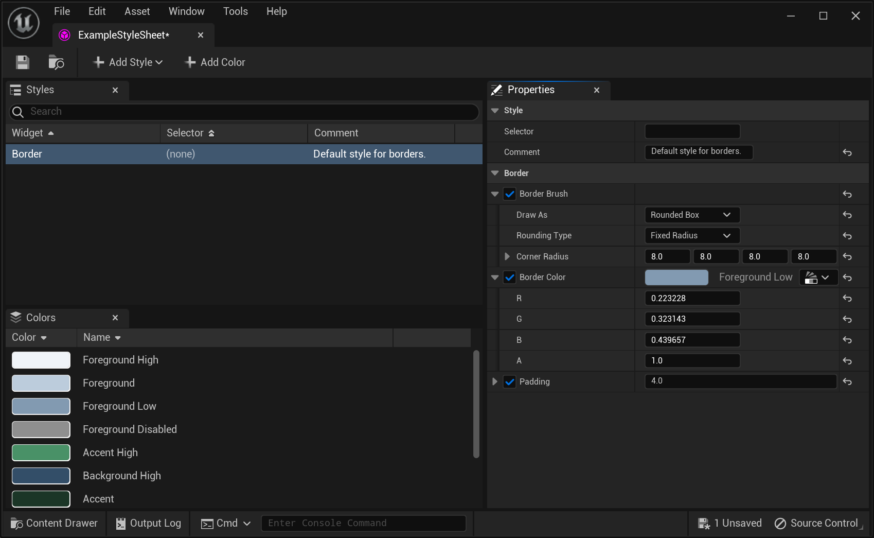 The style sheet editor.
The style sheet editor allows you to create new styles. Each style is specific to a certain widget type. When you select a style in the list, you can choose which properties it will provide. Like CSS, styles are cascaded, meaning the final style is built up by applying many individual style definitions, each of which can choose which properties it will add.
The selector field in a style definition determines which widgets it will apply to. At the simplest level, this can be just a list of style tags; the style will apply to each widget that has all of those tags. (If the style definition has an empty selector, it will apply to all widgets of that type. This is useful for creating sensible defaults.)
For example, if you create a new button style and give it the selector dialog, it will apply to all buttons
which have the dialog style tag.
When multiple styles are applied to the same widget, they apply in the order of less specific to more specific. Most of the time specificity is simply the number of matching tags: a style which has 3 tags in its selector will be applied after a style with only 2. And a style with an empty selector is applied first.
When you make any change in a style sheet, it is reflected instantly in all widget editors as well as running game instances. This allows you to edit your styles and see them reflected in real-time in a play-in-editor game. You can even drag the cursor around a color wheel and see the colors change instantly in game!
Interactive widgets typically want to change their appearance based on user input, or when their state changes. This is handled by automatically adding or removing certain tags based on a widget's state and user input:
hoveredis added when the mouse is currently over a widget. (RequiresIs Hoverableto be checked in the widget's properties.)focusedis added when the widget currently has user focus. (RequiresIs Focusableto be checked in the widget's properties.)pressedis added when the widget is currently being clicked, or activated via keyboard or controller input. (RequiresIs Clickableto be checked in the widget's properties.)disabledis added when the widget is in the disbled state. Styled widgets override the default Slate behavior or rendering disabled widgets semi-transparently, giving you full control over their appearance.
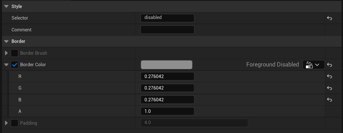 Example of using the
 disabled tag to change the background color of a button.
Because these states are implemented as style tags, you have the full power of the styling engine to determine how they effect a widget's appearance.
Standardizing colors is an important part of any UI design workflow. Style sheets have a built in mechanism to support this: the color palette. The palette allows you to designate a set of named colors. Then, in any style with a color property, you can click a button to open up a menu allowing you to select one of these named colors.
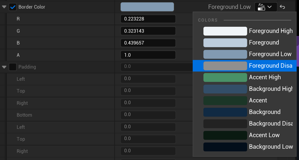 Example of using the color palette to set a color property in a style.
If, at a later time, you want to change the color, you can update it within the color palette. You will then be asked if you want to update all instances of that color across all styles.
Here is an abbreviated list of some of the more advanced capabilities of this plugin.
You can use the styling engine to apply to your own UMG widgets. First, create a new blueprint class that inherits from WidgetStyleBase. Add variables to this class for each of the style properties you want to expose to the style sheet.
Next, create a widget and inherit from StyledUserWidget rather than UserWidget. Set the Style Class property to the blueprint style class you made. Finally, override the Apply Style function. Cast the input to the style class you made, and then you can read its values and use them to style your widget.
If you have a styled widget but you want to define its style directly instead of applying it from a style
sheet, you can click Use Inline Style in the Style category. When this is set, the style sheet will
not be applied to the widget, and you can edit its appearace properties directly.
Normally, you have a single active style sheet at a time which styles your entire game. This is the recommended
workflow, but if you want to use a different style sheet for part of the UI, you can do so. Each styled widget
has a Override Style Sheet property, which you can set to a custom style sheet. This will be used not only
for the widget, but for all of its children.
All styled widgets have an Identifier field (under the Behavior category.) This can be used to uniquely
identify a widget to the styling engine, similar to an element ID in HTML. In a style selector, putting
a hashtag before a token causes it to match by identifier rather than tags.
Identifier matching is considered higher priority than style tag matching, using the same algorithm as CSS.
Every styled widget implements the IStyledWidgetInterface interface. This provides blueprint-exposed
functions which allow you to add, remove, or toggle style tags at runtime.
You can change the current style sheet at runtime, which will cause all active widgets to automatically restyle themselves. To do so, use the WidgetStyleManager class, which is a GameInstance subsystem.
In some cases it may be necessary to resolve ambiguities about the order in which styles should be applied
to a widget. In a selector string, you can prefix a token with ! to invert it and only match widgets that
do not have the given tag. You can also use the + prefix, which will match that tag at a higher priority.
Production-grade performance is a key consideration of this plugin. To that end, it is written entirely in C++, and utilizes caching and edit-time processing as much as possible to minimize the runtime workload. Perf costs are primarily during widget construction, and there is zero per-frame overhead versus standard UMG widgets.
In some cases you may see performance benefits to using this plugin, because swapping a widget's style by changing its tags is faster than changing its appearance using Blueprint functions.
In the first version of this plugin, the styled widgets inherited from their UMG counterparts. However, this created issues because there are significant inconsistencies between widget implementations. To give the maximum power and flexibility to the UI designer, it was necessary to achieve a "blank slate", similar to reset stylesheets in the web world. This necessitated reimplementing the UMG widgets, but this proved to have a number of advantages:
- Simplification and pruning of unnecessary properties. Many UMG widgets, for example, have multiple colors, and it is often unclear which should be used. This is related to...
- Better encapsulation of Slate. UMG is somewhat inconsistent about where it exposes Slate structures
directly (such as
FSlateBrush) and where it encapsulates them. In rebuilding the widgets I have tended towards a much more thorough encapsulation of the underlying Slate widget, with the goal of presenting the cleanest and simplest interface to UI designers. - More consistent interactivity features. UMG widgets are not terribly consistent in terms of supporting states like hovered, focused, etc. Styled widgets all support these natively, and also provide Blueprint events for these interactions. I have also added support for keyboard and controller input as an alternative mechanism for clicking. In order to avoid adding any runtime overhead, these interactions are all opt-in.
- Removal of hard-coded styling choices. In particular, many UMG widgets are automatically rendered as semi-transparent when disabled. Only a handful override this behavior. In contrast, styled widgets expose 100% of a widget's appearane to the designer.
This is still an early version of this plugin, and so there is quite a bit more work to be done. This includes:
- More widget types, with the goal of eventually providing a styled version of every UMG widget type.
- Integration with UE5's Common UI and View Model plugins.
- Better documentation and more in-depth tutorials.
- Mechanism for splitting a style sheet into multiple files to make it easier for designers to collaborate.
- Tool for diagnosing how a style is applied to a widget so that a designer can easily debug when a widget doesn't look like expected.
- Screen reader/general accessibility support.